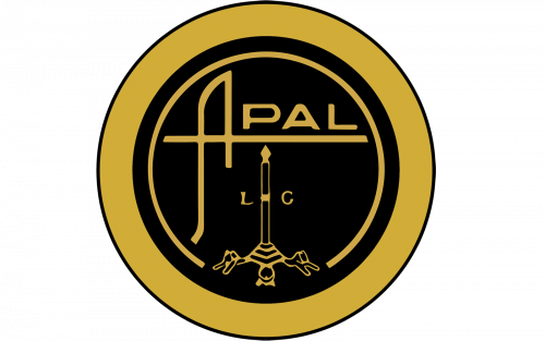
 APAL Logo PNG
APAL was a Belgian specialist automobile manufacturer closely associated with fiberglass-bodied sports cars, buggies and kit cars. Its name is an acronym for Application Polyester Armé Liège, directly linking the brand to reinforced polyester construction and to the Liège region where the company was created. [1]
The APAL logo is primarily built around a distinctive custom wordmark, with some historical badge versions incorporating a circular emblem beneath it. Unlike many automotive logos, its strongest documented meaning comes from the company name itself, not from generic color or shape symbolism.
APAL Logo Meaning and History
The APAL identity developed around the company’s full name: Application Polyester Armé Liège. This referred directly to the reinforced polyester material used to create lightweight vehicle bodies. [1]
That connection makes the name itself an important part of the logo story. The branding was not based on a fictional symbol or unrelated initials: APAL encoded the company’s manufacturing method and geographic origin directly into its name.
What Does APAL Stand For?
APAL stands for:
- Application
- Polyester
- Armé
- Liège
In English, this refers roughly to reinforced polyester applications in Liège. Contemporary and historical sources consistently identify this as the origin of the company name. [2]
This is the clearest verified meaning behind the brand identity.
The APAL Wordmark
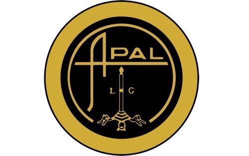
The APAL logo is visually dominated by a custom wordmark. The most distinctive feature is the capital A, which is much larger and more stylized than the remaining letters.
Its left stroke curves outward while the horizontal bar extends beneath the rest of the name, creating an underline across PAL. This makes the first letter function as both an initial and a structural element within the entire wordmark.
The remaining letters are lower, wider and more restrained, giving the logo a strong visual contrast between the dramatic A and the simpler PAL lettering.
Was the APAL Logo Based on a Standard Font?
No authoritative historical source located for this article identifies the APAL wordmark as a standard commercial typeface.
Some later logo-reference sites compare the PAL lettering with modern fonts such as Stereo Gothic, but those are visual approximations rather than documented design sources. The safer description is that APAL used custom display lettering with a heavily modified A.
The Circular APAL Emblem
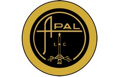
Some versions of the APAL identity include a more ornate circular badge beneath or around the wordmark.
The emblem contains a vertical central structure and additional decorative elements inside a circular frame. Later secondary sources have interpreted this as a candle, tower, pen or even a rocket, but those explanations are inconsistent and should not be treated as established historical fact.
There is stronger evidence that the badge relates visually to Liège, reflecting the geographical origin already encoded in the APAL name. However, without surviving official brand documentation, the exact symbolic meaning of each component remains uncertain.
Does the APAL Emblem Reference Liège?
Some modern analyses compare the emblem to the historic civic imagery of Liège, particularly the city’s perron, a monument and symbol strongly associated with Liège.
This interpretation is plausible because Liège is explicitly part of the APAL name, but no primary APAL design manual located for this article confirms a formal element-by-element explanation.
For Logo Index, it is more accurate to state that the emblem appears to reference the company’s Liège origin rather than assign definite meanings to the individual shapes.
APAL Logo Colors
The APAL logo is commonly reproduced in black and white, although historical vehicle badges and printed materials may show other finishes depending on the application.
There is no reliable evidence that APAL officially defined black as confidence, white as purity or any similar color-psychology interpretation.
The monochrome execution is best understood as a practical and highly reproducible treatment for badges, print and vehicle applications.
When Was the APAL Logo Introduced?
The exact first-use date of the surviving APAL wordmark is not well documented.
The company itself emerged at the beginning of the 1960s. Historicar’s historical account traces the collaboration of Edmond Pery and Bruno Vidick to around 1960, while APAL’s formal company registration was published in the Belgian official gazette on May 25, 1962. [1]
Because no reliable logo archive establishes a precise first-use year for the current wordmark, it is better to associate it broadly with the company’s early history rather than invent a specific redesign timeline.
APAL and Fiberglass Design
The company’s use of polyester-reinforced fiberglass is relevant to the logo because it explains the APAL name directly.
Edmond Pery specialized in fiberglass construction, and the material gave APAL a way to create lightweight bodies without the tooling costs associated with steel. The first APAL Coupé used Volkswagen mechanical components beneath a custom fiberglass body. [2]
This manufacturing focus is part of the brand story, but it should not be converted into claims that the logo’s shapes themselves symbolize lightness or engineering precision unless documented.
APAL Models and the Badge
The APAL name and badge appeared across a diverse range of specialist vehicles.
Historically important examples include:
- APAL Coupé
- APAL Formule V
- APAL Horizon GT
- APAL Buggy
- APAL Rancho
- APAL Jet
- APAL Auki
- APAL Corsa
Between the late 1960s and early 1980s, thousands of fiberglass bodies were produced for APAL buggy variants, making the badge visible well beyond the company’s low-volume sports cars. [3]
How Much Did the APAL Logo Change?
There is no well-documented official year-by-year APAL logo evolution.
Surviving references show both the distinctive standalone wordmark and a more elaborate circular emblem, but there is not enough evidence to assign exact introduction and retirement dates to each version.
For a small historic manufacturer like APAL, forcing a neat logo chronology would create false precision. The more defensible approach is to document the known visual forms and clearly state where dating is uncertain.
APAL Logo Legacy
The APAL identity remains closely tied to one of Belgium’s better-known specialist car makers of the post-war era.
Its strongest visual feature is the custom A-led wordmark, while its strongest documented meaning lies in the acronym itself: Application Polyester Armé Liège.
That makes the logo a good example of an identity where the company name carries more historically verifiable meaning than later symbolic interpretations of the badge.