Table of Contents
1976: The Original Newton Logo
 Apple was founded on April 1, 1976, by Steve Jobs, Steve Wozniak and Ronald Wayne. Apple itself marked its 50th anniversary in 2026 by tracing the company’s history back to that date. [1]Ronald Wayne created Apple’s original logo in 1976. Rather than a modern corporate symbol, the mark resembled a detailed engraving. It depicted Isaac Newton sitting beneath an apple tree, surrounded by an ornate frame containing the company name.The illustration also incorporated a line adapted from William Wordsworth referring to Newton as a mind traveling through “strange seas of thought.”It was conceptually appropriate for a young computer company interested in discovery and knowledge, but visually it was very different from the simple identity Apple would soon adopt.The important point is not that Apple formally documented problems such as printing costs or poor scalability. Those are reasonable design observations, but they should not be presented as documented reasons for the redesign unless supported by a primary source.
1977: Rob Janoff Creates the Rainbow Apple
In early 1977, Apple worked with the Regis McKenna advertising agency on a new corporate identity for the launch of the Apple II. Rob Janoff, then an art director at the agency, was selected to develop the new mark. [2]Janoff’s own account says the design process took about two weeks. He studied real apples and their cross-sections before developing the simplified bitten-apple silhouette. The concept presented to Apple used horizontal rainbow-colored stripes, and Steve Jobs approved it for production. [3]The new identity was prepared for print advertising, signage, hardware badges and software labels ahead of the Apple II’s launch at the West Coast Computer Faire in April 1977. [3]This was the decisive moment in Apple’s visual history. The ornate Newton illustration disappeared, but the apple itself remained. The company had moved from a literal historical scene to a compact symbol that could identify a product without explanation.Why Does the Apple Logo Have a Bite?
The bite is one of the most discussed features of the Apple logo, and it has accumulated many myths over the years.Rob Janoff has explained that the practical reason was recognition. Without the bite, the round fruit could be confused with another type of fruit, particularly at smaller sizes. The bite made it unmistakably an apple. [3]This is a better-supported explanation than stories connecting the bite to computer “bytes,” Alan Turing or biblical symbolism. Those interpretations became popular later, but they were not the documented basis of Janoff’s design.The design lesson is straightforward: a small modification can make an otherwise generic silhouette distinctive.Why the Original Apple Logo Used Rainbow Stripes
The 1977 logo contained six horizontal color bands. Janoff’s design appeared at the same time Apple was launching the Apple II, a computer notable for its color-display capabilities.Janoff’s own logo history connects the rainbow mark directly with the Apple II launch, and the multicolor treatment became inseparable from Apple’s identity for the next two decades. [3]It is reasonable to read the colors as emphasizing the product’s ability to display color, but more speculative claims should be treated cautiously. Statements that the palette was specifically intended to represent inclusion, rebellion against IBM or particular psychological traits are interpretations rather than documented design instructions.The strongest documented point is simpler: the colorful logo arrived with the Apple II and helped distinguish Apple’s products visually during an era when computing was often presented in a much more technical and institutional way.1977–1998: The Rainbow Apple Becomes the Brand
The rainbow Apple logo remained in use for roughly two decades. Janoff’s archive identifies the rainbow version as Apple’s principal logo from 1977 until 1998. [3]During that period, the same silhouette appeared across products including Macintosh computers and the Newton PDA. The exact context changed, but the bitten-apple shape remained recognizable.This long period of continuity is important. Apple did not need to reinvent the symbol every time the company introduced a major new product. Instead, recognition accumulated around the same basic form.1998: Apple Moves to Monochrome
 Apple abandoned the rainbow treatment around 1998 and began using monochrome versions of the familiar apple silhouette. Rob Janoff’s archive identifies a monochrome period beginning in 1998. [3]The timing coincided with Steve Jobs’s return to Apple and the introduction of products such as the iMac G3, which dramatically changed the company’s hardware design language.The important visual change was not the silhouette. The bite, leaf and overall proportions remained recognizable. What changed was the treatment applied to the mark.Removing the rainbow stripes gave Apple much greater freedom to integrate the logo into different materials and product finishes. The mark could appear black, white, translucent or molded directly into hardware without altering its underlying identity.
2001–2007: The Aqua Era
Apple’s visual language changed again around the introduction of Mac OS X. The operating system’s Aqua interface emphasized translucency, reflections and glossy surfaces, and the Apple logo often appeared with similar dimensional treatments.Janoff’s archive identifies an Aqua version from 2001 to 2007. [3]The logo could appear glossy, translucent or metallic depending on the context. These variations matched Apple’s wider product and software design language during a period that included the iMac, iPod and early Mac OS X interfaces.Again, Apple changed the surface treatment without redesigning the symbol itself.The Modern Apple Logo
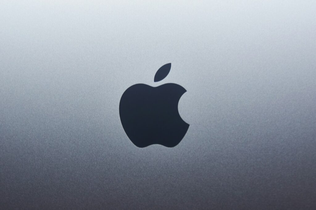
 Modern Apple branding generally uses the bitten-apple silhouette in simple monochrome or material-specific treatments.The mark may appear black or white in communications, polished or recessed into hardware, or adapted to the material and interface around it. What remains consistent is the silhouette established in 1977.This distinction matters because there is no single clean moment when Apple permanently replaced every glossy logo with one universally flat version. Different products and communications have used different finishes over time.The more accurate way to describe Apple’s modern identity is therefore as a stable symbol with flexible surface treatments.
Apple’s Logo in the Current Brand
In 2026, Apple marked its 50th anniversary while continuing to use the same essential bitten-apple form introduced nearly five decades earlier. The company’s anniversary communications even revisited the historic rainbow logo as part of its celebration of Apple’s design history. [1]The longevity of the mark is unusual. Apple’s products have moved from early personal computers to Macintosh, iPod, iPhone, iPad, Apple Watch and Apple Vision Pro, yet the central brand symbol has remained visually recognizable throughout those changes. [1]Why the Apple Logo Works
The Apple logo is effective for several practical reasons:- Distinctive silhouette: the bite separates it from a generic fruit shape.
- Simple geometry: the mark remains identifiable at very small sizes.
- No dependence on typography: the symbol can represent Apple without the company name.
- Material flexibility: the same shape works in print, glass, metal, plastic and digital interfaces.
- Long-term continuity: Apple has retained the central silhouette since 1977.
What Designers Can Learn From the Apple Logo Evolution
Apple’s logo history offers several useful lessons for identity designers.- Simplification can create longevity. The shift from Ronald Wayne’s detailed illustration to Janoff’s silhouette made the identity far easier to reproduce and recognize.
- Distinctiveness can come from one small detail. The bite transforms a generic apple into a proprietary-looking symbol.
- A strong shape can support changing styles. Rainbow stripes, monochrome, translucency and metallic finishes all worked because the underlying silhouette stayed consistent.
- Surface treatment is not the same as a redesign. Apple has repeatedly changed how the logo is rendered without replacing the basic mark.
- Brand recognition is cumulative. The symbol became powerful because Apple used it consistently across decades of products and communications.
From Newton to the Bitten Apple
Apple’s visual evolution is often summarized as a journey from complexity to minimalism, but that description misses part of the story.The largest transformation happened almost immediately. Ronald Wayne’s Newton illustration lasted only briefly before Rob Janoff created the bitten apple in 1977.Most of what followed was not a sequence of completely new logos. It was a sequence of different treatments applied to the same core symbol.That distinction is why the Apple logo is such a useful design-history case study. The company changed radically, its products changed radically and the visual styles surrounding the logo changed repeatedly, yet the central mark survived.
FAQ
Who designed the Apple logo?
Rob Janoff designed the bitten Apple logo in 1977 while working at the Regis McKenna agency. Apple’s original 1976 Newton logo was created by co-founder Ronald Wayne. [3]
Why does the Apple logo have a bite?
Rob Janoff has explained that the bite helped viewers recognize the shape as an apple rather than another round fruit, particularly when the logo was reproduced at smaller sizes. [3]
Why was the old Apple logo rainbow-colored?
The rainbow-striped logo was created for the introduction of the Apple II in 1977. The colorful identity was closely associated with a computer notable for its color graphics capabilities. [3]
When did Apple stop using the rainbow logo?
The rainbow Apple logo remained in use until approximately 1998, when Apple began adopting monochrome treatments of the same bitten-apple silhouette. [3]
What was Apple’s first logo?
Apple’s first logo was a detailed 1976 illustration by Ronald Wayne showing Isaac Newton sitting beneath an apple tree. It was replaced the following year by Rob Janoff’s much simpler bitten-apple design.
Has the Apple logo changed since 1977?
Yes, but primarily in its visual treatment rather than its basic shape. Apple has used rainbow, monochrome, translucent, glossy and metallic versions while retaining the recognizable bitten-apple silhouette created in 1977.
Disclaimer
This article is part of the educational resources provided by Logo Index, an independent archive covering logos, visual identities and graphic design history. Apple and all associated trademarks and brand assets remain the property of Apple Inc.