 Autobianchi Logo PNG
Autobianchi was an Italian automobile marque created in 1955 by Bianchi, Fiat and Pirelli. Its best-known visual identity is the stylized geometric A introduced in 1968, a logo designed by Italian graphic designer Ilio Negri when Autobianchi was absorbed into Fiat. Before that mark appeared, the company used several identities including an AB shield, a distinctive wordmark and a badge incorporating symbols associated with its industrial partners. [1] [2]
Autobianchi should be distinguished from Edoardo Bianchi’s much older bicycle, motorcycle and automobile company. Bianchi began in Milan in 1885, but Autobianchi itself did not exist until January 11, 1955. Earlier Bianchi eagle, crown and monogram emblems therefore belong to Bianchi’s own history rather than to the Autobianchi marque. [3] [4]
Meaning of the Autobianchi Logo
The most recognizable Autobianchi emblem is a stylized letter A contained within a circular form. Museo del Marchio Italiano identifies this logo as the work of Ilio Negri and dates its introduction to 1968, the year Fiat absorbed Autobianchi. [2]
The mark is therefore best understood first as a graphic representation of the initial A in Autobianchi. There is no need to assign unsupported meanings such as stability, precision or modern engineering to the triangular geometry. Its documented value lies in the way Negri reduced the brand name to a compact identifying symbol.
Autobianchi Was Founded in 1955
Autobianchi was founded on January 11, 1955 through an initiative led by Ferruccio Quintavalle, general manager of Bianchi. The aim was to revive Bianchi’s automobile activity after the difficult postwar period by creating a new company together with Fiat and Pirelli. The initial capital was divided equally among the three partners. [4]
The production plant was at Desio, near Milan, using facilities already owned by Bianchi. Fiat supplied important technical and industrial resources, while Pirelli participated as both investor and tire supplier. Autobianchi subsequently became a useful platform for introducing concepts that Fiat could test outside its core range. [5]
Bianchi Logos Before Autobianchi
1901 to 1905
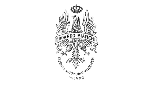
This image belongs to the history of Edoardo Bianchi’s company rather than Autobianchi. Bianchi had already been active for decades before Autobianchi was formed in 1955, producing bicycles and later motorcycles and automobiles. The eagle and elaborate heraldic treatment belong to that earlier Bianchi identity. [3]
1905 to 1919
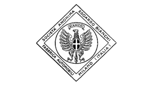
The continued use of eagle imagery and the Bianchi name reflects the identity of Fabbrica Automobili e Velocipedi Edoardo Bianchi. These marks provide useful background to Autobianchi’s ancestry, but they should not be described as Autobianchi logos.
1919 to 1923
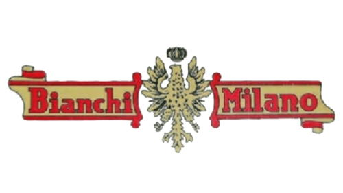
Later versions of the Bianchi badge continued to use the eagle and founder’s name in increasingly elaborate arrangements. No authoritative evidence located for this article supports interpretations such as the crown representing authority or the colors representing luxury.
1923 to 1933
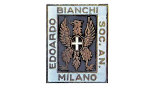
This is likewise part of Bianchi’s pre-Autobianchi visual history. The distinction matters because presenting these designs as Autobianchi logos would incorrectly extend the marque’s history several decades before its actual creation.
1933 to 1940
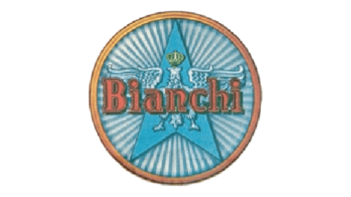
The Bianchi name remained the dominant identifier during the 1930s. Although these older marks form part of the industrial background from which Autobianchi eventually emerged, they were not created for Autobianchi.
1940 to 1945

Bianchi remained an independent industrial name through the Second World War. Autobianchi would only be established a decade later as a separate company involving Fiat and Pirelli.
1945 to 1948
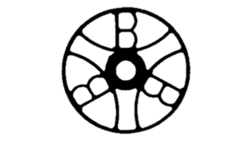
This geometric postwar emblem is another Bianchi mark. Claims that it intentionally contains three hidden B letters or that its circular construction was designed specifically as a wheel should not be stated as established fact without contemporary documentation.
1948 to 1957

The B initial connects this badge directly with the Bianchi name. The chronology overlaps with the creation of Autobianchi in 1955, but the early portion of this period still predates the new company, so it should not simply be labeled an Autobianchi logo from 1948.
1957 to 1959: AB Shield
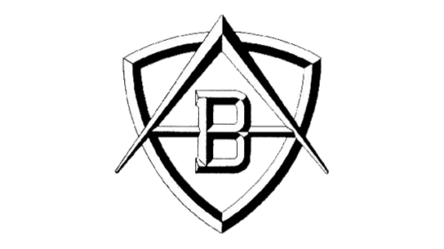
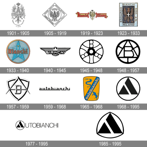
With the arrival of the Bianchina in 1957, Autobianchi used a shield-shaped emblem incorporating the letters A and B. Museo del Marchio Italiano dates this badge to the launch period of the Bianchina and states that it remained in use until 1959. [2]
The AB construction directly abbreviates Autobianchi. Contemporary Autobianchi historical material also refers to a characteristic AB shield used on vehicles during the company’s first years. [6]
1959 to 1968: Autobianchi Wordmark

In 1959 the AB shield was replaced by a stylized Autobianchi wordmark. Museo del Marchio Italiano confirms this transition, making it one of the better-documented changes in the marque’s identity. [2]
The lettering is visually distinctive because the characters share a continuous horizontal baseline. No reliable source located for this article states that the line was intended to symbolize corporate unity or the Fiat, Pirelli and Bianchi partnership, so that interpretation should be avoided.
1965: Bull and Biscione Badge
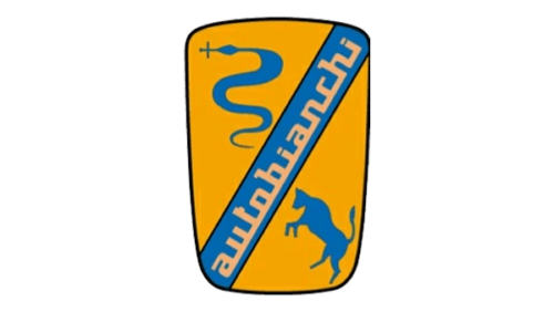
A new emblem appeared in 1965 around the presentation of the second-series Primula. Museo del Marchio Italiano identifies a bull and a biscione, the serpent traditionally associated with Milan, as elements of this badge. [2]
This is more specific than describing the figures generically as symbols of strength or growth. The badge belongs to a relatively short transitional phase before Fiat’s complete takeover.
1968: Ilio Negri’s Stylized A

The most important Autobianchi logo was introduced in 1968, when Fiat incorporated the company. It was designed by Ilio Negri, one of the significant figures in postwar Italian graphic design. The emblem consists of a stylized A placed within a circular form. [2]
The mark is often described as triangular because of its outer geometry, but its documented purpose is more straightforward: it is a stylized representation of the Autobianchi initial. Unsupported claims that the triangle signifies precision, stability or engineering should be avoided.
1977 to 1995: Emblem and Wordmark

Later applications combined Negri’s emblem with the Autobianchi name. In some versions, the symbol effectively takes the place of the initial A, integrating the stand-alone badge into the full wordmark.
No authoritative source located for this article identifies a specific commercial font used for the accompanying lettering.
1985 and the Lancia Connection

From 1985, Autobianchi became increasingly linked with Lancia. Museo del Marchio Italiano notes that Autobianchi and Lancia logos appeared together and that the stylized Autobianchi A was also incorporated, inverted, into a Lancia-style shield in some applications. [2]
The Y10 illustrates this transition particularly clearly. It was introduced under the Autobianchi name in some markets but sold as a Lancia elsewhere. According to MAUTO, it was Autobianchi’s final model and from 1995 onward was marketed under the Lancia brand. [1]
Autobianchi and Fiat
Fiat’s involvement began at Autobianchi’s creation rather than only with a later acquisition. Fiat, Pirelli and Bianchi initially held equal stakes in the company. Fiat subsequently took full control, with historical sources placing the takeover in 1967 or incorporation into Fiat Auto in 1968. [5] [1]
Autobianchi became especially important as a development platform for ideas that later influenced Fiat products. The Primula, introduced in 1964, used front-wheel drive with a transversely mounted engine, an arrangement that became highly influential in compact-car design. Stellantis’ historical material specifically highlights Autobianchi’s role as a testing ground for alternative technical solutions. [5]
When Did Autobianchi End?
It is more accurate to say that the Autobianchi marque was phased out rather than that an independent manufacturer simply stopped production in 1995. Fiat had controlled the company for decades, and Autobianchi models were increasingly integrated with Lancia.
The A112 remained in production until 1986. The Y10 succeeded it and became the final model associated with the Autobianchi name. From 1995 the Y10 was marketed under Lancia, effectively ending Autobianchi as an active automobile marque. [4]
Typography and Color
Autobianchi used several very different lettering styles during its existence, from the compact AB shield to the connected 1959 wordmark and later combinations of the Ilio Negri emblem with the company name.
No authoritative source located for this article identifies commercial typefaces for these marks. Likewise, the historical use of blue, black, white and other colors can be described visually, but claims that specific colors represented luxury, Italian racing heritage or modernity are not supported by the sources reviewed.
FAQ
When was Autobianchi founded?
Autobianchi was founded on January 11, 1955 through an initiative led by Bianchi general manager Ferruccio Quintavalle. Fiat, Pirelli and Bianchi initially participated with equal shares.
Who designed the Autobianchi logo?
Italian graphic designer Ilio Negri designed the stylized A emblem introduced in 1968. It became the best-known Autobianchi logo and was used in several later variations.
What does the Autobianchi logo mean?
The best-known Autobianchi symbol is a stylized letter A inside a circular geometric form. Reliable sources identify it as an A designed by Ilio Negri rather than assigning broader meanings such as stability or precision to its shape.
Are the old Bianchi eagle logos Autobianchi logos?
No. Edoardo Bianchi’s company existed decades before Autobianchi. Eagle, crown and other Bianchi emblems from before 1955 belong to Bianchi’s own corporate and automotive history rather than to Autobianchi.
When did Autobianchi disappear?
The Autobianchi marque was gradually absorbed into Fiat and Lancia. Its final model was the Y10, and from 1995 that model was marketed under the Lancia name, effectively ending Autobianchi as an active automobile brand.
Disclaimer
This article is part of the educational resources provided by Logo Index, an independent archive covering logos, visual identities and graphic design history. Autobianchi, Bianchi, Fiat, Lancia and associated trademarks and brand assets remain the property of their respective rights holders where applicable.