Barkas is the brand of the East German state works VEB Barkas-Werke, based in Hainichen and Karl-Marx-Stadt, the city now called Chemnitz. The name emerged in the late 1950s, when the nationalised Framo van operation was absorbed into the GDR’s IFA vehicle combine, so Barkas is best understood as a state enterprise rather than a new private company. Its best-known product, the Barkas B1000 van and minibus, entered series production in 1961, and the same plants also built engines, among them units for the Trabant and, at the end of the model’s life, a Volkswagen-licensed four-stroke engine for the B1000-1 [1].
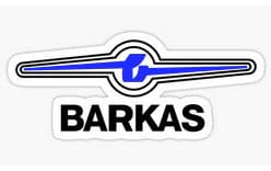
The Barkas logo is the badge that sat on the front of those vans: a compact blue-and-white emblem built around a lowercase b whose strokes stretch outwards into horizontal wings.
 Barkas Logo PNG
The Barkas emblem and its winged B
The mark is organised around a single letter. A custom lowercase b sits at the centre of a circular form drawn with a double outline in white and blue. From the body of the letter, two straight lines run outwards and repeat the shape of the wings that frame the badge, so the letter and the surrounding bars read as one continuous graphic rather than two separate elements.
Those wings are geometric and deliberately elongated. Their contours are clean and straight, and they extend well beyond the circle on both sides, which gives the badge a wide, horizontal silhouette rather than the tall, upright proportion of many automotive emblems. The letter is a drawn form rather than a standard typeface character: the bowl and stem are simplified so the shape stays legible at the small size a grille badge demands.
A designer credit for the emblem is not documented in publicly accessible sources, and the identity is easier to read from the surviving badges and printed material than from any written brand specification. Across those surviving examples, the winged b works as the primary symbol while the brand’s block lettering is used alongside it.
Badge, wordmark and the B1000 script
Barkas vehicles carried more than one piece of lettering. Alongside the winged emblem, the B1000 used a separate BARKAS wordmark and a B1000 script, and restoration suppliers still list these as distinct parts: a grille emblem on one hand, cast aluminium B1000 scripts on the other [2]. The wordmark lettering is a heavy uppercase geometric sans serif, set in thick strokes with flat, square-cut bar ends, which gives it an industrial rather than decorative character.
Splitting the identity this way is standard practice for commercial vehicles. The symbol has to register from a distance on a moving van, while the wordmark and the model script have to stay readable close up, at the front panel or on the tailgate.
Lettering and colour
Blue and white are the colours most closely associated with the Barkas identity. Blue forms the field of the badge and the counter of the letter, white is used for the outlines and the letterform, and darker, near-black tones appear in wordmark treatments on printed material and signage. The result is a high-contrast mark that separates clearly from light bodywork on a van front.
The badge was also built for horizontal placement. Because the wings spread to the left and right, it sits naturally on a wide grille panel and balances the proportions of a boxy van nose instead of being dwarfed by it.
Where the mark appears today
Series production of the B1000 ended in the early 1990s and the works closed with it. The logo has outlived the vehicles in the familiar way: it turns up on restored B1000s, in museum collections of GDR design [3], and on scale models and merchandise. Because the mark is simple and legible at small sizes, it reproduces well on cast parts, stickers and printed goods, which is a large part of why it remains recognisable long after the vans left the road.
FAQ
What does the Barkas logo look like?
It is a compact blue-and-white badge with a double outline, built around a custom lowercase letter b. Two straight lines extend from the letter’s body and echo the elongated, geometric wings that spread to either side of the circle, giving the emblem its wide, horizontal shape.
What does the “b” in the Barkas logo stand for?
It is the initial of Barkas, the brand name of the VEB Barkas-Werke enterprise. The emblem belongs to the letter-based family of marks, in which the initial itself carries the graphic idea rather than sitting next to a separate symbol.
When was the Barkas logo used?
The Barkas name dates from the late 1950s, and the winged emblem appears on the vehicles and on printed material throughout the production life of the B1000, which ran from 1961 into the early 1990s.
Is Barkas still in business?
VEB Barkas-Werke was an East German state enterprise, and vehicle production came to an end in the early 1990s after reunification. The logo now appears on restored vans, museum displays and collectables rather than on newly built vehicles.
Disclaimer
This article is part of the educational resources provided by Logo Index, an independent archive covering logos, visual identities and graphic design history. Barkas and associated trademarks and brand assets remain the property of their respective rights holders where applicable.