Amblin Entertainment’s logo is recognized by a bicycle and riders silhouetted against a moon, alongside the AMBLIN wordmark. The mark draws on imagery from E.T. the Extra-Terrestrial (1982), according to AVID’s logo history.
 Amblin Entertainment Logo PNG
Meaning and history
The logo combines the moon-crossing bicycle image with a wordmark framed by horizontal bars. The company name comes from Steven Spielberg’s 1968 short film Amblin’, according to the University of Kiel film encyclopedia. Accounts differ on the company’s founding year, so the logo’s documented on-screen history offers a clearer timeline.
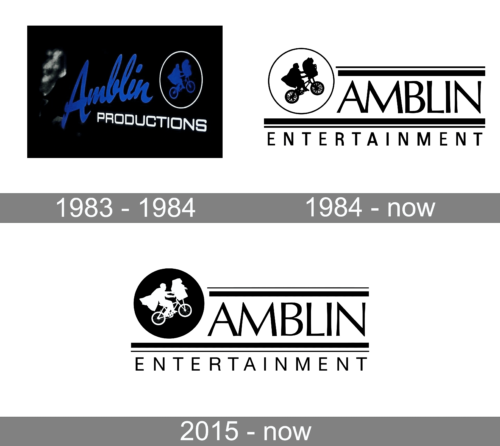
1983 – 1984
This graphic shows a blue cursive “Amblin” above “PRODUCTIONS,” with a small bicycle emblem inside a circle. The heading supplies a date range, but the graphic itself establishes only its visible design; the documented on-screen Amblin Entertainment logo begins with a different treatment in 1984.
1984 – Today
The 1984 in-credit still uses a circular moon outline around the silhouetted riders, with AMBLIN set to its right and horizontal bars framing the wordmark. A smaller “ENTERTAINMENT” sits beneath the lower bar. AVID dates the still’s debut to Gremlins on June 8, 1984, and the animated version’s debut to The Goonies on June 7, 1985.
In the animated treatment, the moon recedes as the bicycle and riders move into position; the wheels continue turning, then the bars and lettering appear. AVID records its regular use through The Hundred-Foot Journey in 2014, with later appearances in The House with a Clock in its Walls (2018) and West Side Story (2021). The animated treatment therefore has later documented returns, even as a redesigned CGI version appeared in 2015.
2015 – Today
The CGI logo debuted with Jurassic World on June 12, 2015, and AVID identifies it as the continuing in-credit version. It keeps the moon, bicycle and riders while giving the wordmark and moon more dimensional treatment; the silhouette was also redrawn. This graphic presents the design as a white bicycle-and-riders silhouette inside a solid black disc, with the wordmark and bars alongside it.
Wordmark, symbol and color
The lockup places the moon and bicycle to the left of AMBLIN. Two horizontal bars bracket the main wordmark, while “ENTERTAINMENT” appears below. AVID describes the lettering as Optima, a flared humanist sans serif; that typeface identification is a source-reported description rather than a design credit.
Color varies between versions. AVID describes the in-credit still as white on black and records animated treatments with blue, red or orange accents, as well as both flat-blue and more realistically shaded moons. The logo’s fine bicycle details and small secondary lettering make the full composition more legible at large display sizes than at very small sizes.
Amblin Partners, formed in 2015, is the parent company of Amblin Entertainment. Its related wordmark omits the bicycle-and-riders image and uses “PARTNERS” with the bar-bracketed AMBLIN lettering; AVID dates that logo to 2016. The corporate version is a related identity, not the Amblin Entertainment screen logo.
Disclaimer
This article is part of the educational resources provided by Logo Index, an independent archive covering logos, visual identities and graphic design history. Amblin Entertainment and associated trademarks and brand assets remain the property of their respective rights holders where applicable.