The Everett AquaSox are a Minor League Baseball club in Everett, Washington, and a Seattle Mariners affiliate. The franchise began in Everett as the Giants in 1984 and adopted the AquaSox name for the 1995 season, when its frog identity took shape. The club’s history and name change are summarized in the AquaSox account of its 35th-anniversary logo.
 Everett AquaSox Logo PNG
Meaning and history

The name joins “aqua,” a reference to the region’s water, with “Sox,” a nod to baseball tradition. The frog gives that regional idea a character: a tree frog reaching for a baseball with its tongue. The team’s rain-and-frog explanation is recounted in this archived overview of the club.
1997 — 2009

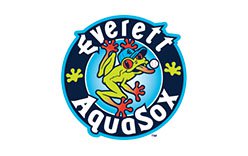
This stage shows the frog inside a broad navy wordmark ring, with aqua water splashes extending around it. The lime-green body, orange-red feet, baseball and cap marked with an “E” establish the identity’s main visual ingredients. Although this archive stage is labeled 1997–2009, the club’s name change and frog reveal date to 1994, before the first AquaSox season in 1995, as the club’s historical account notes.
2010 — Today

On April 5, 2010, the AquaSox introduced a brand extension with a refreshed primary frog, a “Trident-E” cap mark and a “Socks” logo, along with new uniforms. The Trident-E reworked the Mariners’ trident “M” into an “E”; the Socks mark pictured aqua socks with frog toes. Plan B Branding led the nine-month project, according to MiLB’s report on the launch. In this stage image, the frog remains the central character, while the cleaner circular arrangement gives the wordmark and figure a more compact outline.
2013 — Today

This stage presents the frog mark without the large surrounding water splash seen in the earlier version. The central pose, baseball, “E” cap and dark wordmark ring remain recognizable, making the image a more compact treatment of the established character rather than a different mascot. The club’s documented identity includes the frog primary together with the Trident-E and Socks marks; the 2010 launch and its additions are covered by MiLB and the Everett Herald.
The frog-and-baseball scene remains the visual anchor: its bright colors and action pose make the primary mark easy to distinguish, while the E-based cap mark and Socks design provide alternate expressions of the same baseball-and-frog identity.
Disclaimer
This article is part of the educational resources provided by Logo Index, an independent archive covering logos, visual identities and graphic design history. Everett AquaSox and associated trademarks and brand assets remain the property of their respective rights holders where applicable.