 BYD Logo PNG
What Does BYD Mean?
BYD is now widely associated with the phrase Build Your Dreams, but that was not the original meaning of the company name.Founder Wang Chuanfu has explained that when the company was registered in Shenzhen, the Chinese name Biyadi was chosen largely because an unusual three-character name was easier to register. He said the name initially had no particular meaning. The English initials BYD were later given the aspirational interpretation “Build Your Dreams” as the company developed its international identity. [3]This makes “Build Your Dreams” a later brand interpretation rather than the literal origin of the BYD name.BYD Logo History
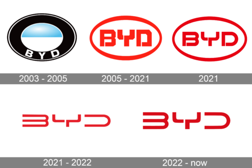 BYD’s logo history needs to distinguish between BYD Company, the wider corporate group founded in 1995, and BYD Auto, the automotive operation created after the company’s 2003 entry into vehicle manufacturing.The two have not always used exactly the same identity. This became particularly clear in 2021, when BYD Auto introduced a new passenger-car logo while the wider BYD Group retained its existing red oval mark. [4]
2003 to 2007: Early BYD Auto Logo
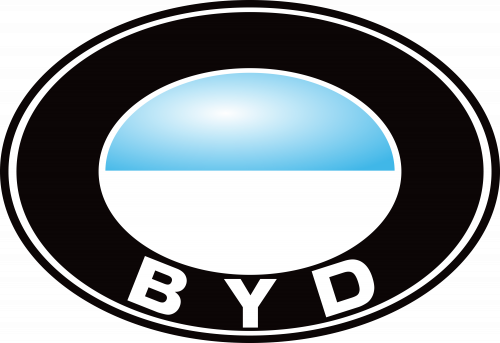 This blue-and-white badge is associated with BYD Auto’s early years rather than with BYD Company’s original foundation in 1995. BYD entered the automobile industry on January 22, 2003, when it acquired Xi’an Qinchuan Automobile, the company that became BYD Auto. [1]The early automotive badge used a dark oval surrounding a smaller blue-and-white central form together with BYD lettering. Secondary automotive histories report that BYD described the blue and white as representing the sky and clouds, although this explanation is not as well documented in BYD’s current official identity material. The colors should therefore not be expanded into generic claims about loyalty or professionalism.The badge also attracted comparisons with BMW’s roundel because of its circular blue-and-white construction. BYD subsequently abandoned this design.
Red Oval BYD Identity
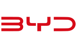
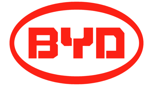 BYD later adopted the red oval identity that became strongly associated with both the company and its vehicles. The badge consists of the BYD initials enclosed within a red oval frame.The lettering uses custom geometric forms, with breaks incorporated into the B, Y and D. No authoritative BYD source located for this article identifies a commercial typeface for the mark, so similar-looking fonts should not be presented as its actual typography.Older logo descriptions often assign meanings such as passion, power or energy to the red color. BYD’s later official material does describe its corporate red as passionate, but broader color-psychology claims should not be added beyond what the company itself states. [2]
2021: BYD Auto Removes the Oval
 On January 1, 2021, BYD Auto officially introduced a new visual identity specifically for its passenger-car business. The most obvious change was the removal of the oval border, leaving a more open BYD wordmark. [4]Unlike speculative interpretations of older logos, BYD provided a detailed explanation for this design. The company said the oval boundary was removed to create a more open identity, while the enclosed spaces within the three letters were opened so that their line endings resembled connection points.BYD explicitly connected those open forms with its intention to interact more openly with users and partners and explore new products and services in the intelligent-vehicle era. The left-to-right construction was also described as communicating forward movement and supporting BYD Auto’s “moving forward” brand spirit. [4]This 2021 logo initially applied specifically to BYD’s domestic passenger-car business. Other BYD operations continued using the existing corporate identity.
2021 to 2022: Open BYD Auto Wordmark
 The borderless BYD Auto identity emphasized the custom construction of the three initials. The breaks in the letterforms became more prominent because there was no surrounding oval competing with the wordmark.The exact succession of graphic variants during 2021 should not be overcomplicated into several separate corporate rebrands without primary documentation. BYD’s own announcement supports a major redesign on January 1, 2021, followed by another documented group-wide update in February 2022. [4]
2022 to Today: BYD Group and BYD Auto Update
 On February 17, 2022, BYD Group and BYD Auto announced another coordinated identity update. BYD Group retained its red color and rounded frame but revised the details of both the lettering and outer shape. BYD Auto simultaneously refined its own borderless mark. [2]BYD’s explanation is unusually specific. The company said the group logo replaced sharper letter shapes with more rounded forms and described the geometry as having a mathematical aesthetic. BYD also connected the revised design with affinity, openness and its human-oriented corporate philosophy. [2]These documented statements provide a much stronger basis for discussing the modern BYD identity than generic claims that thicker lettering automatically means strength or that red automatically represents performance.
BYD Company vs BYD Auto
One reason BYD logo histories can become confusing is that BYD is much more than an automobile marque.BYD Company was founded in Shenzhen as a rechargeable-battery manufacturer. Its official history records the company’s foundation in the mid-1990s, expansion into lithium-ion batteries and electronics, and its acquisition of Xi’an Qinchuan Automobile in January 2003. [1]BYD subsequently expanded into four major business areas: automobiles, electronics, new energy and rail transit. This wider corporate structure explains why BYD Group and BYD Auto could use related but separate identities during the 2021 transition.When Did BYD Become a Car Manufacturer?
BYD entered automobile manufacturing in 2003. It did not begin as an automotive company.BYD officially records January 22, 2003 as the date it acquired Xi’an Qinchuan Automobile Co., which became today’s BYD Auto. BYD’s own milestones describe this acquisition as its entry into the automotive industry. [1]The BYD F3 followed in September 2005 and became one of the company’s first major automotive successes.BYD’s Transition to Plug-In Vehicles
BYD’s automotive identity has increasingly become associated with electrification, but its early passenger vehicles were not exclusively electric.In April 2022, BYD stopped manufacturing vehicles powered solely by internal-combustion engines and shifted its passenger-car focus to battery-electric vehicles and plug-in hybrids. BYD continues to describe both categories as new-energy vehicles. [5]This distinction matters because describing BYD simply as an “electric vehicle manufacturer” can hide the importance of its plug-in hybrid business.Typography
The BYD identity uses custom geometric lettering built specifically around the three initials. Breaks within the letterforms have remained an important feature through several redesigns.No authoritative source located for this article identifies a commercial font used for the BYD logo. It should therefore be described as custom brand lettering rather than matched with visually similar typefaces.Color
Red has become the principal color associated with BYD’s corporate identity. In its 2022 redesign announcement, BYD explicitly stated that the group retained its characteristic passionate red while revising the frame and lettering. [2]That documented description should not be expanded into an invented system in which red necessarily means power, speed or automotive performance. Physical vehicle badges may also appear in metallic or monochrome finishes depending on the model and application.FAQ
What does BYD stand for?
BYD is now associated with the slogan “Build Your Dreams,” but founder Wang Chuanfu has said the original company name did not have that meaning. “Build Your Dreams” was adopted later as an English brand interpretation.
When was BYD founded?
BYD began in Shenzhen in the mid-1990s as a rechargeable-battery company. BYD’s widely published international history gives February 1995, while the company’s current Chinese corporate page records November 18, 1994 as its establishment date. The automotive business began later, in 2003.
When did BYD start making cars?
BYD entered the automobile industry in January 2003 by acquiring Xi’an Qinchuan Automobile, which became BYD Auto.
Why did BYD change its logo in 2021?
BYD Auto said the 2021 redesign removed the oval boundary and opened the internal spaces of the letters to express greater openness and connection with customers and partners. The left-to-right design was also intended to suggest forward movement.
Did BYD change its logo again in 2022?
Yes. On February 17, 2022, BYD Group and BYD Auto unveiled updated identities. The group retained its red oval format but introduced rounder lettering and revised geometry, while BYD Auto also refined its borderless wordmark.
Disclaimer
This article is part of the educational resources provided by Logo Index, an independent archive covering logos, visual identities and graphic design history. BYD, BYD Auto and associated trademarks and brand assets remain the property of their respective rights holders where applicable.