 Bajaj Logo PNG
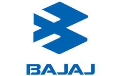
Bajaj Auto Limited is an Indian manufacturer of two-wheelers and three-wheelers, headquartered in Pune and part of the wider Bajaj Group. The corporate logo it uses today, an open blue “flying B” beside an all-capital wordmark, was introduced in 2004 and replaced a hexagonal emblem that had served the business for roughly three decades before that.
Meaning and history

Bajaj Auto was incorporated on 29 November 1945 as Bachraj Trading Corporation Private Limited, began selling imported two- and three-wheelers in 1948 and moved into licensed manufacturing in the late 1950s. The Chetak scooter arrived in 1972, which is why the early 1970s are sometimes mixed up with the company’s founding. That year is a product milestone, not a corporate one.
What the early 1970s do mark is the arrival of the previous corporate logo. Coverage of the 2004 rebrand described the new identity as Bajaj Auto’s first new corporate logo in 30 years [5], which places the outgoing mark in the early 1970s rather than at the founding. A precise first-use year for that earlier logo is not well documented, so it is best described simply as the pre-2004 mark.
The legacy logo (pre-2004)
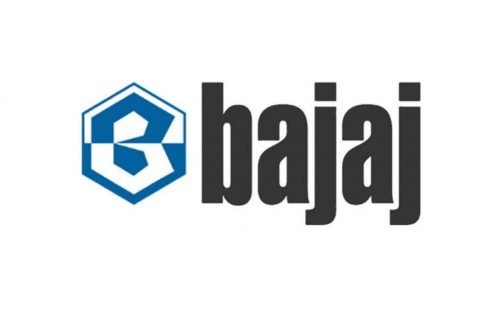
The old lockup was a two-part design: a hexagonal emblem on the left and a lowercase nameplate beside it. Inside the hexagon, a geometric B folded into the frame, with the shape divided horizontally so that the blue half carried a white portion of the letter and the white half carried a blue portion. The wordmark was set in a dark, almost black, bold and narrow lowercase style. Bajaj Auto’s own 2004 release described the outgoing identity as “the white and blue reverse hexagonal symbol with Bajaj Auto in small lettering, which stood in good stead for Bajaj Auto for many decades” [1].
The mark was compact and industrial, and its symmetry made it easy to reproduce at small sizes on scooter badges, fuel tanks and dealer signage. It stayed in service until 2004, when Bajaj Auto replaced it as part of a broader corporate rebrand.
The 2004 redesign
Bajaj Auto unveiled the new identity on 15 January 2004 at the Auto Expo in New Delhi. The work was created by Elephant Design, the Pune-based studio, and Elephant Design co-director Sudhir Sharma said the logo took about two years to design and to set the process for implementation [3].
The hexagon frame was removed and an open, abstract form of a stylized B took its place, which the company named the flying B. The launch release said the symbol represents style and technology, and that its external form retains a hint of the hexagon, a visible link back to the emblem it replaced. The wordmark moved to all capitals in a bold, angular sans-serif, and the brandline “Inspiring Confidence” was added below it in a script face.
Bajaj Auto also set out what each element was meant to carry. The flying B form denotes speed, the open shape denotes transparency, the capital wordmark stands for precision engineering and perfection, and the script brandline was tied to learning values and to the brand moving closer to the customer. The brand essence was defined as “Excitement”, supported by five values: Learning, Innovation, Perfection, Speed and Transparency [1].
Elephant Design later produced a corporate sculpture for Bajaj Auto, described in trade press as depicting the new flying B identity with five pillars standing for those five values [3].
Because the symbol is drawn from two angular strokes that cross, it reads to many viewers as a bird in flight or as a pair of arrows. That is a matter of resemblance rather than documented meaning. The only name Bajaj Auto has given the mark is the flying B, and the older reading of a bird or arrows was never part of the official description.
Font and color
The current logotype is set in a bold, angular, custom-looking sans-serif in all capitals, with tight spacing and diagonal cuts on the horizontal strokes. No font identification has been published for the wordmark, so any specific typeface named as a match should be treated as an approximation rather than a documented fact.
Color is better documented than type. The 2004 release introduced what the company called a “fresh new Blue” [1], and the same announcement attributes stability and strength, high technology and precision engineering to that blue. No official Pantone, CMYK or RGB values appear in the contemporary announcements. The earlier branding paired the blue and white emblem with a dark, nearly black lowercase nameplate, so the all-blue logotype was a change in palette rather than a continuation of one.
The identity since 2004
The corporate logo has not been replaced since 2004. The 2019 line “The World’s Favorite Indian” was a brand platform and messaging shift rather than a new logo, and the flying B remains the anchor of the company’s visual identity across vehicles, dealerships and corporate material.
The Bajaj name is shared across separate listed businesses, including Bajaj Finserv, Bajaj Finance and Bajaj Electricals, each of which uses its own mark rather than the Bajaj Auto symbol. The identity described here belongs to Bajaj Auto Limited specifically.
FAQ
When did Bajaj Auto change its logo?
Bajaj Auto unveiled its current corporate identity on 15 January 2004 at the Auto Expo in New Delhi. Trade coverage at the time described it as the company’s first new corporate logo in about 30 years, which makes it the only material corporate redesign in the brand’s modern history.
What does the flying B in the Bajaj logo mean?
The flying B is the company’s own name for the open, abstract form of a stylized letter B at the centre of the mark. Bajaj Auto’s 2004 launch material said the symbol represents style and technology, that its form denotes speed, and that its open shape denotes transparency. The outer outline also keeps a hint of the hexagon used in the previous logo.
Who designed the Bajaj logo?
The 2004 identity was created by Elephant Design, the Pune-based studio. Elephant Design co-director Sudhir Sharma said the logo took about two years to design and to set the process for implementation, and the studio later produced a corporate sculpture built around the same flying B identity.
Why do people say the Bajaj logo looks like a bird?
The symbol is built from two angular strokes that cross, and that arrangement reads to many viewers as a bird in flight, or as a pair of arrows. It is an informal resemblance rather than an official meaning: the name Bajaj Auto uses for the mark is the flying B.
Is the Bajaj logo blue and white?
The older emblem paired a blue and white hexagon with a dark, nearly black lowercase wordmark. The 2004 identity was introduced with what the company called a fresh new Blue and an all-capital wordmark. Blue remains the primary colour, associated in the launch release with stability and strength, high technology and precision engineering.
Disclaimer
This article is part of the educational resources provided by Logo Index, an independent archive covering logos, visual identities and graphic design history. Bajaj and associated trademarks and brand assets remain the property of their respective rights holders where applicable.