 Berkeley Logo PNG
Berkeley Cars Ltd of Biggleswade, Bedfordshire built small, light sporting cars for just four years, yet its badge remains one of the more recognisable emblems of the British microcar era. The marque was the car-making arm of Berkeley Coachworks, the caravan and glass-reinforced plastic manufacturer owned by Charles Panter, and the cars were developed with the designer Lawrence “Lawrie” Bond. The first model, the Sports SA322, was announced in September 1956 and shown at that year’s London Motor Show, which makes 1956 the launch date of the car marque rather than the founding of the parent company. Berkeley’s four-year run produced roughly 4,100 cars before the company entered liquidation on 12 December 1960, with the remaining assets liquidated in 1961.
The cars themselves were small, economical and quick for their size, combining motorcycle-derived engines of 322 cc to 692 cc with front-wheel drive and glass fibre bodywork. That packaging, and the rounded nose it produced, is part of why the badge sits where it does and why it is so closely tied to the marque’s image.
The Berkeley badge and what it shows
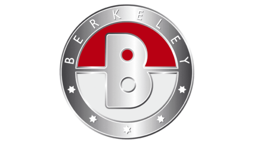
Almost all of Berkeley’s visual identity sits in one object: a small circular badge fitted to the nose or bonnet area of surviving period cars. It is a name-led design, built around the marque’s wordmark, with a handful of simple geometric elements carrying the rest of the composition.
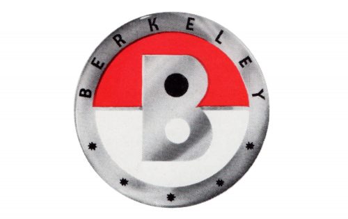
Read closely, the emblem resolves into four clearly separated parts. The outer ring carries the word BERKELEY in spaced capitals arched across its upper half. The lower half of the ring holds five five-pointed stars. Inside the ring, a large capital B sits over a circular field divided horizontally into two halves. In the colour version, that field reads as red and grey or silver, while the lettering and the surrounding ring are white or silver. The B is drawn with two closed loops rather than an open, stroke-based form, which gives the centre of the badge a compact, almost symmetrical weight.
The badge is also densely detailed for its size. Lettering, stars and a monogram all have to stay legible at the scale of an emblem mounted on a low, rounded nose, which is typical of period car badges and gives the design its slightly crowded, jewelled look.
One period badge, 1956 to 1960
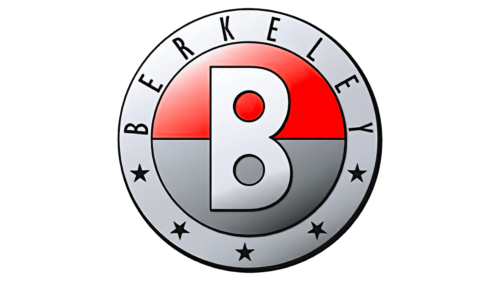
Berkeley’s short production life means its identity did not accumulate the layers of revision that longer-lived manufacturers did. The company is associated with a single period badge, and no redesign date for the marque is documented. Differences between surviving badges are largely a matter of casting, finish, reproduction and wear rather than a change of design.
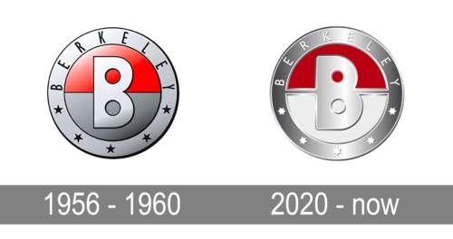
For the same reason, the emblem belongs to the whole production span rather than to any particular model year. Berkeley’s model lines, which included the SA322, the SE328 and SE492, the Foursome, the B95 and B105 and the later T60 and B65, all wear essentially the same circular badge, and the marque did not develop the family of sub-marks that larger makers used to separate trim levels or body styles.
Lettering and colour
The Berkeley wordmark is set in spaced capital letters in a condensed sans-serif style. Badge lettering of this era was cut and cast rather than typeset, so identifying a specific digital font is an approximation at best. Comparisons with modern narrow grotesques describe the flavour of the lettering reasonably well, but the original is period commercial lettering rather than a licensed typeface applied to a screen.
The palette is deliberately limited. In colour, the badge uses white or silver lettering on a ring, with a red and grey divided field behind the central B. The contrast between the two halves of the inner circle does most of the visual work, and the ring and stars stay relatively quiet around it.
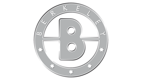
Monochrome badges of this kind are common in print, signage and reproduced artwork, where a single-colour treatment is easier to reproduce. This version reverses the emphasis: white inner circle, wordmark and stars against a black frame, B and dividing line. It is best understood as a monochrome variant of the same emblem rather than a separate corporate standard, and no formally specified black and white version is documented for the marque.
Reading the symbols
The individual elements of the badge are easy to describe and much harder to interpret. Ideas that assign a sales message to the stars, or a psychological value to each colour, circulate widely online through logo directory sites, and they are not supported by company or archive material.
A second common claim concerns the typeface, usually an assertion that the badge was set in a specific modern font. The original was a physical metal and enamel badge, and its letterforms reflect the engraving and casting conventions of the 1950s. Suggesting a close modern equivalent is a fair way to describe the style, as long as it is not presented as the typeface Berkeley actually used.
What can be said with confidence is that the design centres on the name. The wordmark identifies the car; the stars and the two-tone field give the circular badge its structure and its period character. That is a complete description of the mark, even without a documented symbolic programme behind it.
Where the badge appears
On surviving period cars the badge sits on the nose or bonnet area, which is where it features in most photographs of the marque. Original cars and restorations differ slightly in finish and mounting, so any individual vehicle is best judged from photographs of that car rather than from a general rule.
Later use of the name
Car production ended with the liquidation of Berkeley Cars, but the Berkeley name has reappeared since. A separate modern venture trading as Berkeley Sportscars has been connected with the marque, and it uses its own badge. Because it is a different company with its own history, that mark has its own date and status, and it should not be read as a continuation of the 1956 to 1960 emblem.
The name in other contexts
Berkeley is also shared with unrelated organisations, such as the property and construction group Berkeley Group, the Berkeley campus of the University of California, and its California Golden Bears athletics teams. Their identities have nothing to do with the Bedfordshire car manufacturer; the only thing they share is the name.
FAQ
When was the Berkeley car badge introduced?
The badge belongs to the 1956 to 1960 production period. Berkeley’s first model, the Sports SA322, was announced in September 1956, and the same circular emblem is associated with the marque across its four years of production.
Did the Berkeley logo change during the marque’s life?
No redesign is documented. Surviving cars carry one basic circular badge, and the differences between individual examples reflect casting, finish, reproduction and wear rather than a new design.
What do the five stars on the Berkeley badge mean?
There is no reliable explanation for the stars or for the red and grey halves of the central field.
Is the modern Berkeley Sportscars badge the same as the original?
No. The modern revival is a separate undertaking with its own mark, and its badge should not be confused with the emblem used on cars built between 1956 and 1960.
Where was the badge fitted on a Berkeley car?
On surviving period cars it appears on the nose or bonnet area, which is where it is most often seen in photographs of the marque.
Disclaimer
This article is part of the educational resources provided by Logo Index, an independent archive covering logos, visual identities and graphic design history. Berkeley and associated trademarks and brand assets remain the property of their respective rights holders where applicable.