Honda does not use a single logo. It maintains three related but separate identities: the stylised “H” carried by its cars, the winged mark worn by its motorcycles, and a red, all-caps HONDA logotype used across the rest of the business. Because the marks share a parent company and a colour, popular histories tend to flatten them into one timeline, which is how the brand acquired a reputation for a logo that never changed.
 Honda Logo PNG
The company behind those marks is normally dated from the Honda Technical Research Institute, founded by Soichiro Honda in 1946, with the Honda Motor Company formally incorporated on 24 September 1948 alongside the financier Takeo Fujisawa. Honda’s own corporate record notes that the business built its reputation on motorcycles long before it built cars and only entered automobile production in 1963 with the T360 mini-truck and the S500 roadster. The Civic, often treated as the company’s automotive starting point, did not arrive until 1972.
Meaning and history
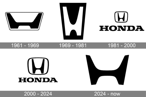
A composite history of this kind shows the split clearly: a run of car emblems on one line and a run of winged motorcycle marks on the other. The two lineages developed in parallel and were never interchangeable.
The automotive “H”
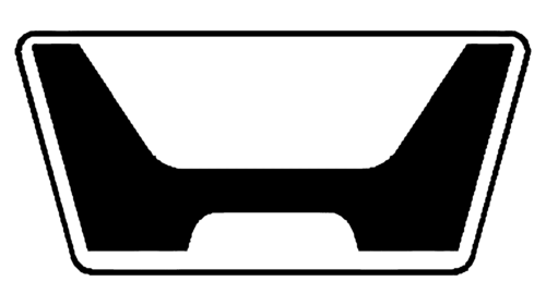
The first automotive badge is generally dated to 1961 and was carried through Honda’s earliest cars, among them the T360 and S500. It paired a stylised H with an uppercase serif HONDA wordmark on a rectangular plate, an approach visible in early badge photographs in Hemmings’ Honda archive.
A 1969 revision stripped the wordmark away and let the emblem stand alone, narrowing the letterform and simplifying the palette to black and white.

The 1981 redesign is the version that matters most to Honda’s car identity. Hagerty’s study of Honda’s car emblems treats this soft-cornered H, paired with a serif wordmark, as the basis of every Honda since. The letterform sits inside a rounded trapezoid, the contours were cleaned up, and the monochrome palette was fixed.

The 2000 update added volume. The strokes of the H were elongated until they touched the surrounding frame, the mark took on an embossed, chrome-like finish, and the wordmark shifted to red. This is the three-dimensional H most drivers would recognise on a grille today.

The 2026 emblem
A new H appeared on Honda’s 0 Series concepts at CES 2024, with prototypes following at CES 2025, and Honda formally announced it as the automotive emblem in January 2026. It reverses several established rules at once: the H is flat rather than dimensional, wider than before, and no longer enclosed by a frame.
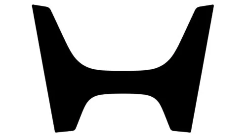
This is the one Honda mark with an officially stated meaning. Honda describes the open, borderless H as resembling two outstretched hands, and frames the change as a “second founding” linked to expanding mobility, as reported by Autoplus. Autocar India notes that the emblem rolls out on next-generation EVs and hybrids from 2027 and extends to dealerships, communications and motorsport, making it a company-wide automotive change rather than an electric-vehicle detail. The mark shown here is materially different from the enclosed chrome H above: the wide, borderless form belongs to the newer design.
The motorcycle wing
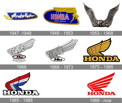
Honda’s motorcycle identity runs on a separate track, and Honda documents much of it directly. The first winged mark appeared on the Model A auxiliary bicycle engine in the late 1940s, and by 1948 Honda was using a flying figure, described on Honda’s own wing-mark history page as drawing on the Nike of Samothrace and the eagle. The artwork from that period is undated, so it is best read as an approximate representation of the 1947 to 1948 stage.
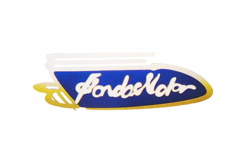
By 1948 the badge had been rebuilt with upright lettering and a figure in motion set against a wide gold wing.
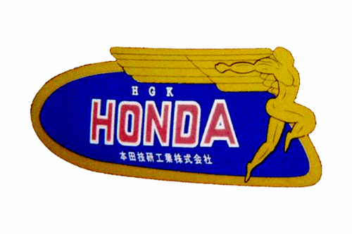
From 1953 the wings multiplied. A badge pairing two metallic wings, with no lettering at all, served Honda motorcycles for roughly fifteen years.
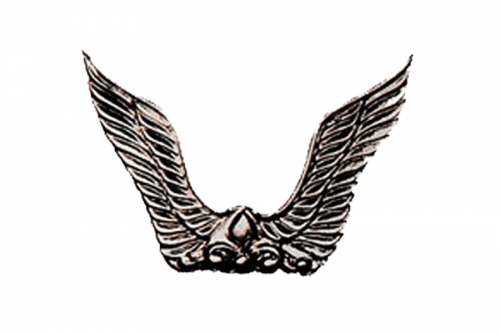
In 1968 Honda introduced an oval badge with an “HM” monogram, an arched HONDA inscription and a wing springing from the left. A simplified variant followed, dropping the outlined frame and the arched wordmark so that the monogram carried the badge alone.
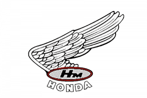
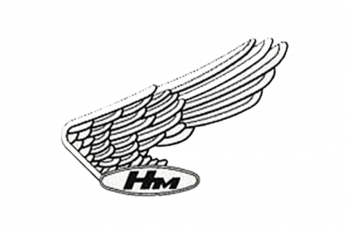
Those two 1968 marks differ materially from one another despite their shared year, which is why surviving artwork of that period is a cautious guide to the exact sequence rather than a precise record.
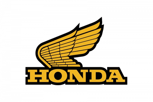
The 1973 revision dropped the oval entirely and set a bolder wing against a strong HONDA wordmark.
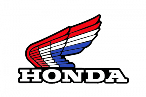
A 1985 refresh softened the outlines and widened the palette to include red and blue alongside black and white.
The current red wing was drawn in 1988, proposed by an employee for Honda’s fortieth anniversary, with rounded thick-line wings and a clean wordmark. It was refreshed again in 2001.
Honda confirmed in November 2025 that the wing continues on combustion-engine motorcycles while electric models receive a separate “Honda” lettering product mark, according to the company’s announcement. A monochrome “Honda Flagship WING” is being introduced on flagship combustion models from 2026, so the motorcycle side of the business now carries more than one badge.
The wordmark, colour and type
Beyond the car H and the motorcycle wing sits a plain red, all-caps HONDA logotype. It appears on power equipment, marine engines, aircraft and corporate material, and works as the company’s general-purpose signature. The wordmark is a proprietary custom logotype, and no authoritative source names the typeface behind it. The frequently repeated comparison with Clarendon Bold or the Colt family traces to logo-directory listings rather than to Honda, so it is not a confirmed font identification.
Red has been a consistent accent across both the car emblem and the motorcycle wing, but the marks have also used black, white, gold and blue at different points in their history.
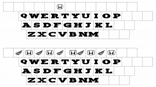
The H itself is austere, with no decorative detail, and the lettering specimen above is illustrative rather than an official font reference.
One clarification that circulates widely: the 1960s Honda H is sometimes described as a forerunner of the Acura emblem. Acura, which launched in 1986, uses its own badge.
FAQ
Why does Honda have more than one logo?
Honda’s identity grew out of two separate product lines. Its motorcycles adopted a winged emblem in the late 1940s, while its cars adopted a stylised “H” badge from 1961 on. A third element, the red all-caps HONDA wordmark, covers power equipment, marine engines, aircraft and corporate use. The three marks share a company and often a colour, but they are managed separately.
What does the new Honda H logo mean?
The open, borderless H that Honda announced as its automotive emblem in January 2026 is described by the company as resembling two outstretched hands, representing an expansion of mobility possibilities. Honda has framed the change as a “second founding,” and the mark begins rolling out on next-generation EVs and hybrids from 2027.
When did Honda last change its car logo?
The enclosed chrome H served Honda cars from around 2000 to the mid-2020s. A new flat, frame-free H appeared on the 0 Series concepts at CES 2024 and was formally announced as the automotive emblem in January 2026, with rollout on production vehicles beginning in 2027.
Disclaimer
This article is part of the educational resources provided by Logo Index, an independent archive covering logos, visual identities and graphic design history. Honda and associated trademarks and brand assets remain the property of their respective rights holders where applicable.