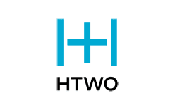
HTWO is the hydrogen brand of Hyundai Motor Group, introduced on 10 December 2020 in Seoul as a dedicated fuel cell system brand. Its visual identity is deliberately spare: a blue symbol formed from two connected H shapes set above the wordmark HTWO, written in black capitals on a white ground. Nothing in the mark gestures at a vehicle, a molecule diagram or a technology schematic, which is unusual for an industrial energy brand and is the most distinctive thing about it.
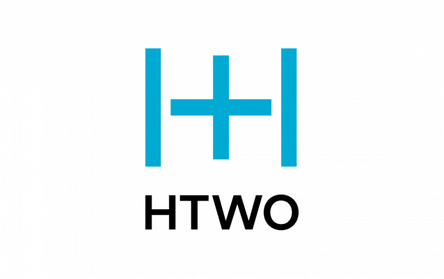 HTWO Logo PNG
The name behind the mark
HTWO is a stylisation of H2, the chemical formula for hydrogen, and it doubles as an acronym for the two ideas Hyundai says the business is built on: Hydrogen and Humanity. The company summarises the name and the badge together as “Hydrogen for Humanity,” a phrase that appears in Hyundai’s launch announcement and in its later brand material.
Worth stating plainly, because it is often blurred in secondary coverage: HTWO is a brand, not a manufacturer or a stand-alone company. The fuel cell engineering underneath it belongs to Hyundai Motor Group and predates the name by more than two decades, with Hyundai’s hydrogen fuel cell research programme beginning in 1998.
Two connected H’s
The graphic element is a monogram rather than a picture. Two H letterforms are joined into a single continuous blue shape, so the pair reads as one unit at small sizes and as two strokes of a single letterform at large ones. Hyundai’s own description is that the logo features two connected H’s, and that the pairing stands for the two pillars of the hydrogen value-chain business. That is the only reading the company publishes.
Some secondary write-ups describe the joint between the two letters as a plus sign. The plus motif does appear in Hyundai’s hydrogen design language, but in connection with the INITIUM concept rather than as an official explanation of the HTWO emblem, and it is not part of the manufacturer’s stated meaning for the brand mark. Treat the two-connected-H description as the documented one.
Colour and typography
Two colours carry the whole identity. The symbol is blue, a bright shade sitting between sky blue and a lighter turquoise depending on reproduction, and the wordmark is black. There is no frame, no gradient and no secondary accent colour in the emblem itself. The blue is widely read as a hydrogen cue, since the gas burns without carbon and the industry leans on cool tones, but Hyundai does not publish a colour rationale for the brand, so the association is a convention rather than a stated intent.
The wordmark is set in a plain, capitalised sans serif with even strokes and open counters. It is a neutral grotesque rather than a bespoke display face, and the letters carry no custom joins or terminal details. Because the typeface is not documented by Hyundai, the exact family behind the wordmark cannot be confirmed. What can be said is that the lettering is deliberately unremarkable: it defers to the symbol above it and keeps the mark legible on a tank, a shipping container, a generator housing or a business card without modification.
Reproductions of the emblem vary in size and crop but keep one fixed relationship: symbol centred above wordmark, both on white. The stacking is what makes the mark work at the scale of a vehicle livery and at the scale of a favicon, since the blue monogram survives alone as an app-style square when the wordmark is dropped.
What the badge was built to represent
The HTWO name arrived long after the technology it labels. Hyundai began fuel cell research in 1998 and showed early prototypes, including a Santa Fe FCEV around 2000 and a Tucson FCEV prototype in the mid-2000s; Hyundai’s own material dates that second prototype to 2004 in one place and 2005 in another, so the year is best left approximate. The ix35 Fuel Cell followed in 2013, presented as the first mass-produced fuel cell electric vehicle, with production starting at Ulsan in January 2013, the first complete car finished on 26 February 2013, and the first fifteen cars handed over in Copenhagen on 3 June 2013. Hyundai’s stated targets at the time were 1,000 units by 2015 and 10,000 beyond that. The NEXO SUV, using a later generation of the system, debuted at CES in 2018, though at least one Hyundai page lists 2019 for its introduction.
None of those vehicles carried an HTWO badge. The brand was created to give the fuel cell business a name of its own once Hyundai began supplying complete systems to other applications, from trucks to stationary power. That is why the emblem is abstract rather than automotive: it needed to sit credibly on a bus, a forklift or a power module as easily as on a car.
One emblem, a widening brand
The HTWO symbol has not been replaced since 2020. In January 2024, at CES, Hyundai announced that HTWO would expand from a fuel cell system brand into the group’s hydrogen value-chain business brand, alongside a grid-scale offering called HTWO Grid, as set out in Hyundai’s CES 2024 announcement. The expansion changed what the brand covers, not what it looks like; no new emblem accompanied it. The identity remained in active use afterwards, including a HTWO appearance at the H2&FC EXPO in Japan in March 2026.
Hyundai has not documented who designed the mark or when a formal brand guideline was issued, so those details remain open. What is clear from the evidence is a single consistent emblem rather than a series of redesigns, which is unusual for a brand that has changed scope as much as this one has.
FAQ
What does the HTWO logo mean?
The blue symbol is made of two connected H’s, representing the two pillars Hyundai associates with the brand, Hydrogen and Humanity. The company sums this up as “Hydrogen for Humanity.”
Is HTWO a company or a brand?
HTWO is a brand owned by Hyundai Motor Group, launched on 10 December 2020 for the group’s fuel cell system business and widened at CES in January 2024 to cover its hydrogen value-chain activities. It is not a separate manufacturer.
Has the HTWO logo been redesigned?
There is no documented redesign. The same blue monogram and black wordmark introduced in 2020 were carried over when the brand’s scope was expanded in January 2024.
Disclaimer
This article is part of the educational resources provided by Logo Index, an independent archive covering logos, visual identities and graphic design history. HTWO and associated trademarks and brand assets remain the property of their respective rights holders where applicable.