 Toyota Logo PNG
Toyota’s familiar three-oval emblem was introduced in 1989 and has remained the core of the company’s visual identity ever since. Unlike many automotive logos, its symbolism is documented in detail by Toyota itself: the overlapping ovals represent the relationship between the customer and the company, while the outer oval represents the world embracing Toyota. [1]
Toyota Logo Meaning and History
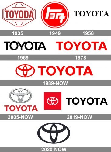
Toyota’s visual history began before Toyota Motor Co. was formally established in 1937. The automotive business grew from the Toyoda family’s industrial enterprises, with Kiichiro Toyoda leading the move into automobile development. Toyota records the establishment of Toyota Motor Co., Ltd. in 1937. [2]
The most important change to the identity came even earlier, in 1936, when the company held a public competition for a new logo and changed the brand name from Toyoda to Toyota. [1]
From Toyoda to Toyota

The company’s name comes from the Toyoda family name. Toyota says the change to Toyota was influenced by several factors: the pronunciation was considered clearer in Japanese, the katakana spelling トヨタ uses eight strokes, a number associated with good fortune, and the new name also marked the transition from a family enterprise toward a larger corporate organization. [1]
Early Toyoda vehicle emblems differed significantly from today’s identity. Toyota’s historical archive notes that the first passenger-car emblem used wings to convey speed together with kanji characters for Toyoda. [1]
Early Toyota Wordmarks

Before the three-oval emblem existed, Toyota relied on different wordmarks and Japanese-script identifiers. These designs varied by market and application, so they should not be treated as a perfectly linear series of global corporate logos.

As Toyota expanded internationally, Latin-alphabet TOYOTA wordmarks became increasingly important. These marks evolved from serif lettering toward simpler sans-serif forms better suited to global use.


The typography continued to be refined through the 1960s and 1970s, but no reliable Toyota source located for this article identifies commercial fonts such as Hypersans or Sole Sans as the actual Toyota typefaces. Those comparisons should therefore not be treated as factual font identifications.
The 1989 Three-Oval Logo

Toyota announced its new brand mark on October 2, 1989. Development had taken about five years, with the goal of creating a symbol that would be recognizable from a distance and strong enough to distinguish Toyota internationally. [3]
The emblem made its vehicle debut on the Toyota Celsior in October 1989 and was then rolled out across Toyota models worldwide. [1]
What Do the Three Toyota Ovals Mean?
Toyota gives the emblem a specific official interpretation.
- The two inner ovals represent the heart of the customer and the heart of the company.
- Their overlap represents a mutually beneficial relationship and trust.
- The two inner shapes also form a stylized T for Toyota and resemble a steering wheel.
- The outer oval represents the world embracing Toyota.
- The surrounding space represents values Toyota wants to offer customers, including quality, innovation, driving enjoyment and responsibility.
Toyota also notes that the different line thicknesses of the ovals were influenced by Japanese brush art. [1]
Popular Toyota Logo Theories
Several interpretations circulate online, including claims that the emblem depicts a thread passing through a needle or that every letter in TOYOTA can be found hidden inside the geometry.
These may be visually interesting observations, but Toyota’s own official explanation does not identify either of them as part of the intended meaning. They should therefore be treated as popular interpretations rather than established logo history.
2000s Three-Dimensional Versions
During the 2000s, Toyota frequently rendered the oval emblem with metallic gradients and three-dimensional effects that echoed the physical chrome badges fitted to vehicles.
These treatments changed the appearance of the identity without altering the underlying three-oval construction introduced in 1989.
Flat and Digital Toyota Branding


More recent Toyota visual systems use flatter, simplified versions of the emblem for digital and corporate applications. These should be understood as modern renderings of the existing 1989 symbol rather than an entirely new Toyota logo.
The three-oval emblem itself remains Toyota’s principal brand mark more than three decades after its introduction. Toyota’s current brand history still identifies the 1989 design as the emblem used today. [1]
Toyota Typography
Toyota has used several wordmark treatments across its history, from early Japanese-script identities to serif and later sans-serif Latin lettering.
The modern brand relies heavily on the oval emblem itself, so the wordmark often serves as a supporting element rather than the primary identifier. No authoritative Toyota source located for this article identifies the current wordmark as one of the commercial fonts often suggested by logo-font websites.
Toyota Logo Colors
Toyota has used red, white, black and metallic treatments depending on medium, market and vehicle application. The physical emblem on cars is often metallic, while corporate and digital versions may appear in flat red, black or white.
Generic statements such as red representing passion or black representing sophistication should not be presented as official Toyota symbolism unless supported by a specific brand guideline.