IM Motors (智己汽车) is the premium electric-vehicle marque of SAIC Motor, established as a joint venture with Alibaba Group and Zhangjiang Hi-Tech. The operating company, IM Motors Technology Co., Ltd., was registered on 25 December 2020 with initial registered capital of 10 billion RMB, and the brand and its emblem were unveiled together on 13 January 2021 in a single event staged in Shanghai, at CES in Las Vegas and in London, according to the company’s brand-launch announcement. That sequencing matters when reading the logo’s history: the corporate entity dates to late 2020, while the mark itself begins in January 2021.
 IM Motors Logo PNG
SAIC is the controlling shareholder rather than one partner among equals. A China Daily report from March 2022 put the split at roughly 54 percent SAIC, 18 percent Alibaba and 18 percent Zhangjiang Hi-Tech, while at inception a SAIC-controlled fund held a substantially larger share. The precise distribution has shifted over time, but the venture framing is consistent.
What the name and the emblem stand for
“IM” abbreviates Intelligence in Motion. The Chinese name 智己 is drawn from the Classic of Changes (《周易·系辞上》), and the brand slogan is “IM What I am / 我自 由我”. Both the wordmark rationale and the logo rationale come from the company’s own launch text rather than from outside interpretation.
That text describes the emblem as a letterform variation on “IM” (IM的字母变形) assembled from two dots and two diagonal strokes (两个原点、两条斜线), encoding the “0 to 1” language of digital code. The stated intention is a mark that signals intelligent technology while keeping a warmer, more human register. Some design coverage has read the monogram as a visual pun on the contraction “I’m”; that reading is commentary and has not been confirmed by the company.
The stand built from the logo
The identity was not confined to a badge. At its first auto-show stand in April 2021, the brand built the architecture from the same vocabulary of circles, points and lines used for 0 and 1, as the company’s own account of the event describes. The two-dot, two-bar structure functions as a design system, not just a signature at the front of a car.
The original emblem, 2021 to 2025
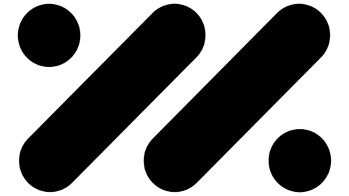
The launch mark places two solid discs and two thick diagonal bars on a centred axis, balanced at roughly 45 degrees. It is symmetrical yet offset: one dot sits upper left, the other lower right, so the mark reads as a pair of strokes in motion rather than a static glyph. The artwork often labelled as the “2020” logo is the launch emblem itself; the filename date is approximate, since the mark first appeared in January 2021.
The 2025 refresh
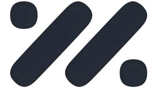
The monogram above carries noticeably squarer dots than the launch version. The file itself has no date attached, so its era rests on the composition rather than on the filename, but the change it illustrates matches the refinements the company described in 2025.
The adjustment surfaced quietly in official channel material in early April 2025 and was reported by CNMO before being explained publicly. On 9 April 2025, design chief Xu Dengtao, executive director of the IM Motors Creative Design Center, set out the changes in a statement carried by IT之家 and corroborated by DoNews.
Three measurable moves define the revision. The double diagonal was tilted up by 1.6 degrees to 46.6 degrees, a value the design team calls a “golden cut”. The gap between elements was tightened from 0.41X to 0.38X, where X is the dot diameter. And the contours were redrawn with G3 curvature continuity, giving the strokes a smoother, more sculpted transition instead of a simple radius. The visible result is the one the reporting picks out: the dots and corners read squarer, with round discs giving way to slightly rounded rectangles.
The first production car to carry the revised badge was the facelifted IM L6, which opened pre-sales on 18 April 2025, as autohome reported. This was a brand-level update covering the logo, the brand avatar and the nose badge on new models, not a market-specific variation.
Colour and credit
The brand’s main colour was retained, with only subtle tuning of saturation and brightness rather than a switch to a new hue. No Pantone or hex specification for the mark has been published in a form that can be verified independently.
The 2025 statement also refers to a collaboration with Central Saint Martins as part of the brand’s design work. As for authorship, the designer or agency behind the original 2021 emblem is not documented in reliable sources. The refinement is attributed to the in-house creative design centre led by Xu Dengtao.
Geometric monograms are a recurring choice for young electric-vehicle brands, where a simple abstract construction survives better on a grille-less nose than a figurative badge would; Bollinger Motors’ emblem is a comparable case of a mark reduced to a few bold forms.
How the identity holds together
IM Motors’ identity rests on a deliberately small inventory: two origin points, two diagonal strokes, and the 0-to-1 idea behind them. The 2025 revision did not add or remove elements. It sharpened angles, tightened spacing and smoothed curvature, which is a restrained way to signal a shift in a brand that had spent its first years establishing the mark in the first place. For a marque whose name means Intelligence in Motion, the quietest possible change was also the most consistent one.
FAQ
What does the IM Motors logo mean?
The company describes it as a letterform variation on “IM” made from two dots and two diagonal strokes, encoding the “0 to 1” language of digital code. The name stands for Intelligence in Motion, and the Chinese name 智己 comes from the Classic of Changes.
When did IM Motors change its logo?
The refreshed emblem began appearing in official materials in early April 2025 and was explained by design chief Xu Dengtao on 9 April 2025. The facelifted IM L6, pre-sold from 18 April 2025, was the first model to wear it.
What changed in the 2025 redesign?
The diagonal angle rose 1.6 degrees to 46.6 degrees, the gap between the dots and bars tightened from 0.41X to 0.38X of the dot diameter, and the contours were redrawn with G3 curvature continuity, leaving the corners visibly squarer than the original round dots.
Disclaimer
This article is part of the educational resources provided by Logo Index, an independent archive covering logos, visual identities and graphic design history. IM Motors and associated trademarks and brand assets remain the property of their respective rights holders where applicable.