Infiniti is the luxury division of Nissan Motor, created for the North American market and launched in 1989. It is not an independent carmaker, and its visual identity reflects that corporate origin: a single restrained mark, an oval enclosing two lines that converge toward a vanishing point, supported by an uppercase wordmark. The badge has been through four recorded iterations and has never drifted far from the first drawing.
 Infiniti Logo PNG
The emblem and its documented meaning
Nissan’s own account describes the Infiniti emblem as two dynamic lines converging at the vanishing point of an infinite road, with a horizon implied beyond them. Visually the shape reads as a rounded triangle notched at the bottom: the two lines meet at a point while a gap opens at the base of the oval, so the figure is never fully closed. The wordmark is set in uppercase, and its four “i” characters are cited by Nissan as a nod to symmetry and forward-looking design.
Two readings circulate widely but are not the company’s stated intent. Mount Fuji is often said to be echoed in the triangular peak, and the emblem is frequently called a stylised lemniscate, or infinity symbol. Nissan frames both as popular interpretations rather than the documented meaning, and they are best treated that way: recognisable associations rather than a designer’s brief.
From the Horizon task force to the first badge
The identity grew out of a project rather than a design competition. In 1985 Nissan assembled an internal team, the “Horizon” task force, to build a performance-luxury division; Infiniti’s own brand material names Takashi Oka and Bill Bruce among its leaders. The name INFINITI was settled in July 1987 as a respelling of “infinity”, with the final letter changed to “i” and a fourth “i” added, giving the wordmark its evenly spaced rhythm.
According to Infiniti’s own announcements, the brand and its emblem were shown to the press at the North American International Auto Show in Detroit in January 1989 alongside the Q45, with Canadian entry announced later the same month. US retail began on 8 November 1989 through 51 retailers, offering the Q45 sedan and M30 coupe. The badge on that first Q45 was a handcrafted cloisonné piece, a far more tactile object than the flat lockup most people now associate with the brand. Infiniti Canada opened its dealer network around a year later, in 1990, starting with a small number of retailers.
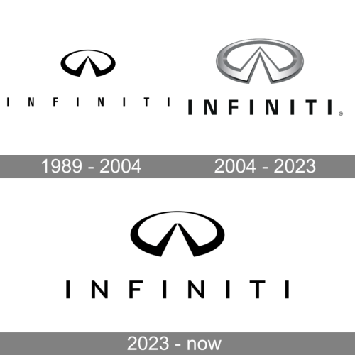
It is a useful visual summary of the mark’s evolution, though it is an editorial history graphic rather than a dated company record.
Design history
1989: the founding look
The original identity paired a flat black emblem with an uppercase wordmark set beneath it in the same solid black. That flat, high-contrast combination is what survives in most early reference images. One caveat applies to the artwork labelled 1989: the badge fitted to the production Q45 of that year was cloisonné, so the surviving flat black file reflects the print and logo version of the mark rather than the physical car badge.
2004: volume and chrome
The first logged revision came in 2004, when the emblem gained volume. It was redrawn with a silvery gradient and darker shading to read as three-dimensional chrome, and it was enlarged relative to the lettering, which became more compact. This is the era that produced the metallic badge most commonly seen on Infiniti vehicles through the 2000s and 2010s.
2016: a return to flat
A second revision in 2016 moved back toward simplicity, flattening and simplifying the emblem after the chrome period. It is a quieter change than either the 2004 gradient treatment or the 2023 refresh, and it is documented mainly through automotive coverage rather than a stand-alone brand announcement.
2023: the fourth iteration
The most substantial recent update arrived on 22 June 2023, when Infiniti unveiled what it called the fourth iteration of its logo. The refresh had two parts: a flat two-dimensional mark for general use, and a new three-dimensional illuminated emblem intended for future vehicles. It came with a “Dynamic Horizon” backdrop, a blue and gold palette and a sonic logo, and it was introduced with comment from Alfonso Albaisa, Nissan’s senior vice president of Global Design.
The geometry shifted slightly in this version. As Motor1 noted, the opening at the base of the emblem widened and the “road” no longer terminates in a sharp point. The change is small, but it makes the 2023 mark softer and more open than the earlier, more angular drawings.
Colour and wordmark
For most of its life the identity has been monochrome. On vehicles, the emblem appears in metallic grey, with backlighting available on some models; in print and digital use it is normally a flat single-colour lockup, which is where the mark is easiest to read. The 2023 refresh introduced blue and gold accents to the wider brand system, but the core logo still works in one colour.
The wordmark itself has stayed close to a geometric sans-serif in uppercase. Its distinguishing feature is not an unusual letterform but the spacing: the four “i” characters break the name into an even visual rhythm. Successive revisions have adjusted weight and width rather than the underlying structure.
The emblem in use
The oval and its notched interior are the constant. Across the four iterations the emblem has been drawn flat, shaded in chrome gradient and, from 2023, rendered as an illuminated three-dimensional badge for vehicles, while flat monochrome versions handle everything else. That split, a dimensional car badge alongside a flat graphic mark, is common among premium carmakers and has been part of Infiniti’s identity since the chrome era began.
Where the brand operates
Infiniti’s footprint helps explain why the emblem is tuned for both chrome and flat reproduction. The brand entered Europe in autumn 2008, announced at the Geneva Motor Show, and later announced its withdrawal from Western Europe on 12 March 2019, effective in early 2020; Q30 and QX30 production at Sunderland ended in July 2019. Infiniti has described itself as operating in approximately 50 countries. Vehicles have been built at Tochigi in Japan, at Nissan Shatai’s Kyushu plant for the QX80, at the COMPAS plant in Aguascalientes, Mexico after it opened in 2017, at Smyrna, Tennessee, and through Dongfeng joint ventures in Xiangyang and Dalian, China.
FAQ
What does the Infiniti logo mean?
Nissan describes it as two dynamic lines converging at the vanishing point of an infinite road, with a horizon beyond. The mountain-like peak is often read as Mount Fuji and the shape as an infinity symbol, but Nissan treats both as common interpretations rather than the stated meaning.
When did the Infiniti logo change?
Four versions are documented: the 1989 original, a chrome-gradient three-dimensional revision in 2004, a return to a flat simplified emblem in 2016, and the fourth iteration revealed on 22 June 2023, which added a flat mark and an illuminated 3D vehicle badge.
Why does INFINITI have four letter i’s?
The name was chosen in July 1987 as a respelling of “infinity”, with the final letter changed to an “i”. Nissan says the four “i” characters convey symmetry and forward-looking design, and they give the uppercase wordmark its evenly spaced rhythm.
Disclaimer
This article is part of the educational resources provided by Logo Index, an independent archive covering logos, visual identities and graphic design history. Infiniti and associated trademarks and brand assets remain the property of their respective rights holders where applicable.