 Aprilia Logo PNG
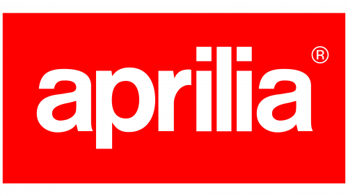
The Aprilia logo is one of the simplest identities in motorcycle branding: a lowercase white wordmark placed inside a solid red rectangle. There is no animal, crest or mechanical symbol. The Aprilia name itself carries the identity.
That red rectangular mark remains the primary corporate logo used by Aprilia and its parent, Piaggio Group, across official publications, product material, merchandise and motorcycle branding. [1]
Aprilia Logo Meaning and Design

The current Aprilia logo is primarily a wordmark rather than a pictorial emblem. The brand name appears in bold lowercase lettering on a rectangular red field.
Its most recognizable characteristics are:
- all-lowercase aprilia lettering;
- thick sans-serif letterforms;
- a compact horizontal composition;
- white lettering on a red rectangular background;
- no separate symbol in the main corporate logo.
Aprilia does not appear to publish an official explanation claiming that the rectangle means stability, lowercase letters mean approachability or white represents loyalty. Those interpretations should therefore not be presented as factual logo meaning.
The Aprilia Wordmark
The most distinctive part of the identity is the lettering itself.
The name is written entirely in lowercase, including the initial a. The letters have broad, relatively simple strokes and rounded forms, particularly around the a and p.
The two lowercase i characters are also visually distinctive because their square dots sit noticeably above the vertical stems. This is an observable feature of the lettering, but there is no evidence that Aprilia assigns it a symbolic meaning.
The result is a highly compact nameplate that can be reproduced clearly on motorcycle fairings, clothing, race equipment, dealerships and digital media.
What Font Does the Aprilia Logo Use?
The Aprilia lettering is often compared online with commercial sans-serif fonts, including variants of Swiss 721. However, no authoritative Aprilia or Piaggio source located for this article identifies a commercial typeface as the official source of the logo.
It is therefore safer to describe the mark as a custom or proprietary lowercase sans-serif wordmark rather than claiming that the logo is simply typed in Swiss 721 or another commercially available font.
Visual similarity is not the same as documented authorship.
Why Is the Aprilia Logo Red?
Red is firmly established as a central Aprilia brand color. The red rectangular logo appears throughout official Piaggio Group publications and Aprilia product material. [1]
However, there is no reliable evidence that Aprilia officially defines the logo’s red as a symbol of passion, energy or its post-war founding.
That last claim is particularly weak. The idea that the red background was chosen as a tribute to the period following World War II appears in later logo-description websites rather than in documented Aprilia brand history.
For Logo Index, the defensible explanation is simpler: red and white are longstanding, highly recognizable elements of Aprilia’s visual identity.
Red, Black and Aprilia Racing
Although the primary corporate mark is red and white, Aprilia’s wider identity is not limited to those two colors.
Black is used extensively across motorcycles, apparel and racing graphics, and red frequently works as an accent against dark backgrounds. Official Aprilia product material also uses purple, white and red in reference to the marque’s 1990s racing heritage. [2]
This distinction matters: the colors of a racing livery or motorcycle model are part of the wider visual system, but they should not automatically be treated as the fixed corporate-logo palette.
The Standalone Aprilia “A”
Aprilia also uses a large lowercase a as a graphic device on some motorcycles and promotional applications.
Piaggio’s own material for the SR GT describes a large Aprilia “A” appearing on the sides of the scooter’s front shield. [3]
This does not replace the complete aprilia wordmark as the main corporate logo. Instead, the enlarged initial functions as a secondary brand graphic that can be integrated into vehicle liveries and product design.
How the Aprilia Logo Is Used on Motorcycles
The rectangular logo is particularly suited to motorcycle applications because it behaves like a compact nameplate.
It can appear:
- on fairings and body panels;
- on race motorcycles;
- on technical documentation;
- on clothing and merchandise;
- on dealership signage;
- as part of Aprilia Racing lockups.
An official Aprilia technical document for the RS4 125, for example, displays the familiar red rectangle with white lowercase lettering. The same structure remains visible in much newer Aprilia material. [4]
This long-running use is more significant than trying to assign hidden meanings to individual letters.
Aprilia Logo History
The early history of the Aprilia company is much better documented than the precise chronology of its logos.
Alberto Beggio established the business in Noale after the Second World War as a bicycle manufacturer. His son Ivano Beggio took over in 1968 and moved the company toward motorized two-wheelers. The first Aprilia motorcycle was a small gold-and-blue 50 cc machine, followed by models such as the Colibrì, Daniela and the 1970 Scarabeo. [5]
Secondary logo archives show several earlier Aprilia lettering and symbol treatments, but authoritative company documentation assigning precise introduction and retirement dates to each version is limited.
For that reason, it would be misleading to create a neat year-by-year logo timeline without stronger archival evidence.
When Did the Current Aprilia Logo Appear?
The exact first-use year of the familiar red rectangular wordmark is not clearly established in the primary sources located for this article.
What can be verified is that the mark was already firmly established in official Piaggio material by the early 2010s and has continued through current Aprilia branding. Piaggio’s corporate reports, technical documents and current product publications consistently show the same basic red rectangle and lowercase wordmark. [6]
Without a dated Aprilia brand manual or designer statement, assigning a precise year such as 1986 should be treated cautiously.
Aprilia and Piaggio Group
Aprilia became part of Piaggio Group on December 30, 2004, together with Moto Guzzi. Piaggio states that its strategy included maintaining and developing Aprilia’s distinct brand identity rather than absorbing it into the Piaggio marque. [5]
The Aprilia logo therefore continued to operate independently within a group that also owns brands including Vespa and Moto Guzzi.
Aprilia Logo and Racing Identity
Aprilia’s racing history gives the wordmark much of its accumulated recognition.
The marque expanded from small motorcycles and motocross into road racing, Superbike, Supermoto and MotoGP. Over decades of competition, the Aprilia name has appeared prominently across race fairings, team clothing and paddock graphics.
Aprilia Racing also uses the familiar wordmark as part of a combined aprilia racing lockup, demonstrating how the core identity can be extended without replacing it. [7]
Why the Aprilia Logo Is Recognizable
The Aprilia logo relies on very few elements, but decades of consistent exposure have made those elements distinctive:
- the lowercase spelling;
- the characteristic proportions of the letters;
- the compact red rectangle;
- the white-on-red contrast;
- repeated use across road motorcycles and competition.
Its identity therefore comes primarily from consistency and accumulated brand recognition, not from hidden symbolism.