Iveco is an Italian commercial-vehicle brand rather than a car marque. It was created in 1975 inside the Fiat Group, when five European truck manufacturers were brought together: Fiat Veicoli Industriali, which had absorbed Officine Meccaniche (OM), and Lancia Veicoli Speciali in Italy, Unic in France and Magirus-Deutz in Germany. The name is an acronym of Industrial Vehicles Corporation, and the brand has carried a distinct visual identity almost from the start.
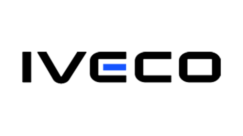 Iveco Logo PNG
The truck and commercial-vehicle business is now the central brand of Iveco Group N.V., which was spun off from CNH Industrial and listed on the Borsa Italiana in early 2022. Iveco describes a current footprint of seven production sites, eight research and development centres, roughly 3,500 outlets and sales in more than 160 countries.
The first Iveco logo, 1975
The original mark set the initial letter of the name diagonally inside a blue square, paired with the wordmark in uppercase Gill lettering and a blue-and-white palette. An important detail of the early years is that the founding manufacturers’ own logos continued to appear alongside the Iveco identity rather than being folded into it, so the new brand shared space with the marks it had replaced.
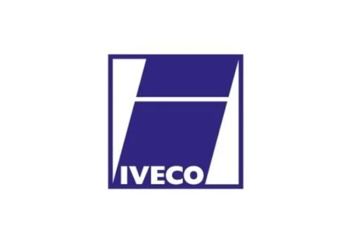
The 1970s identity was the work of a small internal team. Riccardo Felicioli led the project, Giovanni Brunazzi directed corporate identity, Paolo De Robertis handled art direction, and Carlo Malerba and Piero De Macchi worked as graphic designers. The Museo del Marchio Italiano, which records both those credits and the dated stages of the logo’s development, is the main reference for this period.
1977: a restyle for legibility
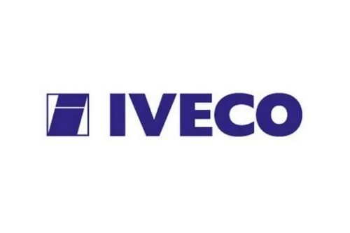
The mark was reworked in 1977, reportedly because the logotype lost legibility when it was reproduced at strong reductions. The restyled version put the emblem together with the wordmark set at the same height, keeping both elements on a single visual line.
1979 and 1980: new lettering, then the emblem goes
In 1979 the logotype was redrawn with original lettering and rounded, blunt edges, and was shown for the first time together with the restyled mark. A year later the lettering appeared on its own, with no emblem beside it.
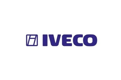
That standalone wordmark carried the identity by itself for the next three decades. In 1984 Piero De Macchi designed the institutional typeface used for dealer names, a supporting element rather than a change to the master logo.
2010: wider spacing and medium blue
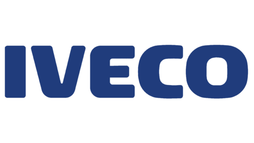
A graphic restyling in 2010 widened the letter spacing slightly and moved the palette to a medium blue, making it the next documented change after the 1979 letterforms. The wordmark kept its basic structure through this period rather than being rebuilt.
2023: a black logo with a blue centre
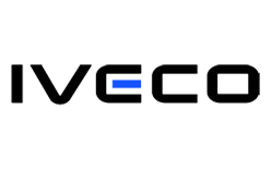
On 15 November 2023, at a “Be the Change” event held at Fira Barcelona alongside the MY24 range, Iveco unveiled an all-black identity with squarer, more compact letters. A blue element sits at the centre of the logo, documented in the letter “E”. Iveco’s own announcement describes the blue as a flash of energy-blue light at the heart of the mark and as the meeting point between the brand’s heritage and its new energy future, so the redesign is presented as a statement of change and innovation. The brand-identity pitch for the project was won by the agency Grey.
Iveco and Iveco Group are separate identities
The Iveco logo and the Iveco Group logo are not the same mark. Iveco Group, the parent company, presented its own corporate identity on 30 September 2021, before the spin-off from CNH Industrial was completed the following year. Passenger transport sits under the separate Iveco Bus brand introduced in 2013, which is why Iveco’s own identity is built around commercial vehicles rather than cars.
FAQ
What does the blue in the 2023 Iveco logo represent?
Iveco describes it as a flash of energy-blue light at the centre of the mark and as the meeting point between the brand’s heritage and its new energy future. In the logo it appears as a blue element inside the letter “E”.
How many times has the Iveco logo changed?
The documented stages are 1975, the 1977 restyle, the 1979 lettering, its standalone use from 1980, the 2010 spacing and colour update, and the 2023 black identity with the blue centre.
Disclaimer
This article is part of the educational resources provided by Logo Index, an independent archive covering logos, visual identities and graphic design history. Iveco and associated trademarks and brand assets remain the property of their respective rights holders where applicable.