KAMAZ, the Kama Automobile Plant, is Russia’s largest manufacturer of heavy trucks, buses and diesel engines. Founded in 1969 and headquartered in Naberezhnye Chelny in Tatarstan, the company built its public identity around an unusual emblem for a machine builder: a running steppe horse. That horse, drawn predominantly in blue and paired with a bold uppercase wordmark, is the mark most people recognise today.
 KAMAZ Logo PNG
Ownership is often summarised imprecisely. Autostat records Daimler’s initial 10 percent stake, bought in December 2008 and later increased to 15 percent, and cites Rostec at 49.9 percent following a 2010 consolidation, while KazanFirst puts Rostec at roughly 47.1 percent, Avtoinvest near 23.5 percent and reports Daimler’s exit by 2025. Rostec is the largest shareholder rather than a majority owner. That background matters for the logo in one respect: the identity has been controlled by the plant itself rather than licensed from an outside parent, which helps explain how consistently the horse has been used since the late 1980s.
Meaning and history
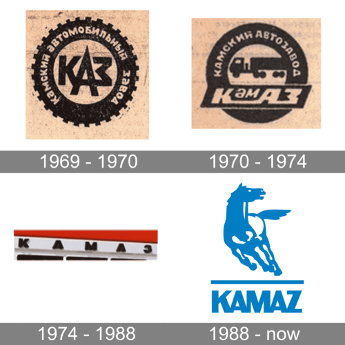
KAMAZ’s visual identity has passed through a small number of documented stages: an early Cyrillic wordmark, a second wordmark variant in the 1980s, and the horse emblem that eventually replaced them as the company’s signature. The surviving artwork for those stages is uneven in quality, and the dates attached to some early variants circulate without documentary backing. The horse is the part of the story that can be traced most securely.
The horse and its symbolism
The animal is the argamak, a steppe breed of Akhal-Teke type. It was chosen as a nod to Tatar traditions and to convey speed, power, stamina and adaptability. The idea is credited to Olga Yakubova, who headed KAMAZ’s advertising and exhibition work, with the artwork produced by the Moscow artists Viktor Kryuchkov and Viktor Markovsky, according to Chelny Izvestia.
KAMAZ’s own corporate history states that the argamak became a trademark of the KAMAZ association in 1987. The emblem was shown publicly for the first time in 1988 at the Spetsavtotransport-88 exhibition in Moscow’s Sokolniki Park, where it was planned for the cab of the plant’s millionth truck; that application did not go ahead, as the corporate newspaper account records. So the horse existed as a mark several years before drivers saw it on a production vehicle.
The wordmark before the horse
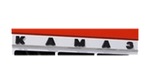
The earliest documented KAMAZ trademark is a Cyrillic КАМАЗ wordmark recorded by the USSR Committee for Inventions and Discoveries in February 1974. Some Russian accounts date the first registration to 1973 instead, and the two dates remain in circulation. A second wordmark variant appeared in the early 1980s, a fused two-colour rendering of the name with a star element, and stayed in use on consumer goods, booklets and event materials until about 1991.
The company’s name and truck-brand trademarks were formally registered on 31 December 1999, the point from which the modern mark’s legal protection is usually dated. The horse did not become the standard badge on series trucks until later still: the first model to carry it as standard was the KAMAZ-4308 in 2006. Both dates come from the same corporate newspaper history that documents the 1974 filing.
A recent seahorse, and the current palette
In September 2025 KAMAZ-Port Machines obtained a Rospatent patent for a seahorse mark intended for its Galleon line of port tractors, reported by ASM Holding. It is a distinct mark for a specialised product line, not a replacement for the core KAMAZ logo, and it sits apart from the running horse rather than revising it.
The main identity remains dominated by blue, with the horse and the wordmark set against light backgrounds. A brand-asset reference records the primary blue as #005BAA, though that value has not been confirmed by KAMAZ itself. No authoritative typeface credit for the wordmark is documented, so the lettering is better described by its visual character, a heavy uppercase face with wide, blocky forms, than by a named typeface.
The horse also travelled beyond the truck cab. KAMAZ-master, the company’s rally team, became the most-decorated truck team at the Dakar Rally, taking an 18th victory in 2019 as Rostec reported. That association gave the emblem a recognition beyond the domestic market, even as the company’s export reach has narrowed from the very broad figures quoted in older material to something closer to fifty markets in recent reporting.
Disclaimer
This article is part of the educational resources provided by Logo Index, an independent archive covering logos, visual identities and graphic design history. KAMAZ and associated trademarks and brand assets remain the property of their respective rights holders where applicable.