Gold Peak is a Coca-Cola-owned ready-to-drink tea brand sold in the United States. Its visual identity has moved from a scenic launch label to a mountain landscape and a later Real Brewed identity built around a leaf-detailed wordmark.
 Gold Peak Logo PNG
Meaning and History
Coca-Cola North America announced Gold Peak on July 25, 2006, with the tea scheduled to reach stores that week. The launch used clear, carafe-like 16.9-ounce glass bottles, and the label featured a tranquil lakeside scene. The announcement described the tea as a premium option and listed five varieties: sweetened, unsweetened, lemon, diet and green. At launch, Gold Peak was marketed through Beverage Partners Worldwide North America, a joint venture between Coca-Cola and Société des Produits Nestlé S.A. (Coca-Cola’s launch announcement.)
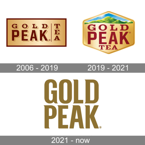
The first stage image shows a framed, two-line GOLD PEAK name, with TEA arranged vertically at the right. Its warm gold field and dark red-brown lettering give it a denser, label-like appearance than the later marks. The lakeside scene is documented on the 2006 launch label; the finer details of this pictured lockup are visible in the artwork but are not separately established by the launch announcement.
2006 – 2019
This stage image makes the early lockup easier to see: GOLD sits above PEAK, while TEA runs vertically beside the name inside a rectangular frame. That compact arrangement differs from the later mountain design, which gives the landscape a prominent place above the wordmark. The supplied date range labels the stage; the launch announcement supports the lakeside-label direction in 2006.
Gold Peak’s growth is useful context for the brand’s visibility, but it does not establish a logo change. Convenience Store News reported that the brand drove about 30 percent of U.S. ready-to-drink tea category dollar growth in 2014 and joined Coca-Cola’s billion-dollar brand roster in the mid-2010s (Convenience Store News).
2019 – 2021
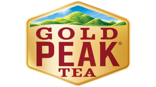
In August 2019, Beverage Industry reported a new Gold Peak label with a reimagined logo, a contemporary mountain landscape and the campaign line “Real Comforts of Home” (Beverage Industry). The stage image places green hills and blue sky above the name, which is set in red serif capitals inside a broad, angular frame. The mountain scene is consistent with the reported redesign; the image’s particular frame and colors are visible features, not documented explanations of the design.
2021 – Today
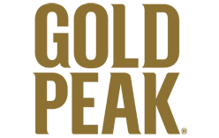
This stage image shows GOLD PEAK stacked in large gold lettering, without the mountain scene in the previous stage image. Its appearance should not be taken as proof of the current wordmark: trade coverage of the Real Brewed identity describes a reimagined wordmark with subtle leaf-like serifs, alongside tea-leaf imagery and an organic palette that emphasizes the tea’s golden hue (Convenience Store News; CSP Daily News). The sources describe the identity change but do not establish 2021 as its rollout date.
The Real Brewed positioning also connected the visual identity to tea made from real leaves rather than concentrate. Coverage links the “Stay Gold” campaign to the wordmark and package changes; reports place the formula transition in 2018 or 2019, so the change is best understood as occurring across that period. The phrase “Real Comforts of Home” from the 2019 label campaign and “Stay Gold” both give the brand a home-oriented tone without requiring a symbolic reading of the frame or lettering.
Gold Peak remains an active Coca-Cola brand. The company’s brand page lists it in its coffee and tea portfolio, and 2026 trade coverage reported growth in sales and volume as well as a Simply Gold Peak half-and-half line (The Coca-Cola Company; Beverage Network).
Disclaimer
This article is part of the educational resources provided by Logo Index, an independent archive covering logos, visual identities and graphic design history. Gold Peak and associated trademarks and brand assets remain the property of their respective rights holders where applicable.