 Hennessy Logo PNG
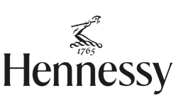
Few spirits marks carry as much history in as small a space as the Hennessy logo. The house’s emblem, known in French as the Bras Armé, or “armed arm,” shows a bare forearm and clenched fist gripping a short-handled axe, and it has sat on Hennessy labels for well over a century. It is the single most recognisable element of the brand’s identity, and the 2022 refresh of that identity is the clearest window into how Hennessy treats its own image.
Meaning and history
Hennessy was founded in 1765 in Cognac, France, by Richard Hennessy, an Irishman who served in the French army of Louis XV as part of the Irish Brigade before settling on the Charente. The house’s official history records his birth in 1724 and his death in 1800, and notes that the first shipment to the United States reached New York in 1794. Today the business sits inside Moët Hennessy, the group created by Hennessy’s 1971 merger with Moët & Chandon and absorbed into LVMH in 1987.
The emblem is younger than the company. Hennessy’s official timeline states that the Bras Armé became the brand symbol in 1856, decades after the founder’s death. Regional press in Cognac has placed the mark on labels from around the middle of the nineteenth century, which fits that date. The device was borrowed from Richard Hennessy’s family coat of arms and reflects his military background; Moët Hennessy’s own brand history ties it to the founder’s army career, which is said to have earned him French citizenship.

The weapon inside the fist is usually called a hatchet by Hennessy itself, from the French hache. At least one design publication has described it as a halberd, so the exact category of the blade is not settled across sources. The pose, however, is consistent: bare forearm, closed hand, short handle, blade angled upward. That silhouette has been redrawn many times without being fundamentally altered.
The fuller family arms carried a crest of a wild boar, according to Sud Ouest. The boar was reportedly never carried over onto commercial labels, so unlike the arm it never became part of the brand’s public face.
1856–2022: the Bras Armé era

For most of the twentieth century and into the 2000s, Hennessy packaging paired a small Bras Armé with a serifed wordmark on a dark ground. The arm was treated as a seal rather than a headline: compact, finely engraved, and easy to miss at a glance. It appeared across the range rather than belonging to a single expression, which is why the mark reads as the house signature rather than a product badge.
The 2022 redesign
That arrangement was rebuilt in 2022, when the house commissioned a full identity and packaging programme from NR2154, a studio with offices in New York, Paris and Copenhagen. Coverage of the project centres on the V.S.O.P. expression, for which the Bras Armé was redrawn in a simpler, more graphic form, the glass bottle was given a new shape, and gift packaging was reworked.

Because the programme rolled out across releases rather than on a single fixed day, some sources place the unveiling in late 2022 and others describe it through coverage published in early 2023. The studio credit is well documented; the precise launch date is not.
Some accounts also attribute a rhombus-shaped “H” monogram to the same programme.
Font

The 2022 system uses three custom typefaces rather than one. The wordmark is set in a flared serif; a clean sans-serif handles digital use; and a third face based on hand-lettering echoes the hand-dated markings traditionally applied to cognac barrels. Together they let the brand move between ceremonial gift packaging and everyday screen use while keeping a family resemblance.
Color

The documented premium palette is black and gold: a deep, near-black ground with the Bras Armé and wordmark picked out in metallic gold. The contrast does most of the work, letting the emblem stay legible at small sizes on a bottle shoulder or a gift box. Some packaging uses silver or white finishes instead, but black and gold remains the version most closely associated with the house.
What ties all of this together is continuity. The arm has been reinterpreted across more than a century and a half and still resolves, at a glance, to the same simple idea: a hand, a blade, and a name that has been attached to cognac since 1765.
Disclaimer
This article is part of the educational resources provided by Logo Index, an independent archive covering logos, visual identities and graphic design history. Hennessy and associated trademarks and brand assets remain the property of their respective rights holders where applicable.