 Jack Daniels Logo PNG
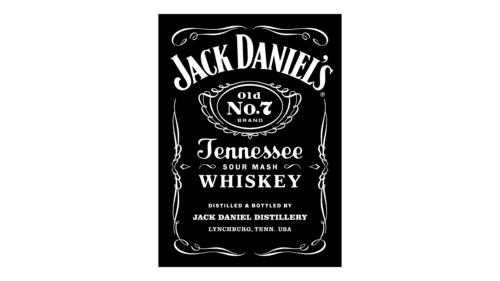
Jack Daniel’s is a Tennessee whiskey made by the Jack Daniel Distillery in Lynchburg, Moore County. Its familiar label combines an arched name, an oval Old No. 7 mark and intricate white ornament on a dark field. The square bottle with its fluted neck was chosen in 1895, according to Fast Company.
Meaning and history
The label’s layout is more clearly documented than the dates of its early versions. The brand gives 1866 as its establishment year, while biographer Peter Krass dates the business to 1875 using land and deed records; CNN describes the disagreement. A 1904 trademark filing records “Old No. 7” as a mark and claims first use in 1875. The label’s recurring elements include a prominent arched wordmark, a central oval and detailed framing.
1950’s – 1990’s
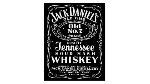
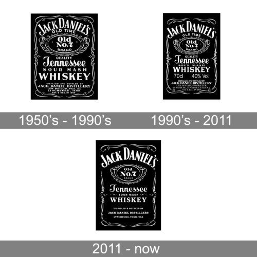
This stage presents the label as a compact framed panel. Fine white lines crowd the border, while “Old Time,” “Old No. 7 Brand,” “Tennessee” and “Whiskey” are stacked beneath the large arched name. The ornamental frame makes the whole composition feel enclosed and densely detailed.
1990’s – 2011
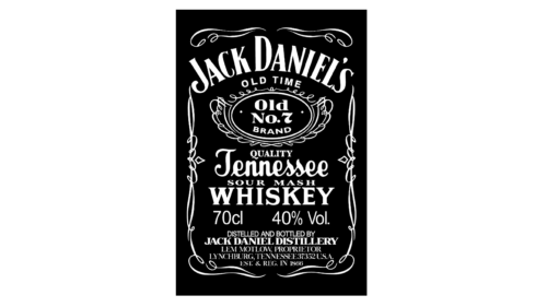
The arched name remains dominant, but the arrangement is more open than in the preceding stage. “Old Time” still appears above the oval, and the supporting product wording remains within the decorative frame. These date ranges are archive labels; the documented redesign boundary is 2011.
2011 – now
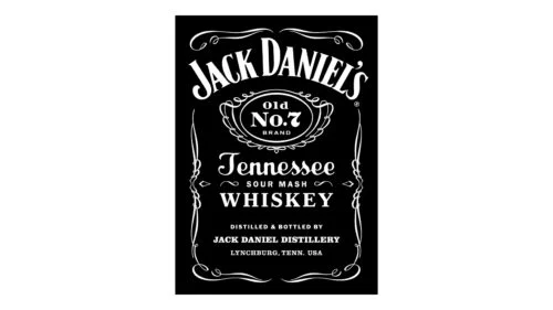
In 2011, Minneapolis design studio Cue redesigned the Old No. 7 packaging, with Alan Colvin as creative director. The work retained the filigree while removing “Old Time,” reducing front-label copy and adding a touch of silver, as reported by Fast Company and described by Cue. This is the 2011 stage, not the latest bottle design.
Symbol
The significance of “Old No. 7” is not settled. The brand’s public-relations director has said its meaning is unknown. Krass’s account proposes that seven was a registration number retained after a whiskey district was renumbered; it is a theory, not a confirmed explanation. Other popular stories are described as folklore by VinePair. A court filing reproduces the 24 May 1904 registration certificate for the words “Old No. 7,” with first use claimed as 1875.
Emblem
The close-up isolates two of the label’s strongest elements: the large, curved “JACK DANIEL’S” wordmark and the circular Old No. 7 Brand mark. On the full label, these sit within the border ornament rather than acting as a standalone symbol. A rope-and-anchor motif also appears on an early-1900s-style black label recreated for Legacy Edition 2; the release account attributes the “unmoving confidence” description to the brand, not to a documented origin for the emblem (Beverage Trade Network).
Font
The wordmark uses high-contrast, serifed capitals arranged on an arch. The full label contrasts that display lettering with script for “Tennessee” and simpler capitals for supporting words such as “Whiskey.” The different styles help separate the brand name from product information.
Color
Black and white are the dominant colors in the familiar label, with silver added in the 2011 redesign. The palette has not been exclusive to black: historical green labels also existed, including on some 80-proof bottlings, while black labels were used for other proof versions (Jack Daniel’s history).
Current identity
The 2011 bottle was refined in 2024–25 with rounder shoulders and a longer neck; the label changed only slightly, adding more printed storytelling. The recipe remained unchanged, according to Creative Bloq. The update refined the packaging while retaining the recognizable black-label identity and its white ornament.
View the Jack Daniel’s logo archive entry.
Disclaimer
This article is part of the educational resources provided by Logo Index, an independent archive covering logos, visual identities and graphic design history. Jack Daniels and associated trademarks and brand assets remain the property of their respective rights holders where applicable.