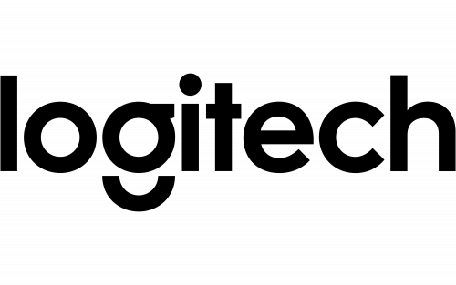
Logitech’s current corporate identity is a lowercase wordmark. Its distinctive “g” has a detached arc beneath the bowl. Logitech introduced the wordmark on 8 July 2015 as part of what the company called the biggest brand transformation in its history. The company’s 2015 announcement and later identity coverage document the new design and its use as the Logitech identity (Logitech; Wired).
 Logitech Logo PNG
Meaning and history
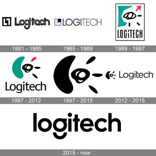
The composite presents several different treatments, but its early date labels should not be taken as independently verified logo launch dates. The strongest documented changes are the hand-drawn identity introduced in 1988, its 1996 redraw, and the lowercase wordmark launched in 2015.
1981 – 1985
This artwork pairs a square geometric emblem with a highly stylized wordmark made from outlined, interlocking letterforms. The archive associates it with this period, but the date is not independently established in the cited logo-history sources.
1985 – 1989
Here the emblem is a square divided into curved sections, beside a thin, uppercase LOGITECH wordmark. This is visibly more restrained than the outlined lettering in the previous image; the archive’s date label is not independent proof of when the design entered use.
1989 – 1997
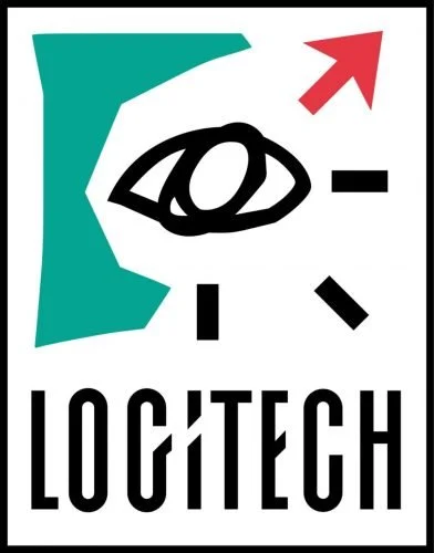
The image shows the teal, red and black hand-drawn identity associated with Logitech’s 1988 redesign. British designer Timothy Wilkinson created it at frog design. Wilkinson described the concept as part sculpture and part face, a “hieroglyph of the first graphical user interfaces”; he also said the red corner element began as a plus sign and functioned as a cursor (Gizmodo). The archive heading begins a year later than the documented 1988 introduction.
1997 – 2012
The image shows a softer version of the frog design, with rounded contours and a lowercase wordmark. Wilkinson redrew the mark in 1996, giving its central, face-like element a more mouse-like appearance (Gizmodo). The archive’s 1997 label does not alter that documented redraw date.
1997 – 2015
This stage image belongs to the same broad era as the preceding redrawn identity. The archive groups it across a longer span, but the supplied chronology does not establish a separate redesign here.
2012 – 2015
The image retains the emblem-and-wordmark arrangement, rendered here in black beside a thin wordmark. The 2015 redesign was described by Ad Age as Logitech’s first facelift since its 1981 founding, so this archive label is not evidence of a distinct 2012 corporate redesign (Ad Age).
2015 – Today
Logitech introduced the lowercase wordmark in 2015 with London agency DesignStudio. The wordmark uses Brown Pro, designed by Aurèle Sack, and its detached arc gives the “g” a distinctive profile. Design Week reported the agency’s description of the marque as representing a more human brand, while noting that viewers could read their own meaning into it (Design Week). Logitech’s 2015 announcement introduced “Logi” as a label for selected new product categories, not as a replacement for the Logitech name (Logitech). The current identity remains the 2015 wordmark; the company’s 2024 shareholder material describes building a single, trusted Logitech brand (2024 shareholder material).
Symbol and related marks
The corporate identity is primarily a wordmark rather than a separate pictorial emblem. The bright blue geometric “G” shown here is a distinct gaming-related mark, not the detached-arc “g” from the corporate wordmark. USPTO records identify LOGITECH G as a separate trademark owned by Logitech International S.A.; the record gives a 2016 filing and a 2017 registration (USPTO record).
Color and applications
The 1988 identity is built around a large teal form, a red cursor element and black lettering. The 2015 system moved away from teal as a fixed corporate color: the wordmark can appear in different colors according to product and context, with a broader palette across packaging and retail (Wired; Design Week). This final image shows the older emblem in a glossy, dimensional treatment, contrasting with the flat, simple typography of the 2015 wordmark.
View the Logitech logo archive entry.
Disclaimer
This article is part of the educational resources provided by Logo Index, an independent archive covering logos, visual identities and graphic design history. Logitech and associated trademarks and brand assets remain the property of their respective rights holders where applicable.