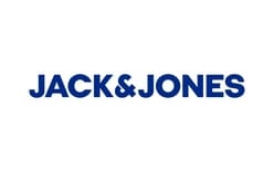
The Jack & Jones logo shown here is a blue, uppercase wordmark arranged on one line. Trade coverage of the identity unveiled in September 2018 describes its blue colour and an ampersand formed from two Js. The images below show several visual treatments of the name, while the documented redesign provides a dated milestone for comparison.
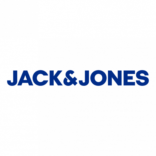 Jack & Jones Logo PNG
Jack & Jones is a Danish menswear brand created in 1990 within the Bestseller group, with denim at its core. Bestseller describes it as the group’s largest business unit, and its first store opened in Trondheim, Norway, in 1991, according to Bestseller and lex.dk.
Meaning and history

The redesign was unveiled in September 2018 and rolled out gradually from that autumn. Copenhagen studio e-Types worked with Jack & Jones’s internal brand team, as FashionForum and Markedsføring reported. The dates attached to the archive’s earlier stages do not establish when those designs were introduced.
1986 – 2003

This image shows script lettering for “Jack & Jones,” with a sweeping underline and smaller “DENIM CLOTHING CO.” and “EST. 1990” text. The heading starts before the brand’s documented creation in 1990, so it cannot be read as evidence that Jack & Jones used this mark in 1986.
2003 – 2019

The image presents a very dark, low-contrast wordmark on one line. Its heading spans the identity unveiled in 2018; it does not establish a logo change in 2003 or 2019. Trade coverage dates the redesign to September 2018 and identifies the blue colour and two-J ampersand as features of the new identity.
FashionNetwork reported that blue was chosen for its association with denim and described the ampersand as expressing a bond between people. The campaign line was “Welcome to the Denim Brotherhood”; the launch coverage also listed four brand values: Masculine, Social, Refresh and Craftsmen.
2019 – Today

This image shows a blue, uppercase “JACK&JONES” wordmark on one line. The lettering and colour distinguish it from the script treatment in the first stage image, while the ampersand’s two-J construction connects it to the 2018 redesign described by FashionNetwork. China Daily reported that the same visual identity was rolled out across retail, web, e-commerce and communications in China in February 2020.
Lettering, symbol and colour
The documented redesign’s central feature is the ampersand, constructed from two Js rather than presented as a conventional separate character. Its blue palette was linked to denim in the launch coverage. Fonts In Use identifies Italian Plate No2 Expanded by Playtype as the typeface used for the identity since 2018.
Across the supplied images, the name moves visually from decorative script to restrained, uppercase wordmarks. The documented 2018 identity gives that change a clear point of comparison: blue lettering and a distinctive two-J ampersand.
Disclaimer
This article is part of the educational resources provided by Logo Index, an independent archive covering logos, visual identities and graphic design history. Jack & Jones and associated trademarks and brand assets remain the property of their respective rights holders where applicable.