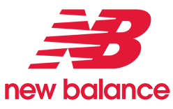
New Balance uses a flying NB monogram and a separate N on footwear. In the full lockup, the joined initials sit above the brand name. The standalone N serves a different practical role: it marks the side of a shoe without needing the full wordmark. New Balance’s company profile identifies the side N on the 320, introduced in 1976. (New Balance company profile)
 New Balance Logo PNG
Meaning and history

Three versions of the flying NB mark are shown. Across them, the linked initials and horizontal strokes remain recognizable, while the color and treatment of the wordmark vary. The bars are graphic elements; claims that they were intended to symbolize speed or motion are not established by the cited accounts.
1972 – 2006
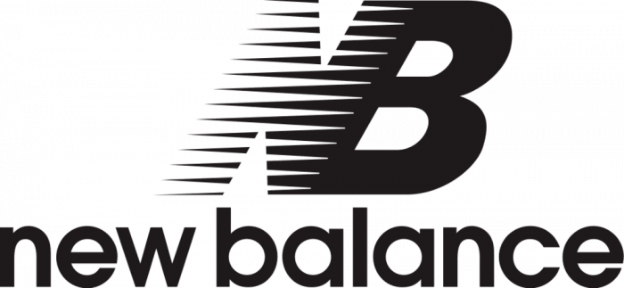
This version is black, with the joined NB above the lowercase name. The image gives the mark a dense, horizontal profile: the strokes extend left from the initials, while the wordmark forms a separate line beneath. The heading identifies this as an earlier stage; Terry Heckler’s work on the New Balance logo is documented, and Complex reports that he was hired after Jim Davis bought the company in 1972. (Complex)
2006 – 2008

Here the monogram and the lowercase name are both red. The initials remain joined and the strokes still trail to the left, but the color makes this lockup distinct from the black version shown above. The heading supplies the date range for this stage; the documented accounts support the broader history of Heckler’s design work, not a precise date for this particular redraw.
2008 – Today

This image isolates the red flying NB monogram, without the wordmark. New Balance continues to use the flying NB and the side N as core marks; a 2026 report on trademark litigation describes the company’s claim of using the N on footwear since the 1970s. (Gerben Law)
Designer and visual details
Terry Heckler designed the New Balance shoe logo. The Seattle Times reports that the company hired his agency, Heckler, Bowker, for the work; Complex recounts Heckler’s description of repeatedly refining the mark so the N could be read more clearly. (The Seattle Times; Complex)
The identity combines a bold, forward-leaning NB monogram with a simpler lowercase wordmark in the pictured lockups. The images show black and red treatments, as well as the monogram without accompanying text. They do not establish a particular typeface or fixed color specification. On shoes, the separate N provides a compact brand mark; the full name is available where the identity needs to be spelled out.
Disclaimer
This article is part of the educational resources provided by Logo Index, an independent archive covering logos, visual identities and graphic design history. New Balance and associated trademarks and brand assets remain the property of their respective rights holders where applicable.