 Lane Bryant Logo PNG
Meaning and history

Lane Bryant is a U.S. women’s apparel and intimates retailer focused on plus sizes. Founder Lena Himmelstein opened a Fifth Avenue shop in 1904. The store’s name came from a bank clerk who entered “Lane” instead of “Lena,” a spelling that stuck, according to the Jewish Women’s Archive.
The logo relies on lettering rather than an illustrated emblem. Across the sequence, the most noticeable changes are the weight, spacing and style of the name itself.
1969 – ????

This version uses bold uppercase letters on a single line. Compared with the later examples, the letters look heavier and more closely set; the R’s extended diagonal leg is a distinctive feature of this rendering.
???? – 2009

This uppercase version has thinner strokes and more open spacing. The extended R leg is absent, giving the wordmark a lighter, more linear appearance.
2009 – 2011

Lowercase letters replace the capitals, and “lane” and “bryant” run together. The first part is lighter than the bold second part, giving the continuous wordmark contrast. In 2010, Fibre2Fashion reported that a Lane Bryant campaign introduced a new logo at a reopened Mall of America store and used the line “Something’s new at Lane Bryant.” Fibre2Fashion’s report connects this period to a documented rebranding campaign.
2011 – 2014

This design pairs light-blue cursive “Lane” with thin purple uppercase “BRYANT.” Chain Store Age reported that Lane Bryant’s rebrand, with a new logo and color palette, launched in September 2012. The publication also said the change extended to Cacique, the company’s intimates line, and that the logo first appeared in an August direct-mail piece. The documented launch date is later than the stage heading’s 2011 start label. Chain Store Age reported the rebrand under the campaign platform “Fashion, Fit Right.”
2014 – Today

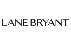
This stage returns to uppercase lettering, with widely spaced, angular characters in place of the preceding script-and-capitals combination. The final image repeats the lead wordmark artwork; here it serves as the visual for this timeline stage.
Lettering and color
Across the sequence, the name shifts from dense black capitals to thinner capitals, lowercase mixed-weight lettering, a colored script-and-capitals pairing and a widely spaced uppercase design. Chain Store Age reported that the 2012 rebrand included a color palette alongside the logo change. The cited coverage does not credit a designer or identify a typeface.
Disclaimer
This article is part of the educational resources provided by Logo Index, an independent archive covering logos, visual identities and graphic design history. Lane Bryant and associated trademarks and brand assets remain the property of their respective rights holders where applicable.