 Prada Logo PNG
Meaning and history
Mario Prada opened a leather goods shop in Milan’s Galleria Vittorio Emanuele II in 1913, trading as Fratelli Prada. The shop’s history is the origin of the house’s “founded in 1913” date; PRADA S.p.A., the present legal entity, was incorporated in 1990, according to the company prospectus.
In 1919, Prada became Official Supplier to the Italian Royal Household. Prada’s account of its Galleria history links that appointment to the addition of the House of Savoy arms and knotted rope to the logo. The brand describes the knots as four figure-eight forms, known as the Savoy knot. These are historical heraldic elements, not simply decorative details. Prada’s account explains the connection.
2002 – Today
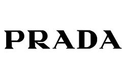
The image shows PRADA in large, high-contrast serif capitals on white. Specialist design coverage describes the logotype as essentially unchanged since it was set a few years after the original shop opened; the historic Fratelli Prada shop sign uses different lettering. NSS Magazine discusses both.

A separate company-recorded milestone is the design and launch of the “triangle” Prada logo in 1980, listed in the company prospectus. The triangle and the wordmark are distinct parts of the identity; the 1980 date should not be confused with the image heading above.
Current symbol

This image shows the heraldic treatment: a crest above the PRADA MILANO DAL 1913 wording, framed by an oval rope with four prominent knots. Prada traces the arms and rope to the 1919 royal-supplier appointment. The wording “PRADA MILANO” and “PRADA MILANO DAL 1913” also appears among marks listed to PRADA S.A. by the UK Intellectual Property Office.
The triangular plaque is another recognizable application of the identity. A trade report describes the customary three-line wording as PRADA, MILANO and DAL 1913, with “dal” meaning “since.” The company prospectus records the triangle logo’s launch in 1980; the plaque’s wording and materials can vary between products. Fashionbiz covers the plaque and later simplified triangle treatments.
That report also describes blank triangle badges in the Spring/Summer 2022 collection and plain-triangle trademark applications in 2021. These simplified treatments contrast with the worded plaque, while the current identity evidence continues to show both the PRADA wordmark and the PRADA MILANO DAL 1913 version. Prada’s account and the trademark listing document those identity elements.
What’s the idea behind the emblem?
The supported meaning is specific: Prada connects the crest and knotted rope with its 1919 appointment as Official Supplier to the Italian Royal Household. The company identifies the knot as the Savoy knot and describes its four figure-eight forms. The image’s oval rope framing PRADA MILANO DAL 1913 presents those elements together with the crest.

This close view shows a triangular plaque on pink leather, with PRADA MILANO above a small crest and decorative elements. It differs from the rope-framed mark above: the triangle puts the lettering and heraldic detail inside a compact badge.
Font and color
Specialist design coverage describes the Prada wordmark as a modern, high-contrast serif. Its heavy main strokes contrast with fine hairlines; the pointed A and angled leg of the R help distinguish the lettering. No font designer is credited in the cited coverage. The lettering visible here is dimensional metal rather than a flat printed wordmark.

The black wordmark on white is a clear, familiar treatment, as shown in this image. It is not the only possible finish: the plaque image above demonstrates how the identity can appear in metal against colored leather.

View the Prada logo archive entry.
Disclaimer
This article is part of the educational resources provided by Logo Index, an independent archive covering logos, visual identities and graphic design history. Prada and associated trademarks and brand assets remain the property of their respective rights holders where applicable.