Bancolombia’s identity has changed from an ornate bank emblem to a streamlined wordmark and symbol. The bank’s 2021 redesign introduced a black-and-white base and a broader graphic system using six vivid colours. The group’s parent company later changed to Grupo Cibest, while Bancolombia’s product and service names continued unchanged, according to Bancolombia’s 2025 announcement.
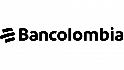 Bancolombia Logo PNG
Meaning and history
Bancolombia’s legal lineage runs through Banco Industrial Colombiano (BIC), constituted in Medellín in 1945. In 1998, BIC absorbed Banco de Colombia and adopted the name Bancolombia S.A.; the bank’s registered corporate history records that it was the surviving legal entity. The group’s history dates the creation of Grupo Bancolombia to 2005, and Grupo Cibest became the parent company on 16 May 2025, as described in the corporate-history certificate and the 2025 announcement.
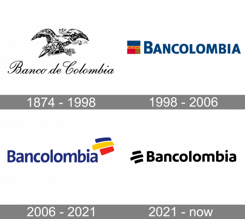
The marks shown here move from an elaborate engraved emblem to compact, colour-led signatures. The 2021 redesign retained an evolved symbol while changing the system around it, including the wordmark, palette and supporting graphics.
1874 – 1998 (Banco de Colombia)
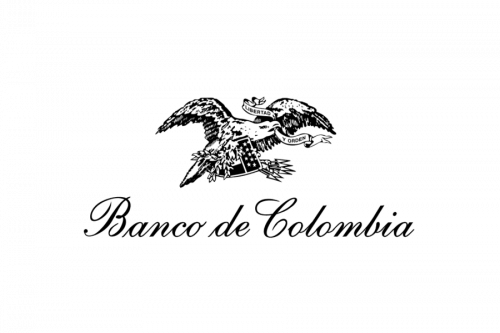
The archived mark pairs a detailed engraved emblem with a script wordmark, a markedly more ornamental treatment than the later corporate signatures. The heading gives 1874, but Bancolombia’s own history dates Banco de Colombia’s founding in Medellín to 29 January 1875 and names Ramón del Corral as its first manager. The bank’s account supports 1875; the earlier year remains in the archive label.
1998 – 2006 (Bancolombia)
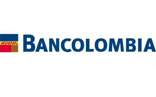
When BIC absorbed Banco de Colombia and became Bancolombia S.A. in 1998, the displayed identity shifted to a bold uppercase wordmark beside a small rectangular colour device. Press coverage of the 2021 redesign described the earlier palette as drawing on the Colombian flag’s colours. The merger direction is important: BIC absorbed Banco de Colombia, rather than the reverse, according to the registered corporate history and the bank’s history page.
2006 – 2021
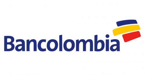
The mark in this stage keeps the flag-associated colours but rearranges them into three rounded strokes beside a lowercase wordmark. Bancolombia absorbed Conavi and Corfinsura in 2005, and the bank’s history dates the Grupo Bancolombia stage to that year; the 2006–2021 heading marks the subsequent identity period. The merger was formalised in 2005, as recorded in the merger filing.
2021 – Today
The 2021 redesign keeps a compact symbol beside a lowercase wordmark, but the stage image presents both in black and white. Reports on the April 2021 renewal describe a wider identity system with six vivid colours, an evolved isotype, a proprietary typeface, and line-based graphics derived from the symbol. The project was credited to Vasava, Comuniza and Sancho BBDO, with Bancolombia’s Adriana Arismendi leading internally; La República and Semana reported the redesign and its rollout.
Type and colour
The 2021 identity includes a typeface made for the brand, used as part of a coordinated system rather than as an isolated wordmark. Its black lettering provides a strong contrast with the symbol; the broader system adds colour through graphic elements. Brandemia’s account describes the symbol as a subtle evolution of the previous one and outlines the proprietary type and line-based graphics.
In interviews reported by Forbes Colombia and Semana, Bancolombia associated white with transparency, black with depth and solidity, and the six colours with emotions, interests, ideals and diversity. The redesigned system therefore moved away from the earlier flag-associated palette while retaining colour as a prominent part of the wider identity.
View the Bancolombia logo archive entry.
Disclaimer
This article is part of the educational resources provided by Logo Index, an independent archive covering logos, visual identities and graphic design history. Bancolombia and associated trademarks and brand assets remain the property of their respective rights holders where applicable.