 Bank Jatim Logo PNG
Meaning and history

Bank Jatim is the trading name of PT Bank Pembangunan Daerah Jawa Timur Tbk, a regional development bank based in Surabaya. The bank was established in 1961, and its present red Garuda-wing identity was launched on 10 November 2011, replacing a mark associated with Surabaya’s Tugu Pahlawan monument. The bank’s announcement of the change explains the new mark and its launch.
1963 — 1974

This stage shows a purple-toned crest: large “BPD” initials sit inside a rounded outline above a “Jatim” ribbon. It has the compact, seal-like form of an institutional badge. The dates belong to the archive’s timeline; a provincial development agency gives a different account, saying the bank’s first logo in 1963 used a Tugu Pahlawan logogram. That account conflicts with the crest shown here, so the early artwork and its dating should be treated cautiously. Bappeda Jawa Timur reports the alternative account.
1974 — 1988
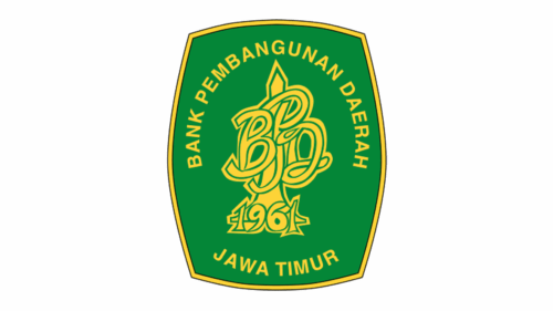
The next stage replaces the small crest with a tall green badge edged in gold. Curved lettering names the regional bank, while an ornate monogram and the year “1961” fill the centre. The stronger color contrast and vertical shield shape give it a more formal, emblematic appearance than the preceding ribbon crest.
1988 — 2011

This mark centers on a pointed tower within a circle, with red lines spreading down and outward above a black uppercase “BANK JATIM” wordmark. The tower refers to Surabaya’s Tugu Pahlawan. In its 2008 annual report, the bank describes the five perspective lines as representing forward vision and Pancasila, the circle as wholeness and unity, and red as courage and power. The annual report documents those meanings. This is distinct from the Garuda-wing logo that followed.
Bappeda Jawa Timur places a graphic version of the Tugu Pahlawan mark in 1998 and says the “Aman Terpercaya” tagline was added in 2000. Those dates differ from the archive’s broad stage label.
2011 — Today

Launched on 10 November 2011, the current identity pairs a red wing with the “Bank Jatim” wordmark. The bank describes the wing as a Garuda ready to fly; its explanation connects the national bird and the Javanese idea of the Garuda as a Bird of Life with a sense of aspiration. It also relates the wing’s aerodynamic balance to the bank’s role in balancing public and government funds with lending. These explanations appear in the bank’s English-language launch notice.
The bank’s explanation assigns meaning to the five feathers: three banking pillars—development, institutional endurance, and services—and two foundations—good corporate governance and risk management. It describes red as courage to move forward and the red-to-black gradient as a transformation “menjadi lebih baik.” These details are set out in the bank’s 2022 sustainability report.
The 2011 launch replaced the Tugu Pahlawan mark and the “Aman Terpercaya” motto. The accompanying motto became “Bersama kami, berkembang pasti.” Bappeda Jawa Timur reported that the change cost at least Rp 5 billion and was intended to strengthen branding and support the bank’s Regional Champion positioning. Its report on the launch also describes the effort to move away from a bureaucratic state-bank image.
The red Garuda-wing identity is still reproduced in the bank’s 2025 report filed through the Indonesia Stock Exchange in 2026, which also describes the “Garuda Bird’s wings.” The filed report supports its continued status as the bank’s identity.
Color and composition
The current mark contrasts the red wing with a dark wordmark, and the feathered shape extends alongside the name. This horizontal arrangement differs from the earlier stages: a ribbon crest, a vertical shield, and a circular monument emblem. The bank describes the red-to-black gradient as part of the identity’s transformation, rather than as a separate symbolic element.
Disclaimer
This article is part of the educational resources provided by Logo Index, an independent archive covering logos, visual identities and graphic design history. Bank Jatim and associated trademarks and brand assets remain the property of their respective rights holders where applicable.