Founded by Ethan Brown in 2009, Beyond Meat is a plant-based protein company. Its visual identity has included a fork, a tag-shaped device, and an animal emblem. In 2025, the company adopted the name “Beyond The Plant Protein Company” and identified Beyond as its primary brand, a change reflected in company materials and reported by Green Queen. The Beyond Meat wordmark shown in this timeline is therefore a historical identity, not the company’s current primary branding.
 Beyond Meat Logo PNG
Meaning and History
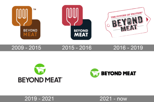
The logo sequence moves from a fork-and-square arrangement to a wordmark paired with a green circular animal emblem. A 2016 identity and packaging case study published by World Brand Design describes a tag device, rustic stamped typography, the company’s fork, and an animal symbol. The case study calls the animal a “veggie animal symbol”; later coverage of the identity has used “caped steer,” including Reel Chicago’s account of agency Stun’s work.
2009 – 2015
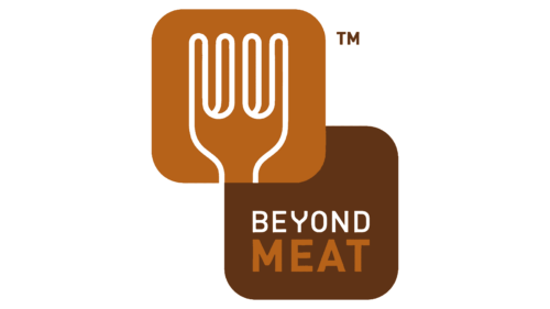
This artwork combines two overlapping rounded squares with a fork outline and stacked Beyond Meat lettering. The warm brown and orange blocks contrast with the later green emblem and horizontal wordmark. The date range is the label used for this stage in the visual timeline.
2015 – 2016
The overlapping-square layout remains, while the upper square changes to a vivid pink-red and the lower block to a dark blue. The fork stays prominent above the two-line name. The date range is the timeline’s label for this artwork.
2016 – 2019
The square blocks give way to a tag-shaped outline around a large, distressed-looking wordmark, with “The Future of Protein” above it. The 2016 redesign and packaging work was created by Bulletproof, according to the agency case study published by World Brand Design. That account also describes a fork within the stamped typography and an animal symbol as part of the broader packaging identity.
2019 – 2021
Here the green circular animal emblem sits above a large, dark wordmark. This is a more open arrangement than the enclosed tag design in the preceding stage. Reel Chicago reported that Stun worked as a branding and media partner on a new logo system and website tied to the “Go Beyond” campaign, and referred to the caped-steer logo.
2021 – Today
This stage places the green emblem to the left of the wordmark, creating a horizontal lock-up. The company’s 2025 move to the Beyond The Plant Protein Company name and its preference for Beyond as the primary brand superseded the Beyond Meat wordmark as the primary identity. Vegan Food & Living and Green Queen report that the branding rollout focused on the United States and Canada, while international sites continued to show Beyond Meat branding. The cited reports do not establish whether the animal emblem carries into the newer identity.
Emblem, lettering and color
The sequence contrasts the early fork-led square marks with later designs centered on an animal silhouette in a green circle. In the documented 2016 system, the fork and animal symbol complemented a stamped-looking wordmark and tag device. The later artwork uses a simpler emblem-and-name arrangement, first vertically and then horizontally. No font name or symbolic meaning is needed to describe these visible changes.
View the Beyond Meat logo archive entry.
Disclaimer
This article is part of the educational resources provided by Logo Index, an independent archive covering logos, visual identities and graphic design history. Beyond Meat and associated trademarks and brand assets remain the property of their respective rights holders where applicable.