The Breyers logo pairs a flowing script wordmark with a leaf. The lettering and leaf shift from a combined emblem to more separate arrangements and back again. Breyers began in Philadelphia in 1866, when William A. Breyer made ice cream; the brand’s official site connects its current quality pledge to that founding story. Breyers’ official site describes that pledge.
 Breyer’s Logo PNG
Meaning and history
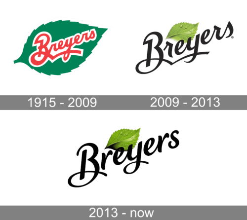
The green leaf is a documented part of the brand’s history: a company-history account dates its entry into the logo to about 1896, when Breyer’s sons established a wholesale plant. The same account traces the business’s growth from its 1866 beginnings. The company-history summary records the leaf and business milestones. The visual stages below are useful for comparing the mark’s changing layout; their labels alone do not establish when a design was introduced.
1915 – 2009
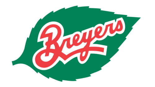
Here, red script sits across a broad green leaf, with a white outline separating the lettering from the foliage-shaped background. The leaf and wordmark form a single compact emblem. The red letters stand out against the green field, while the irregular leaf edge gives the mark a more elaborate silhouette than the later wordmark-led versions.
2009 – 2013
The next arrangement separates the dark script from the leaf: the lettering sits in front, while a smaller green leaf rises behind it. Compared with the previous emblem, the leaf no longer surrounds the wordmark. The lighter background and simpler overall outline make the lettering the most prominent element.
2013 – Today
In this stage, the green leaf overlaps the upper part of the black script, returning the two elements to close contact without enclosing the name. The wordmark and leaf sit together on a plain ground. The image preserves the heading’s “Today” label, but that label does not by itself confirm present-day use.
How the logo’s elements work together
The consistent ingredients across the displayed stages are the script treatment of the name and a green leaf. Their relationship does the most visible work: the earliest shown emblem sets the wordmark on the leaf, the next places the leaf behind it, and the final stage brings the leaf across the lettering. The green leaf motif is also documented in the brand’s earlier history, while the images show the particular changes in color and placement.
Ownership
Breyers passed to National Dairy Products Corporation in 1926, later moved through the Kraft corporate chain, and became part of Unilever’s ice cream business in 1993. Unilever announced a separation of that business in 2024. The demerger completed on 6 December 2025, placing Breyers within The Magnum Ice Cream Company; Unilever retained a minority stake. Reference for Business summarizes the earlier ownership history, while Food Ingredients First reports the demerger and resulting ownership structure.
Disclaimer
This article is part of the educational resources provided by Logo Index, an independent archive covering logos, visual identities and graphic design history. Breyer’s and associated trademarks and brand assets remain the property of their respective rights holders where applicable.