 A24 Logo PNG
A24’s identity is built around a four-character wordmark. New York design agency GrandArmy describes the brief as a request for an identity that felt modern and progressive while nodding to golden-age, mid-century Hollywood. The resulting wordmark and related launch materials included a pre-roll animation, website design and printed collateral. GrandArmy’s project description outlines the brief and work.
The A24 wordmark
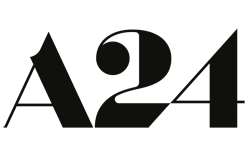
The logo is a wordmark, not a symbol paired with a name: A, 2 and 4 form the entire mark. Its custom-drawn, high-contrast letterforms give the three characters a strong shared presence. The A has a prominent crossbar, the 2 has a rounded upper form and extended lower stroke, and the 4 has a long diagonal. These are visible features of the lettering; the documented design reference is the broader deco influence described by GrandArmy. Made Good Designs’ analysis also describes the letterforms as custom-drawn and high-contrast.
The corporate wordmark appears in black on white or white on black. Film posters and other title campaigns use their own artwork and color, giving the same compact mark a consistent role across very different visual settings. Collater.al describes A24’s use of film-specific logo treatments alongside the continuing wordmark. Read Collater.al’s account of the identity.
The animated film card
A24 also uses an animated card before films. The Audiovisual Identity Database describes a version that builds the letters from stripes and simple geometric shapes against a black field, and credits its 2D animation to Adam Grabowski at GrandArmy. The database’s A24 entry records the card and its animation credit.
2012 – Today
This stage shows the same A24 wordmark in black on white. Compared with the dark-on-dark treatment in the opening image, the high-contrast version makes the letterforms easier to read; the lettering itself is unchanged. The heading marks the identity’s broad span, not a documented redesign date. The research brief confirms the wordmark as A24’s current corporate identity.
A24’s later identity work includes marks for related projects rather than a replacement parent logo. In April 2025, the company introduced A24 Music with a separate record-and-oval mark, as Numéro reported. Creative Bloq also covered the label mark and a redesigned A24 website, a web treatment rather than a change to the parent wordmark. Creative Bloq’s report describes those developments.
Disclaimer
This article is part of the educational resources provided by Logo Index, an independent archive covering logos, visual identities and graphic design history. A24 and associated trademarks and brand assets remain the property of their respective rights holders where applicable.