 TREKOL Logo PNG
TREKOL Logo Meaning and History
 TREKOL’s identity has long combined mechanical and environmental imagery. Historical versions use a wheel or gear-like circular form together with a green leaf and the Cyrillic name ТРЭКОЛ.This pairing fits the company’s actual engineering focus: TREKOL develops vehicles that use very low ground pressure to travel over fragile terrain. The company specifically states that its vehicles can move across snow, marshland, loose sand and even water while exerting minimal pressure on the ground. [1]
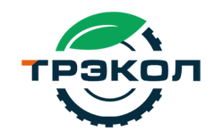
Early TREKOL Emblem
 The early emblem uses a heavy circular mechanical form with the Cyrillic TREKOL name around its lower edge. A green leaf appears at the top, creating a contrast between machinery and the natural environments in which the vehicles operate.It is reasonable to describe the circular form as mechanically inspired, but claims that black represents strength or green officially represents growth should be avoided unless supported by a company brand guide.
Later Metallic Emblem
 A later version retained the same basic concept but rendered it with a more three-dimensional metallic finish. The mechanical ring became more prominent, while the green leaf remained a recognizable part of the composition.The design therefore evolved mainly through styling and rendering rather than by replacing its core visual elements.
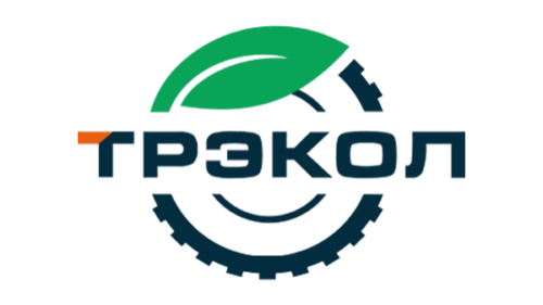
Modern TREKOL Logo
 The modern TREKOL identity simplifies the older emblem and combines it with a prominent green-and-orange Cyrillic wordmark. The circular mechanical form and leaf remain, preserving continuity with earlier versions.The strongest evidence-based interpretation is that the logo visually joins mechanical engineering with operation in natural terrain. More specific ideas such as sustainability, creativity or progress should not be presented as official meanings unless TREKOL documents them.
Why Ultra-Low-Pressure Tires Matter
TREKOL’s identity makes more sense when viewed alongside its core technology. The company says its specialists developed and justified a principle based on the relationship between total tire volume and vehicle mass to maximize off-road capability. [1]TREKOL also states that it became the first serial manufacturer of off-road vehicles using tubeless ultra-low-pressure tires. The company currently produces hundreds of vehicles per year. [1]TREKOL Since 1988
The company’s official history begins in 1988, when its specialists developed the principle that underpins its wheeled snow-and-swamp vehicles. Later milestones document the growing use of ultra-low-pressure tires and the development of specialized all-terrain vehicles. [2]Today, TREKOL operates from Lyubertsy in the Moscow region and continues to design, manufacture and sell its own all-terrain vehicles and tires. [3]Typography and Color
The TREKOL wordmark is usually rendered in bold Cyrillic lettering. Modern versions combine green and orange, while earlier emblems relied more heavily on black, white, green and metallic finishes.No authoritative source located for this article identifies a commercial typeface or assigns official psychological meanings to those colors.FAQ
What does the TREKOL logo represent?
The logo combines a mechanical circular form with a green leaf and the TREKOL name. Visually, it connects the company’s engineering focus with the natural terrain its vehicles are designed to cross.
When was TREKOL founded?
TREKOL says it has produced ultra-low-pressure-tire all-terrain vehicles since 1988. [1]
What does TREKOL manufacture?
TREKOL manufactures amphibious all-terrain vehicles and ultra-low-pressure tires designed for snow, swamps, sand and other difficult terrain. [1]
Who owns TREKOL?
The current official company is OOO NPF TREKOL, based in Lyubertsy, Moscow Region. The company’s own website does not identify Russian Mechanics as its owner. [3]
Disclaimer
This article is part of the educational resources provided by Logo Index, an independent archive covering logos, visual identities and graphic design history. TREKOL and associated trademarks and brand assets remain the property of their respective rights holders.