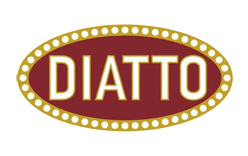
The Diatto logo is a horizontal oval carrying the name DIATTO in white capitals on a red field. It is a restrained mark from an era when Italian car badges were often elaborate, and it belongs to a Turin firm whose roots long predate the automobile. The badge as it is recognised today was adopted in 1909, the year the Italian partners ended their partnership with a French industrialist and gave the company an identity of its own.
 Diatto Logo PNG
Diatto logo history
The business began in 1835 as a carriage and wheelwright workshop opened by Guglielmo Diatto on the bank of the Po in Turin. Guglielmo died in 1864, and his sons expanded the workshop into railway rolling stock and trams. The car company came later and as a separate venture: on 12 April 1905, Guglielmo’s grandsons Vittorio and Pietro Diatto joined the French industrialist Adolphe Clément-Bayard to found Società Automobili Diatto–A. Clément. Cars from this period were sold as Diatto-Clément, marca Torino, built under Clément-Bayard licence.
The badge now associated with the marque dates from the moment that French tie was dissolved. At an extraordinary meeting on 30 June 1909 the partnership was wound up and the firm was reorganised as Officine Fonderia Fréjus – Vetture Diatto. According to the company’s official chronology, it was from this point that the new oval Diatto badge with a red background came into use. Museo Nicolis independently dates the same mark to 1909, describing an oval badge with white lettering on a red ground that appeared once the Diatto brothers had taken over Clément’s share. Two separate records therefore place the birth of the oval in the same year, which is unusually tidy for an early car badge.
A decade later the identity was formalised. On 5 June 1919 the Fréjus and Diatto trademarks were deposited, registering marks that were already in commercial use rather than creating new ones. The corporate name continued to change with the times, becoming Società Anonima Automobili Diatto in 1919 and Società Anonima Autocostruzioni Diatto in 1924, but the oval badge itself stayed recognisable.
What the Diatto badge looks like
The documented elements are few and clear. The shape is a horizontal oval, described in period material as the marque’s characteristic oval mark. The lettering is the company name in capitals, white against red. Writing about a Diatto Tipo 20, the specialist magazine Gazoline describes white lettering inside a red oval bordered by red dots on a white ground, a variant format that adds a dotted surround to the basic red-and-white scheme.
The most defensible reading of the mark is also the simplest: an oval whose content is the company’s own name, in the colour pairing that Turin sources consistently describe. Attempts to read deeper meaning into the red field tend to be modern interpretation rather than documented brand history.
The visual language of the period was shared across Turin. Aquila Italiana, another early Turin marque, also built its identity around a single pictorial emblem in the same years, which is a useful reminder that Diatto’s choice of a name-in-oval badge was one option among several rather than an obvious default.
The Bugatti resemblance
Because both marks are horizontal ovals carrying a marque name in capitals, the Diatto badge is frequently compared with Bugatti’s. Museo Nicolis notes the resemblance, and it is a reasonable observation about two marks that share a typographic format. The popular story that Ettore Bugatti modelled his own badge on Diatto’s is a different matter. Gazoline introduces it explicitly as legend rather than documented fact, which is how it should be treated: a widely repeated anecdote about two early motoring marks, not an established design debt in either direction.
After the cars: the mark and its revival
Car manufacture ended in 1929, with the final cars built that year and the accounts in deficit. The legal liquidation followed in the early 1930s. The corporate entity itself survived for far longer, producing spare parts, compressors and generators until it was absorbed by Veglio & C. on 25 July 1955, a detail preserved in the Museo dell’Automobile’s record of the marque.
The name returned in 2007, not as a production programme but as a centenary gesture. The Diatto Ottovù Zagato, its name a nod to the V8 engine, was shown at the Geneva Motor Show, commissioned by two private collectors and built by Zagato. Two cars were made. A 99-unit limited run was announced in 2013, but as contemporary reporting makes clear, that plan never reached series production. The revival material kept faith with the historic identity: a red field with white DIATTO lettering, the same combination the firm had settled on in 1909.
FAQ
What does the Diatto logo look like?
It is a horizontal oval with the word DIATTO in white capitals on a red background.
When did the Diatto oval badge first appear?
The company’s own chronology and Museo Nicolis both date the oval badge with white lettering on red to 1909, the year the Diatto brothers ended their partnership with Adolphe Clément-Bayard and reorganised the firm.
Why is the Diatto badge compared with Bugatti’s?
Both are horizontal ovals carrying a marque name in capital letters, which makes the resemblance easy to see. The claim that Bugatti copied Diatto’s badge is presented by the classic-car press as legend rather than documented fact.
Disclaimer
This article is part of the educational resources provided by Logo Index, an independent archive covering logos, visual identities and graphic design history. Diatto and associated trademarks and brand assets remain the property of their respective rights holders where applicable.