
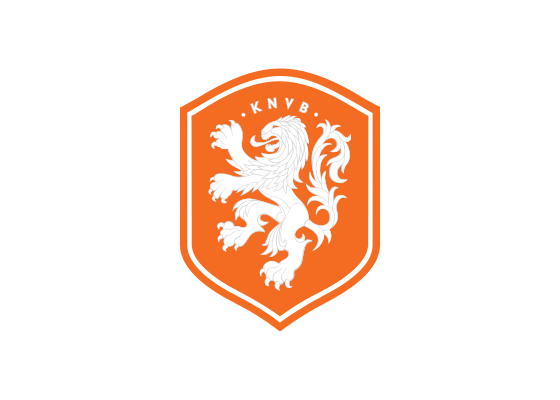
The Netherlands national football team, known as Oranje, is governed by the Royal Dutch Football Association (KNVB). The team’s visual identity centers on a shield-shaped crest featuring a lion, an emblem that has appeared on the Dutch jersey since 1907, when it debuted during a 3-1 win over Belgium.[1]
Design and History
The lion has been a consistent element of the Netherlands crest for over a century. In the 1960s and 1970s, the crest featured a bold, full-bodied black lion. In more recent years before 2014, the design evolved into a crowned lion’s head only.[2]
In 2014, to celebrate the 125th anniversary of the KNVB’s founding, Nike and the federation unveiled a new home kit with a redesigned crest. The new emblem enlarged the lion and changed its color to white, returning to a full-bodied, proudly rearing lion. The redesign was intended to symbolize a new era for Dutch football and the team’s core values of simplicity, honor, and unity.[2][3] The crest also incorporated the dates “1889” and “2014” beneath the shield, marking the association’s founding year and the anniversary.[2][4]
Nike’s global creative director for football, Martin Lotti, described the goal of the new kit and crest as marking a historic moment for the team, honoring past achievements while opening an exciting new chapter for Dutch football.[2]
Meaning and Symbolism
The lion is the national and royal animal of the Netherlands and has been part of the country’s coat of arms since Emperor Charles V first used it in 1515.[1] The KNVB logo incorporates the Dutch Republic Lion, and the animal first appeared on an Oranje jersey in 1907.[1]
The color orange is tied to the House of Orange-Nassau, dating back to William of Orange, a leader of the Dutch revolt in the 16th century. While the national flag uses red, white, and blue, orange remains the color of the royal house and is worn by various Dutch national sports teams.[1] The KNVB describes orange as the color that represents its DNA and serves as the worldwide symbol for its approach to football.[5]
Typography and Design
For the 2014 anniversary kit, Nike collaborated with legendary Dutch graphic designer and typographer Wim Crouwel to design the shirt names and numbers. Crouwel created a new typeface with a modern yet retro aesthetic, evoking the look of 1970s football. Each number also incorporated a small crest emblem at its base, referencing the royal association’s insignia.[2]
Logo Index is an independent educational archive covering logos, visual identities and graphic design history. All trademarks and brand assets remain the property of their respective owners.


