 Aptera Motors Logo PNG
The Aptera logo belongs to a solar-electric vehicle company whose name and symbol both use organic, lightweight visual ideas. The name Aptera comes from Greek and means “wingless,” a meaning the company itself confirms. [1]
The current emblem is more specific than many logo descriptions suggest. In a 2019 U.S. trademark filing, Aptera Motors Corp. described the mark as a stylized flower composed of an upside-down water droplet with a petal-like form around its pointed end. [2]
Aptera Logo Meaning and Design
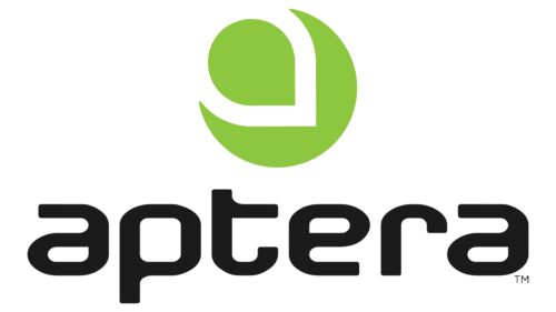
The modern Aptera identity combines a simple wordmark with an abstract organic symbol.
According to the company’s trademark description, the symbol is not officially defined as a wing, solar panel, aerodynamic body or letter A. It is described legally as a stylized flower built from a droplet and petal form. [2]
This distinction matters because many later interpretations try to connect every part of the symbol directly to Aptera’s aerodynamics or sustainability mission. Those ideas may fit the brand visually, but they are not the same as documented logo meaning.
What Does the Name Aptera Mean?
Aptera itself states that its name is Greek for “wingless.” [1]
The company’s trademark filing for the APTERA word mark also gives the English translation as WINGLESS. [3]
This makes the name one of the most clearly documented elements of the identity.
The word fits naturally with Aptera’s unusual vehicle design, which uses a highly aerodynamic three-wheel body, but the company does not need an invented “wing” interpretation in the logo itself for the name to make sense.
The Aptera Symbol
The standalone Aptera symbol consists of rounded organic geometry arranged into a compact circular composition.
The 2019 trademark application describes it as:
- an upside-down water droplet;
- a stylized petal surrounding the pointed end;
- an overall flower-like design.
The trademark specifically states that color is not claimed as a feature of the mark. [2]
That is stronger evidence than assigning the symbol broad meanings such as aerodynamic efficiency, sustainability or technological advancement without a designer statement.
Is the Aptera Logo a Flower?
Legally, yes, at least in the language used in Aptera’s trademark filing.
The U.S. filing categorizes the mark using design codes for a droplet, flowers and circular forms and describes the composition as a stylized flower. [2]
That does not mean viewers must interpret it only as a flower. Abstract marks can support multiple visual readings. But for factual logo history, the trademark description is the best documented explanation currently available.
Aptera Wordmark
The APTERA name is typically presented in a clean, modern sans-serif wordmark alongside or beneath the symbol.
The lettering is restrained and relatively wide, allowing the abstract emblem to remain the more distinctive graphic element.
No authoritative brand source located for this article identifies a commercial typeface used to create the logo. It is therefore more accurate to describe the lettering as a proprietary or customized sans-serif wordmark rather than assign it to an approximate font.
Aptera Logo Colors
The Aptera identity is frequently shown in black, white or other neutral treatments depending on the background and application.
Importantly, Aptera’s 2019 trademark application states that color is not claimed as part of the symbol. [2]
Claims that black represents precision, white represents sustainability or the monochrome palette symbolizes technological sophistication are therefore not documented logo meanings.
When Was the Current Aptera Logo Introduced?
The strongest documented date for the modern symbol is March 8, 2019, when Aptera Motors Corp. filed a U.S. trademark application for the design. The APTERA word mark followed on March 21, 2019. [4]
This timing closely matches the creation of the present company. Aptera Motors Corp. states in its 2025 annual report that it was formed in Delaware on March 4, 2019. [5]
That makes 2019 the key year for the identity used by the current Aptera Motors Corp.
The Original Aptera and the 2019 Relaunch
Aptera’s history is unusual because there are effectively two corporate chapters.
The original Aptera project began in the mid-2000s with Steve Fambro and Chris Anthony and developed highly aerodynamic three-wheeled prototypes. That company eventually ceased operations.
The present Aptera Motors Corp. was incorporated in 2019, with Fambro and Anthony returning to lead the revived project. The current company therefore should not simply be described as one uninterrupted legal entity founded in 2006. [5]
The modern logo belongs to this relaunched corporate phase.
How Different Was the Earlier Aptera Identity?
The earlier Aptera Motors Inc. also registered APTERA word marks and separate image trademarks during the late 2000s and early 2010s. [6]
That confirms the brand had an established visual identity before the 2019 relaunch, but the available trademark records do not provide enough context here to create a detailed year-by-year visual evolution without risking false precision.
For Logo Index, the more reliable distinction is:
- original Aptera era: mid-2000s to early 2010s;
- modern Aptera Motors Corp. identity: from 2019.
Why the Aptera Logo Fits the Brand
The logo can be analyzed visually without inventing symbolism.
The rounded symbol, restrained wordmark and absence of heavy automotive heraldry give Aptera an identity that looks more like a technology or sustainability company than a traditional car manufacturer.
That fits the context in which the brand operates. Aptera describes itself today as a solar mobility company focused on highly efficient transportation and integrated solar technology. [7]
The connection between visual simplicity and the company’s efficiency mission is therefore a reasonable design observation, but it should remain an observation rather than be presented as an official symbolic explanation.
Aptera’s Current Brand Identity
Aptera continues to use the same modern symbol and wordmark across its official website, media room and investor materials. The company maintains a dedicated brand section in its media resources, indicating that the mark remains part of its current identity. [8]
As of 2026, Aptera Motors Corp. is headquartered in Carlsbad, California, not simply San Diego, and its Class B shares trade on Nasdaq under the symbol SEV. [5]
Aptera Logo and Solar Mobility
The company’s current vehicle program is built around a three-wheeled solar electric vehicle with integrated photovoltaic cells.
Aptera’s official website currently describes approximately 700 watts of integrated solar cells, up to 40 miles of solar-powered driving per day and a target range of about 400 miles per full charge, while noting that the vehicle remains in testing and validation. [9]
This context helps explain why the identity appears frequently alongside themes of sunlight, nature and efficiency, but those business themes should not be retroactively assigned as hidden meanings to every element of the logo.