All That is a Nickelodeon sketch-comedy series created by Brian Robbins and Mike Tollin. It premiered in 1994, returned in 2002, and was revived in 2019. Across those periods, its logo changed from a red-lettered oval design to a black wordmark surrounded by splatter-like marks. The series premiered on April 16, 1994, and its original run ended in 2005, with a break between 2000 and 2002, according to The Atlantic.
 All That Logo PNG
Meaning and history
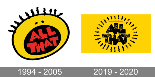
The two designs use different approaches to the show’s name. In the original-era mark, red “ALL THAT” lettering sits at an angle inside a dark oval, surrounded by a broad, irregular yellow shape. The revival design makes the words themselves the main feature, using heavy black letters and scattered black marks against yellow. These are visible differences in the artwork, rather than documented explanations of the designs’ meaning.
1994 – 2005
The original-era logo pairs its slanted red title with an oval center and a yellow outer shape. Small dark details break the edge of the yellow form, giving the mark an uneven outline. The series ran from 1994 to 2000, then returned from 2002 to 2005; Nickelodeon’s account describes the original series as spanning 10 seasons and 171 episodes across 1994–2005. The network’s revival announcement gives that total, while the dates show that the range includes a hiatus.
The original mark also appeared in later Nickelodeon nostalgia contexts, including the TeenNick block The ’90s Are All That and a 2016 cast reunion, according to the series timeline. The block’s identity changed separately: it later became NickRewind, a rebrand reported by Promax.
2019 – 2020
The revival-era artwork replaces the oval composition with stacked black “ALL THAT” lettering. Distressed patches and scattered marks surround the title on a yellow field, creating a more fragmented outline than the original logo. The revival premiered on June 15, 2019, and its final episode aired on December 17, 2020. Paramount’s announcement identifies the premiere date; the finale date is recorded in the series history.
The two stages are easy to distinguish at a glance: the earlier logo frames red lettering inside an oval, while the revival puts black lettering and scattered marks directly on yellow. The 2019–2020 mark belongs to the revival period, which ended in 2020.
Disclaimer
This article is part of the educational resources provided by Logo Index, an independent archive covering logos, visual identities and graphic design history. All That and associated trademarks and brand assets remain the property of their respective rights holders where applicable.