Holden was the Australian car maker based at Fishermans Bend in Victoria, and its lion badge became one of the most recognisable automotive emblems in the country. The business began in Adelaide in 1856 as a saddlery and carriage-trimming firm, moved into car bodies in the early twentieth century, and merged with General Motors in 1931 to form GM-H. The lion, notably, arrived decades before the first Holden car did.
 Holden Logo PNG
What the lion and stone mean
Two parts of the design are properly documented. The brief came first. Holden’s Motor Body Builders commissioned a new emblem in 1927, and the design was to follow the lion used as an Egyptian-revival motif at the 1924 British Empire Exhibition at Wembley (ABC News). The company needed something simpler than what it already had: its existing corporate device, a winged figure on a brass plate, carried far more detail than could be embossed on a car body or stamped into a badge (Powerhouse Collection).
The second documented layer is the stone. The sculptor Rayner Hoff, who took the commission, raised one paw onto a sphere, drawing on the legend that the wheel was suggested by a lion rolling a stone. That story is why the mark is nicknamed the lion and the stone, and the wheel reference is Hoff’s addition rather than part of the original brief (Powerhouse Collection). General readings of the lion as an emblem of power or courage circulate widely, but the documented symbolism rests on the Wembley motif and the wheel legend.
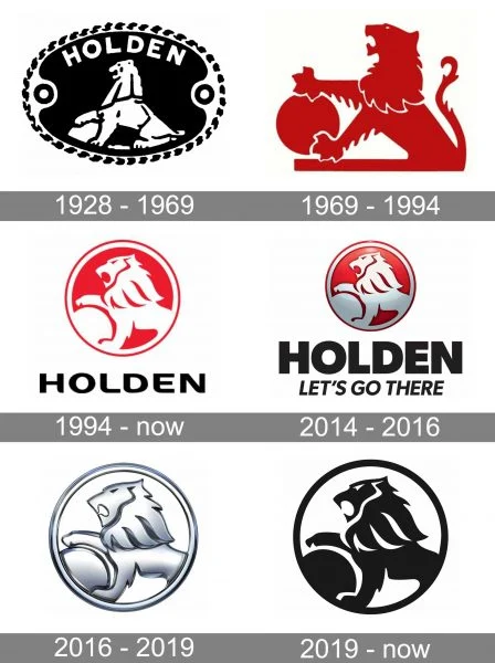
Illustrated timelines of the Holden badge are common, and they are useful for orientation. This composite collects several stages of the emblem side by side; the individual pieces inside it are not dated, so it works as an overview rather than as evidence for any single year.
1927 to 1939: Rayner Hoff’s badge
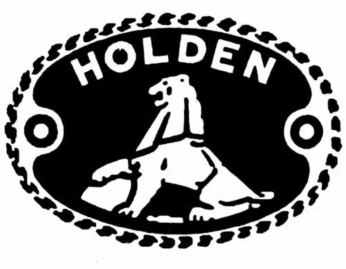
Hoff produced a plaster maquette of the design, now held in the Powerhouse collection, and the finished emblem was applied to Holden bodies as die-cast and pressed metal nameplates from 1928 to 1939. These carried the lion together with the word Holden, and the design was taken up as the company’s advertising trademark. Surviving badges from the period show the lion in profile with its paw on the stone. Sources describe a rectangular nameplate rather than an elaborate frame, so the ornate oval surround with an arched wordmark that is sometimes attached to this period is not corroborated by the archival record.
1948 and 1972: the documented redraws
A revised version of the emblem appeared on 29 November 1948, when the Holden 48-215, the first mass-produced Australian car, was unveiled by Prime Minister Ben Chifley. Red-enamelled lion badges were also used on Holdens of the late 1950s, which is where much of the red association in the mark begins. The next documented redraw came in 1972, when the lion was reworked into a freer silhouette that dropped the tighter drawing of the earlier plates.
Emblems from the middle of the century often render the lion in red on a light ground, and that form still appears on signage and merchandise. The surviving artwork is frequently labelled 1969 in circulation, but the recorded redraws are the 1948 and 1972 versions, and a 1969 restyle is not supported by the available record.
1994: the red rondel
In 1994 the emblem was reworked into the form most people now picture: a white lion and stone inside a red circle, with the Holden wordmark beneath it. Drive’s account of the brand’s identity credits the design to Richard Ferlazzo (Drive). The white lion reads clearly against the solid red field, which is what made the rondel work at small sizes on grilles, keyrings and dealer facades.

Mid-2010s: a three-dimensional badge
Through the early and mid-2010s the badge took on a glossier, button-like appearance, with a red background and gradient shading that gave the lion a metallic sheen. The red version of that badge stayed in use until the brand’s next refresh.

The red went in the overhaul announced on 31 August 2016. Holden dropped the red background, restyled the lion in a chrome finish, and moved its wordmark from bold capitals to upper and lower case, with new advertising work handled by AJF Partnership (The Sydney Morning Herald; GoAuto). Reporting on the same refresh noted that the lion silhouette itself was carried over from the 1994 design (Drive). The line “Let’s go there” that is sometimes attached to the badge was a January 2015 advertising campaign under marketing director Bill Mott, not a permanent element of the logo lockup.

Retirement and later marks
Holden stopped manufacturing in Australia in 2017. In February 2020 General Motors announced that the brand would be wound down and retired by the end of 2020 and into 2021 (Xinhua). The silver lion is therefore the last corporate form the marque used; a separate flat black version dated to 2019 is not documented. Identities such as the Holden Racing Team’s lion-and-helmet badge and dealer signage belong to those sub-brands rather than to the corporate emblem’s own chronology.
FAQ
Who designed the Holden logo?
The lion and stone emblem was designed by the sculptor Rayner Hoff, who was commissioned by Holden’s Motor Body Builders in 1927. A plaster maquette of his design is held in the Powerhouse collection, and the finished badges were fitted to Holden bodies from 1928 to 1939.
What does the Holden lion and stone mean?
The sphere under the lion’s raised paw refers to the legend that the wheel was suggested by a lion rolling a stone. The overall composition follows the lion motif used at the 1924 British Empire Exhibition at Wembley.
Did Holden ever use a winged emblem?
Yes. Before the lion was introduced, Holden’s corporate device was a winged figure carried on a brass plate. It was judged too detailed for embossing and was replaced by Rayner Hoff’s lion from 1928.
Disclaimer
This article is part of the educational resources provided by Logo Index, an independent archive covering logos, visual identities and graphic design history. Holden and associated trademarks and brand assets remain the property of their respective rights holders where applicable.