 Fleur du Mal Logo PNG
Fleur du Mal’s logo and identity
Fleur du Mal is a New York lingerie and ready-to-wear brand founded by Jennifer Zuccarini in late 2012. Its name comes from Charles Baudelaire’s 1857 poetry collection Les Fleurs du mal. The literary reference gives context to the brand’s pairing of beauty with a darker edge. WWD covered the label’s launch and the origin of its name.
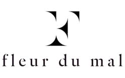
Base Design describes the identity’s F monogram as “based on razor-sharp rose thorns.” The agency characterizes the idea as structurally strong yet fragile and beautiful. In the stage image below, the large, compact emblem contrasts with the slender, widely spaced letters of the Fleur du Mal wordmark; the lead image presents the wordmark on its own. Base Design credits its studio with the identity.
Wordmark, monogram and tagline
The two supplied logo images show different arrangements: one contains the wordmark, while the other places the F emblem above it. This contrast makes the monogram a prominent graphic element without obscuring the full brand name. Base Design also lists “Love Hurts” as part of the identity and says the mark was applied to minimalist packaging and event invitations. The studio describes the art direction as raw and avant-garde.
2012 – Today

This stage image brings the monogram and wordmark together in a vertical composition. Its heading labels the stage “2012 – Today”; the image itself shows the arrangement, but does not establish when it was introduced or whether it is currently used. Base Design’s case study documents the founding identity concept and its applications, while the two supplied images offer a visual comparison of the standalone wordmark and combined lockup.
Disclaimer
This article is part of the educational resources provided by Logo Index, an independent archive covering logos, visual identities and graphic design history. Fleur du Mal and associated trademarks and brand assets remain the property of their respective rights holders where applicable.