 Loewe Logo PNG
Meaning and history
Loewe began as a leather workshop in Madrid in 1846. The house takes its name from German merchant Enrique Loewe Roessberg, who took over the business; Loewe’s English-language history dates the name to 1872. The house describes itself as the world’s second-oldest luxury fashion house, after Hermès. Loewe’s history recounts the workshop’s origins and the name’s adoption.

The collage contrasts an older, heavier serif treatment, shown with “Madrid 1846,” with a more spacious, high-contrast LOEWE wordmark. These are visual examples, not evidence that one design remained unchanged throughout the period named in the heading. Jonathan Anderson told The New York Times that the logo had changed almost every decade, and described a display of past versions at the Madrid headquarters.
1846 – 2014
The date 1846 marks the Madrid workshop’s beginnings, not the creation of the wordmark shown here. The image presents a bold serif LOEWE with “Madrid 1846” beneath it; its letterforms contrast with the lighter, more widely spaced treatment shown in the later stage. The brand’s changing marks are better understood as a sequence of redesigns than as one logo spanning this entire period. Anderson’s interview with The New York Times describes the repeated changes.

2014 – present
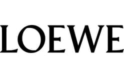
On 4 June 2014, Loewe unveiled a new graphic identity developed with M/M (Paris). The redesign included a redrawn wordmark, a simplified Anagram and new packaging, as reported by FashionUnited and WWD. The stage image shows the uppercase wordmark: its sharp serifs and pronounced contrast between thick and thin strokes give it a formal, high-contrast appearance.
The accompanying Anagram consists of four interlocking, mirrored L forms. Spanish painter Vicente Vela created it in 1970. For the 2014 redesign, M/M (Paris) simplified the monogram with reference to its origin as a branding iron used to mark cattle and leather, according to Brandemia. The wordmark and Anagram serve different roles: one spells out the name, while the compact monogram can stand on its own.

The 2014 identity remains the documented current system. Loewe’s site continues to present the LOEWE wordmark and Anagram, and FashionUnited’s 2026 account notes the same identity at the house’s 180-year milestone. Loewe’s site and FashionUnited Australia provide those current and milestone references.
Lettering and packaging
The 2014 wordmark draws on the lettering of typographer Berthold Wolpe, a reference to the founder’s German roots. The design credit and reference are reported by WWD; the evidence identifies an inspiration, not a named licensed typeface. Its high-contrast capitals give the name a distinct silhouette, while the interlocking Anagram offers a more compact emblem.
The 2014 redesign also introduced packaging in Humo, a smoky-white shade. Its boxes draw on the appearance of library books and archive boxes, extending the identity beyond the wordmark and monogram. Brandemia reports these packaging details.
Disclaimer
This article is part of the educational resources provided by Logo Index, an independent archive covering logos, visual identities and graphic design history. Loewe and associated trademarks and brand assets remain the property of their respective rights holders where applicable.