 Mo Logo PNG
MO is a Portuguese fashion retailer whose legal name is Modalfa – Comércio e Serviços, S.A. The company began as Modalfa under Sonae and became MO in 2013. Sonae completed the sale of MO and Zippy to a consortium including MO chief executive Francisco Pimentel and Fundo Mercúrio in July 2025, as Sonae announced.
Meaning and history
Sonae’s 2009 annual report lists the launch of Modalfa in 1995. In 2013 the name changed to MO, described as an abbreviation and evolution of Modalfa. Briefing’s interview about the rebrand also reports that Brandia Central developed the identity and that MO’s general director called its logo signature-style.

The logo has three visual stages: a coloured Modalfa badge, a lowercase Modalfa wordmark and the flowing MO lettering. The first two dates are labels in this image sequence; the documented identity change is the 2013 move from Modalfa to MO.
1995 – 2006 (Modalfa)
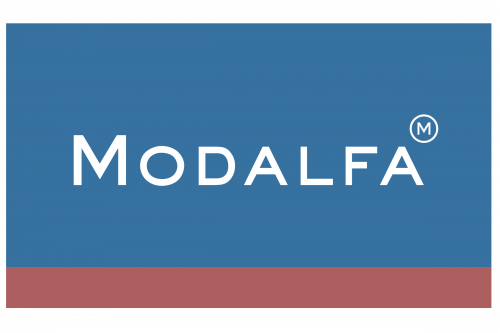
The first stage shown is a white Modalfa name inside a blue rectangle, with a narrow muted-red band along the bottom. The upright, widely spaced capitals contrast with the flowing lettering of the later MO identity. Sonae documents Modalfa’s 1995 launch, but the image’s date range should be read as an archive label rather than a verified logo-change period.
2006 – 2013

The middle stage replaces the framed capital-letter treatment with a simple lowercase “modalfa” wordmark in black. Its unboxed, rounded lettering is visually quieter than the earlier badge and differs from the connected script of the MO mark. The 2006 date comes from the archive sequence; it is not established as the date of a documented redesign.
2013 – present (Mo)

The MO mark is drawn as a connected, signature-style wordmark, with the two letters flowing together rather than appearing as separate typeset capitals. Briefing’s 2013 account credits Brandia Central and describes the new brand as an evolution of Modalfa. The company presented MO as an abbreviation and associated it with proximity and family.
The change extended to stores: Hipersuper reported that 96 Portuguese stores completed the rebranding in about three months. MO is still identified by that name; Sonae’s 2025 announcement documents the change in ownership, not a replacement identity.
Lettering and color
The available reporting describes the MO logo as signature-style but does not name a typeface. Visually, the earlier stages contrast a framed blue-and-red badge and a plain lowercase wordmark with the dark, connected MO lettering. These are observations of the reproduced marks, not documented statements of brand color or design symbolism.
Disclaimer
This article is part of the educational resources provided by Logo Index, an independent archive covering logos, visual identities and graphic design history. Mo and associated trademarks and brand assets remain the property of their respective rights holders where applicable.