 New Look Logo PNG
New Look is a British fashion retailer founded in Taunton in 1969 by Tom Singh. Its first store opened with about £5,000 borrowed from his parents, according to The Independent.
Meaning and history

The timeline shows the name moving between outlined lettering, a teal emblem, and simpler wordmarks. The early stage dates below are retained as labels for the pictured sequence; independently documented redesigns include a 2003 identity by Tandem and a 2008 identity developed by Gary Holt at SomeOne. Campaign reported the Tandem redesign, while Design Week covered the SomeOne work.
1985 – 1987

This version uses outlined uppercase letters with repeated parallel strokes, giving the wordmark a strongly patterned appearance.
1987 – 1989

The lettering remains outlined and uppercase, but the forms are more open and less densely striped than in the preceding design.
1989 – 2001

A teal square containing a line-drawn face now separates the widely spaced teal letters of “NEW” and “LOOK.” This is the sequence’s clearest move away from a wordmark alone.
2001 – 2003

The emblem disappears, leaving a lowercase “new look” wordmark in dark blue. Its simple lettering contrasts with the preceding face-and-square design.
2003 – 2012

The 2003 Tandem identity replaces conventional letterforms with large curved shapes and a small pink dot, with “look” set below in pink. Campaign reported that the design was rolled out across stores, packaging, bags, trucks, and the website. Campaign also reported New Look’s entry into menswear that year.
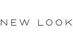
2012 – Today

This timeline stage shows a thin, uppercase black wordmark with widely spaced letters. Its heading is part of the supplied chronology, not confirmation that the design is in use today. FashionNetwork reported a later rebrand featuring a light-blue lockup and the slogan “New Look & Me.” FashionNetwork
Documented identity changes
In 2008, SomeOne’s Gary Holt developed a new visual identity for a New Look store concept at Liverpool One; Design Week reported that the work was still under review. Design Week Later, Drapers reported that New Look was consolidating at least seven existing logos into a single mark. Drapers
Disclaimer
This article is part of the educational resources provided by Logo Index, an independent archive covering logos, visual identities and graphic design history. New Look and associated trademarks and brand assets remain the property of their respective rights holders where applicable.