Meaning and history
OBEY refers to two related but distinct projects: Shepard Fairey’s OBEY GIANT street-art campaign, begun in 1989, and OBEY Clothing, the Irvine-based apparel brand launched in 2001. Their shared imagery links the projects, but the campaign and clothing company are not the same entity. The Guardian and the Los Angeles Times describe the campaign’s origins and the later apparel label.
Fairey made the first “Andre the Giant has a Posse” sticker in 1989 while studying illustration at the Rhode Island School of Design. It used a newspaper photograph of professional wrestler André René Roussimoff, known in the ring as André the Giant. The original sticker did not include the OBEY wordmark; the face was later simplified and the word added. Cranbrook Art Museum traces the campaign’s early development, while The Guardian dates the redesign to 1995.
The later face is called the Icon Face by OBEY Clothing, which describes it as “a bold symbol of counterculture.” The brand’s timeline connects the identity’s visual references with Orwell’s Big Brother, Russian Constructivist posters and Barbara Kruger’s use of typography and color. The word “OBEY” also draws on John Carpenter’s 1988 film They Live. Fairey told Juxtapoz that the film’s lettering was styled after Kruger’s typography.
Fairey has said the original sticker “has no meaning” beyond prompting people to react and search for meaning. He also explained that he chose “obey” to call attention to people following agendas without questioning them, in an interview with Juxtapoz. OBEY Clothing presents the imperative as a prompt to notice propaganda and describes its ideology as rooted in self-empowerment on its About page.
2001 – Today
OBEY Clothing launched in 2001, with Fairey credited as founder and creative director. The business arrangement is more involved than a single artist-owned label: the Orange County Business Journal reported that Don Juncal and three partners funded the venture, and that the clothing maker licensed designs from Fairey’s Obey Giant Art Inc. The campaign’s face and slogan thus carried into apparel through a documented licensing relationship.

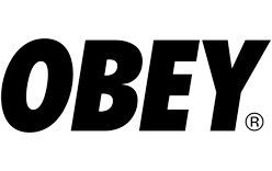
The wordmark shown for this stage spells OBEY in bold, condensed uppercase letters. In the image, black letters sit on a white field, with a registered mark at the lower right. OBEY Clothing also uses the wordmark reversed in white on dark backgrounds, according to its brand materials. The brand’s current timeline and product activity confirm that OBEY Clothing remains active; the wordmark stage is not a retired identity.
Alternative emblems
This framed treatment makes the Icon Face the focal point, using thick black shapes and a rectangular border against white. It differs from the wordmark stage above: there is no visible OBEY lettering, so the face alone carries recognition. OBEY Clothing’s own timeline identifies this portrait as the Icon Face.

Wordmark and color
The wordmark’s condensed, heavy sans-serif capitals give it the direct, sign-like presence of a command. The pictured black-on-white version keeps the letterforms prominent; reversing the same basic treatment to white on a dark field preserves that contrast. Red, black and white recur across OBEY identity materials. The brand relates its palette and graphic approach to Constructivist poster design and Kruger’s use of font and color, rather than identifying a specific typeface or designer for the wordmark. OBEY Clothing’s timeline provides that account.
Disclaimer
This article is part of the educational resources provided by Logo Index, an independent archive covering logos, visual identities and graphic design history. Obey and associated trademarks and brand assets remain the property of their respective rights holders where applicable.