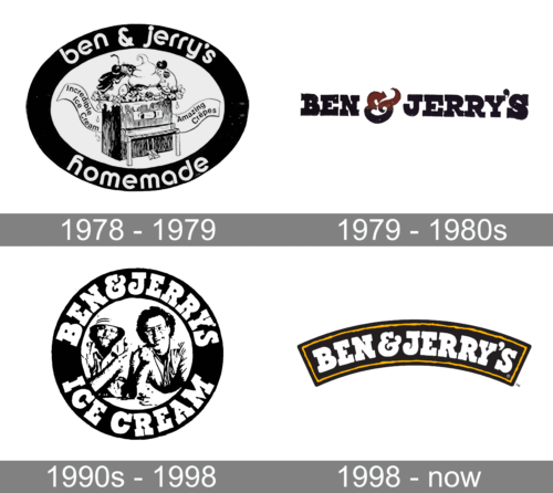
Ben & Jerry’s began in Burlington, Vermont, in 1978, founded by Ben Cohen and Jerry Greenfield. Its logo history moves from an illustrated piano to a wordmark and founder portrait, before the arched-banner design introduced in 1998. That banner remains the brand’s current mark, according to reporting on the brand and its parent company’s 2025 restructuring (The Boston Globe; Reuters).
 Ben & Jerry’s Logo PNG
Meaning and history
The founders opened their first shop in a renovated gas station in Burlington. The earliest logo’s piano illustration reflects the founders’ music and arts interests, as described in a history of the brand’s early marks (Tasting Table).
1978 – 1979
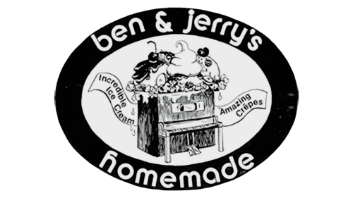
The first mark placed an illustrated piano topped with three scoops of ice cream inside a black oval. Lowercase lettering around the frame read “Ben & Jerry’s Homemade.” Its combination of picture and enclosing oval made it more illustrative than the wordmark that followed. Tasting Table describes this design as lasting about a year (Tasting Table).
1979 – 1980s
The piano scene gave way to a simpler “Ben & Jerry’s” wordmark. The names became the focus, with a multicolored ampersand between them. This was a clear move away from the first logo’s framed illustration, while keeping both founders’ names prominent (Tasting Table).
In 1983, Ben Cohen commissioned Vermont artist Woody Jackson to paint Holstein cows for a billboard and T-shirt; the cow illustrations were later licensed for brand packaging, according to Canny Creative (Canny Creative). The cow imagery would also feature in the later banner identity.
1990s – 1998
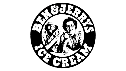
This version arranged “Ben & Jerry’s Ice Cream” around a black-and-white portrait of the co-founders. In contrast to the earlier wordmark, the circular layout made the founders’ image the central feature (Tasting Table).
1998 – Today
A packaging redesign was announced in June 1997, with San Francisco firm Primo Angeli Inc. engaged for the work; the new packaging was expected in stores by 1998 (Los Angeles Times). The logo’s arched black banner carries a white wordmark outlined in yellow above a pastoral scene with Holstein cows, blue sky and green hills. The banner and landscape create a broader, more scene-like composition than the portrait roundel it replaced (Canny Creative).
The current mark retains that arched wordmark as its most prominent element. The brand’s parent changed when Unilever’s ice cream business became The Magnum Ice Cream Company in July 2025; Reuters reported that the new company listed in December and that Ben & Jerry’s remained among its brands (The Boston Globe; Reuters).
Disclaimer
This article is part of the educational resources provided by Logo Index, an independent archive covering logos, visual identities and graphic design history. Ben & Jerry’s and associated trademarks and brand assets remain the property of their respective rights holders where applicable.