Cap’n Crunch is a Quaker Oats cereal introduced in 1963. Its mascot is Horatio Magellan Crunch, captain of the S.S. Guppy, and Quaker Oats has been part of PepsiCo since 2001, according to the brand’s history page.
 Cap’n Crunch Logo PNG
Meaning and history
The identity pairs a bold, chunky wordmark with a cartoon naval captain. The character’s bicorne hat bears a “C”; his blue coat and gold epaulettes echo the navy-and-gold packaging palette. The lettering and character are arranged together in different ways across the archive images. Design commentary describes the palette as navy and gold, but no official typeface or colour specification is established in the cited material (Made Good Designs).
1963 – 1969
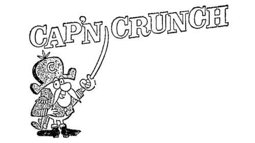
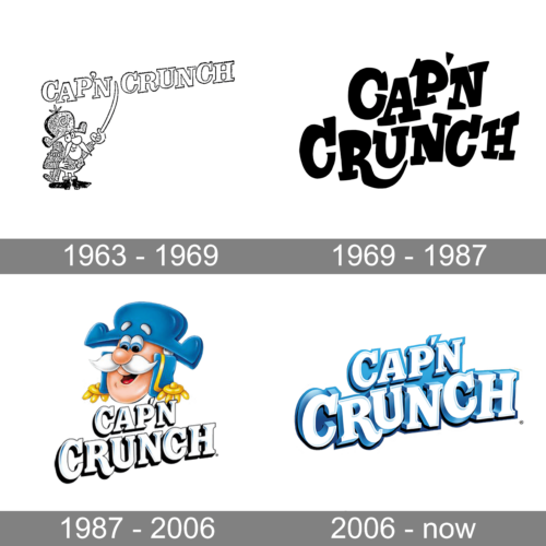
This archive image shows white line art against black: a small captain beneath the arched Cap’n Crunch name. The cereal launched in 1963, and Quaker’s television campaign was produced by Jay Ward Productions, according to the Reporter-Herald. The image documents this particular treatment, not necessarily every version used during the period.
1969 – 1987
The supplied stage image appears black, with no discernible logo artwork to compare. The heading is retained as an archive label; it does not establish that the character disappeared from packaging during this period.
1987 – 2006
Here, the captain appears in colour above a stacked wordmark. The figure and lettering are tightly grouped, with outlined, dimensional-looking letters. A design-history article places a mascot makeover around 2005, but the archive range itself should be read as a label rather than a verified redesign chronology (PopIcon).
2006 – Today
This stage image focuses on the blue-and-white wordmark. In July 2023, reporting on the cereal’s 60th anniversary described an update to the captain’s uniform: four gold sleeve stripes on US packaging, replacing the three-stripe version that had prompted rank-related coverage in 2013. The report also named Haugaard Creative Group as a design partner (Firewire). The 2023 change updated the character rather than replacing the wordmark-led identity.
A 2025 Orange Creampop Crunch box used a flavour-specific character treatment, with a short-sleeved shirt and sunglasses, as Yahoo Life reported. It is a packaging variation, distinct from the core captain-and-wordmark identity.
Disclaimer
This article is part of the educational resources provided by Logo Index, an independent archive covering logos, visual identities and graphic design history. Cap’n Crunch and associated trademarks and brand assets remain the property of their respective rights holders where applicable.