 BabyRuth Logo PNG
Baby Ruth is a candy bar created by Curtiss Candy Company. Today it is a Ferrara Candy Company brand, with Ferrara part of the Ferrero Group (Food Business News). Across the wrapper examples shown here, the name remains the most prominent feature, usually rendered in red.
Meaning and history
The bar was developed from Curtiss’s Kandy Kake and introduced around 1920, with nationwide marketing following in 1921 (Candy Hall of Fame; History). Its name has a contested story: Curtiss said it honored Ruth Cleveland, while later accounts have treated that explanation as a way to avoid paying for the association with baseball star Babe Ruth. A 1926 trademark dispute brought the connection into court, and Curtiss prevailed in 1931 (History; The New York Times).
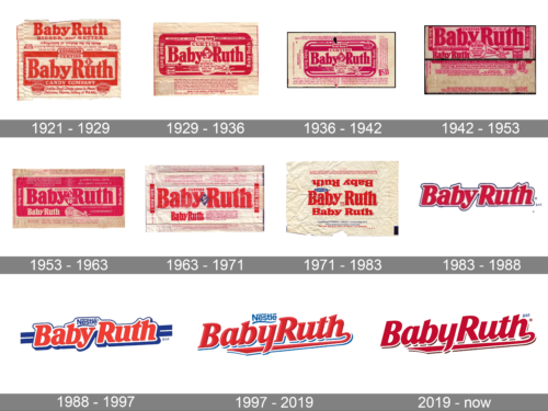
The timeline below preserves a series of wrapper examples. Its date headings are useful labels for comparing the pictured designs; they should not be read as proof that each boundary marks a documented logo redesign.
1921 – 1929
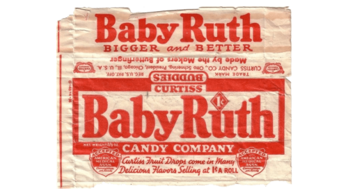
This wrapper places “Baby Ruth” in large red lettering within a rectangular panel. Smaller copy, Curtiss branding, and decorative details share the package, so the name is prominent without standing alone. The bar was marketed nationally from 1921 (Candy Hall of Fame).
1929 – 1936
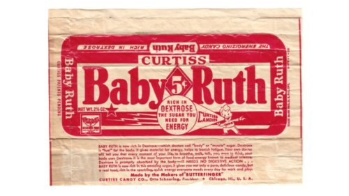
The red field now dominates the visible label, with the name reversed out in light lettering and set across most of its width. Smaller messages and a central badge add detail around the wordmark. Curtiss also used radio promotion, sponsoring The Baby Ruth Hour in 1929 (Wikipedia).
1936 – 1942
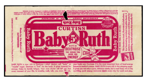
This example keeps the large, light-colored name against red, surrounded by product copy and small graphic elements. The wrapper’s dense layout contrasts with the simple, readable wordmark at its center. Curtiss-era advertising also used dextrose and energy claims, including the NRG mascot (Chicago Stories).
1942 – 1953
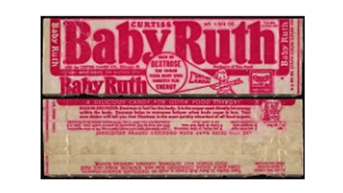
The brand name continues to run prominently across a red panel, while smaller lettering fills the remaining wrapper space. The strong color contrast keeps the name easy to pick out despite the surrounding copy.
1953 – 1963
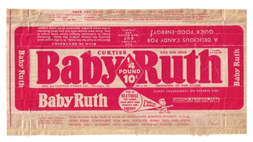
Here the wordmark appears in a large light panel framed by red, with a second, smaller Baby Ruth name below. The repeated name and dense package copy give the wrapper a busier look than a standalone logo. Curtiss founder Otto Schnering died in 1953 (Candy Hall of Fame).
1963 – 1971
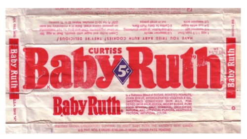
The name again fills a broad light area in red lettering. A small diamond interrupts the middle of the wordmark, while a second version of the name and product information sit below it. The wrapper retains a strong red-and-light contrast.
1971 – 1983
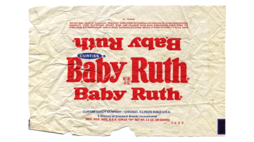
This package example shows the name more simply against a light ground, with a small Curtiss mark nearby. The image is oriented upside down, but the large red lettering remains the dominant feature.
1983 – 1988
The wrapper detail gives way to a compact wordmark: red lettering with a pale outline and little surrounding copy. Compared with the earlier package examples, the name reads more clearly as a standalone graphic.
1988 – 1997
Nestlé branding appears above the red Baby Ruth name, which is set against blue horizontal bands and a light outline. The added corporate name and background stripes distinguish this treatment from the simpler preceding example.
1997 – 2019
The red wordmark grows larger and more open in this version, with an underline extending beneath the name. Nestlé remains above it, while the blue elements provide contrast without taking focus from Baby Ruth.
2019 – Today
The current stage keeps the red Baby Ruth wordmark as the central element, now shown without the Nestlé name or blue bands in the preceding example. Ferrara relaunched the bar in December 2019 with refreshed packaging, including a double-layer metallic wrapper and a cleaner, brighter label, while also changing the recipe (Confectionery News; Packaging Digest). The bar was named Product of the Year in the candy bar category for 2020 (Confectionery News). A 2025 Ferrero certification listing includes Baby Ruth, confirming the brand’s continued presence (Ferrero Foodservice).
Disclaimer
This article is part of the educational resources provided by Logo Index, an independent archive covering logos, visual identities and graphic design history. BabyRuth and associated trademarks and brand assets remain the property of their respective rights holders where applicable.