 All-Out Sundays Logo PNG
All-Out Sundays is a GMA Network variety show that premiered on January 5, 2020, succeeding Sunday PinaSaya in the Sunday Grande sa Hapon block, as PEP reported. Its logo history, as shown here, moves from vivid, busy lettering to a black oval treatment, a bright dimensional wordmark and an abbreviated AOS design.
Meaning and history
The show’s December 2019 teaser used the line “Ready na ba kayong mag-all-out?” and an early singular form, All-Out Sunday, before the broadcast title became All-Out Sundays. The program’s history records that teaser context. The visuals below show how the title and its presentation changed across the stages.
2019 (Prototype)
This design sets the singular title across a cyan field patterned with pale zigzags and radiating streaks. The letters use multiple bright colors and varied treatments; a smiling face appears in place of the O in “OUT.” The composition is lively and crowded, with the title spanning the center.
2020 — 2021
The title is now plural and arranged in two lines, with “SUNDAYS” directly below “ALL-OUT.” Multicolored lettering, the face-shaped O and radiating lines carry over from the prototype, while the wider layout gives the stacked title more room.
2021 — 2024
This stage replaces the bright cyan field with a dark oval centerpiece. White “ALL-OUT SUNDAYS” lettering sits inside it, flanked by rounded forms; small colorful symbols and splashes cluster around the oval. Compared with the earlier stages, the title is less dependent on multicolored letters for emphasis.
2024 — 2026
The wordmark returns to a bright cyan setting. “ALL-OUT” sits above a larger “SUNDAYS,” both in white lettering with colored dimensional edges. Sweeping bands, small media-style icons and vertical decorative marks fill the surrounding space, replacing the previous stage’s compact oval composition.
2026 — Today
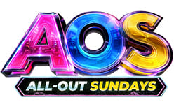
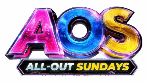
This image combines a large metallic-looking AOS monogram in pink, blue and gold with a smaller “ALL-OUT SUNDAYS” wordmark in a dark outlined bar. It is visually distinct from the full-title design in the preceding stage. The show’s official pages still used the All-Out Sundays title in November 2025, while the research does not establish this pictured AOS design as a current rebrand.
Color and composition
Across the sequence, the most noticeable shifts are in layout and contrast: multicolored letters on cyan, a dark oval with white type, a large white wordmark on a vivid background, and finally metallic initials paired with the full title. The AOS image therefore does not simply remove the show name; it retains “ALL-OUT SUNDAYS” as a secondary line beneath the initials.
Disclaimer
This article is part of the educational resources provided by Logo Index, an independent archive covering logos, visual identities and graphic design history. All-Out Sundays and associated trademarks and brand assets remain the property of their respective rights holders where applicable.