The AMC television network launched on October 1, 1984, as American Movie Classics, a service focused on classic films, according to the Encyclopedia of TV & Radio. On September 30, 2002, it adopted the name AMC and a shorter wordmark, as reported in the network’s 2002 rebrand announcement.
 AMC Logo PNG
Meaning and history
The logo’s broad shift was from marks carrying the full American Movie Classics name to an identity built around three letters. The 2002 announcement introduced the AMC name, the “TV for movie people” tagline and an on-air package by Trollbäck & Company.
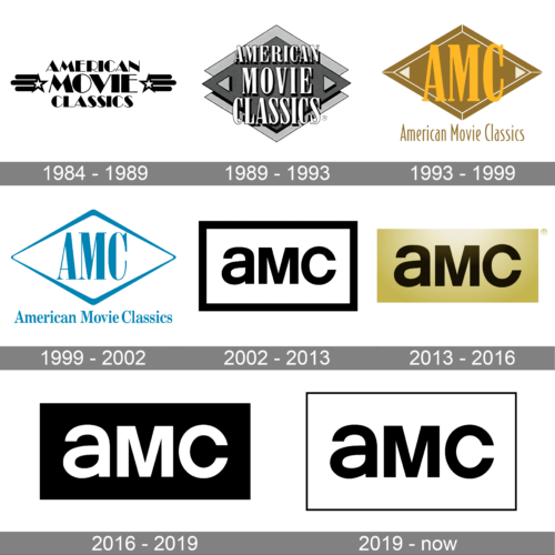
The archive’s sequence shows changing frames and lettering before the acronym became the central feature. The later designs use a compact, mixed-case “aMC” wordmark, with changes to its surrounding frame and background.
1984 – 1989
This stage represents the full American Movie Classics name rather than the later three-letter mark. The archive’s composite groups it with the earliest, stacked treatment of the long name.
1989 – 1993
Here the full name appears in prominent serif capitals over a layered diamond shape. The surrounding geometry gives the lettering a more framed, dimensional appearance than the name-focused earliest treatment.
1993 – 1999
The initials move to the foreground: large gold “AMC” lettering sits inside a diamond, while “American Movie Classics” remains below. This arrangement makes the abbreviation easier to spot without dropping the channel’s full name.
1999 – 2002
This version pares the design back to a blue outlined diamond, with “AMC” above the full channel name. It retains the initials-and-name arrangement but uses a simpler, single-color treatment.
2002 – 2013

The 2002 rebrand replaced the full name with “AMC” and introduced a rectangular frame around the mixed-case “aMC” wordmark. The announcement also described a broader channel identity package by Trollbäck & Company.
2013 – 2016
The wordmark appears in dark lettering against a gold field. In its 2013 announcement, AMC Networks described the gold as suggesting “premium quality and popular appeal.”
2016 – 2019

The gold field gives way to a black background with the “aMC” letters in white. This treatment removes the visible rectangular frame used in the earlier and later outlined versions.
2019 – Today
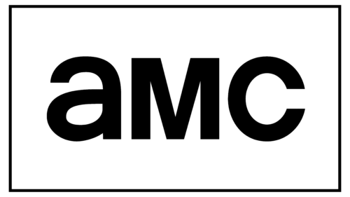
The current documented identity brings back a thin rectangular outline around the black “aMC” lettering. A July 2019 account of the redesign describes refinements to the letterforms, including a flatter curve on the “a” and a wider opening on the “c” (Logo News).
Wordmark and color
Across the acronym-era designs, the mixed-case letters remain the focus while the frame and background change. The 2013 gold field stands apart from the black-and-white treatments shown in the other later stages. The 2019 revision returned to a thin outline, giving the compact wordmark a clear rectangular boundary.
Disclaimer
This article is part of the educational resources provided by Logo Index, an independent archive covering logos, visual identities and graphic design history. AMC and associated trademarks and brand assets remain the property of their respective rights holders where applicable.