 Martell Logo PNG
Founded by Jean Martell in 1715, Martell is one of the great Cognac houses. Pernod Ricard, its owner since 2001, calls it “the oldest of the great Cognac houses.” (Pernod Ricard)
Meaning and history

Martell’s emblem pairs a swift, called a martinet in French, with a shield. The shield draws on the Martell family arms, which feature three gold hammers and the bird. Martell says Jean Martell used the arms on casks shipped from the early 1700s, and describes the swift as expressing the house’s “spirit of daring and freedom.” (Martell)
For the house’s 300th anniversary, Yorgo & Co redesigned the identity, drawing a new swift and reviving the shield. The studio also developed exclusive typefaces and identity guidelines. The redesign was reported in 2015, and a trade account noted the addition of a second wing to the bird. (Yorgo & Co; Vitisphere)
2000 – 2016
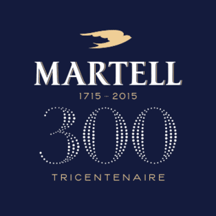
This anniversary design places a gold swift above a white serif wordmark on a dark blue field. Beneath it, “1715 – 2015” and a large “300” with “Tricentenaire” make the commemorative purpose clear. The image’s anniversary wording corresponds to 2015, but does not establish that the design began in 2000.
2016 – Today

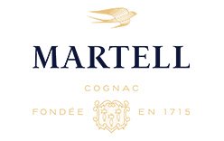
The later arrangement uses a light ground, with the swift above the MARTELL wordmark and a gold shield below. The composition also includes “Cognac” and “Fondée en 1715.” It leaves behind the previous stage’s large anniversary badge while retaining the bird, shield and wordmark. Martell’s current site and its 2022 Cordon Bleu packaging work show the blue-and-gold identity in continued use. (Martell; Martell Cordon Bleu)
Typography and color
The wordmark uses Martell Sans, a custom typeface made for the house in 2014 by Production Type, with art direction by Yorgo & Co. The type project also included an ultra-premium version. (Production Type)
Blue and gold are consistent across the identity: the anniversary artwork uses a dark blue background and gold bird, while the later arrangement sets the wordmark in blue and the emblem details in gold. Martell’s own account also connects blue with the house’s historic ribbon. (Martell)
The swift extends beyond the logo into packaging. For Cordon Bleu’s 110th anniversary, Martell introduced a 2022 bottle redesign featuring the bird as a raised glass motif and an abstract pattern on the carton. (Martell)
Disclaimer
This article is part of the educational resources provided by Logo Index, an independent archive covering logos, visual identities and graphic design history. Martell and associated trademarks and brand assets remain the property of their respective rights holders where applicable.