 Red Kap Logo PNG
Red Kap is a workwear and uniform brand founded in Nashville in 1923. The name came later: the company’s history traces “Red Kap” to Red Cap Smoking Tobacco when the business adopted the name in 1939. The cap motif offers a clear visual link to that name, while the current badge also carries the founding year. Red Kap’s history page recounts the company’s origins and centennial.
Meaning and history

The montage contrasts a circular red emblem featuring a cap with a red, shield-like badge. Both designs use the Red Kap name and the year 1923, but arrange them differently: the older-looking emblem puts the cap above the lettering, while the badge gives the wordmark the central position.
The business began as Central Overall Manufacturing, associated with the Nashville storefront Harlin Bros. & Williams. Red Kap’s company history and a company chronology identify the 1923 founding; Red Kap’s own account traces the later name to 1939. The company’s history also describes a 1947 shift toward uniforms designed for industrial laundering. These milestones give context to the founding year shown in the logo without establishing when either pictured design was introduced.
Old

This circular design places a cap across the top of a thick red ring, with the red uppercase wordmark inside and “1923” below it. The cap, name and date are stacked within a compact oval composition. The year is part of the visible artwork; it does not by itself date the logo’s introduction.
Today

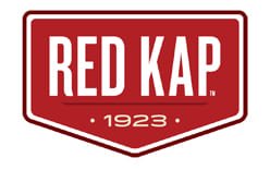
Red Kap’s current identity uses a broad red badge with a pointed lower edge, a white inner border and a white uppercase wordmark. The date 1923 sits beneath the name between small dots. Compared with the circular emblem, the badge removes the cap illustration and moves the founding year into a more prominent, clearly separated line. Red Kap remains an active brand under Workwear Outfitters; the sale of VF’s occupational workwear business to Redwood was reported by Modaes.
Font and Color

This image shows another treatment: a red oval outlined in white, with a cap above the wordmark and “EST. 1923” below it. Unlike the badge in the preceding stage, this version uses horizontal rules to separate the name from the cap and date. The lettering is uppercase and sans serif in appearance; the images show red-and-white palettes across the designs, with the balance of those colors changing from one mark to another.
Disclaimer
This article is part of the educational resources provided by Logo Index, an independent archive covering logos, visual identities and graphic design history. Red Kap and associated trademarks and brand assets remain the property of their respective rights holders where applicable.