The Arby’s logo has kept a cowboy hat at its center while changing its lettering and treatment over time. The first restaurant opened in Boardman, Ohio, on July 23, 1964. The company’s anniversary release says the name comes from the founders’ initials, R.B. for Raffel Brothers, rather than from roast beef, and credits the original hat design to Gloria Raffel.
 Arbys Logo PNG
Meaning and history
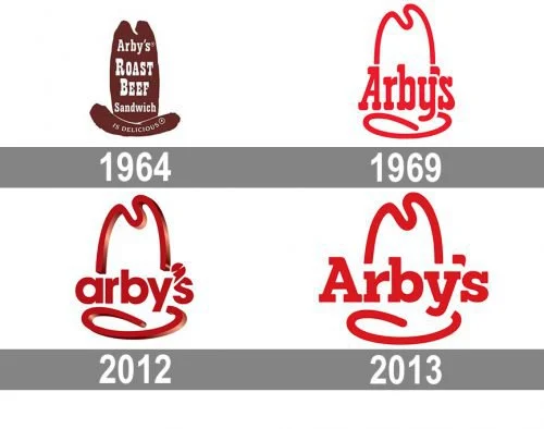
The designs share a recognizable hat outline, but their visual styles vary: the early mark is a brown sign illustration, later versions use a red outline, and the 2012 redesign added a glossy dimensional effect. A City of Winston-Salem historic designation order connects the hat’s western styling with the popularity of westerns when the chain began. For the 2012 mark, Bloomberg Businessweek reported that the lowercase lettering and meat-slicer-shaped apostrophe were deliberate details tied to the brand’s fresh-slicing message.
1964 – 1969
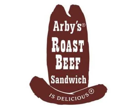
The original mark placed “Arby’s Roast Beef Sandwich” on a tall brown hat, with “is Delicious” curved along its brim. Its stacked lettering makes the design read like a sign as well as a logo. Arby’s anniversary release identifies Gloria Raffel as the designer of the original cowboy-hat logo.
1969 – 2012
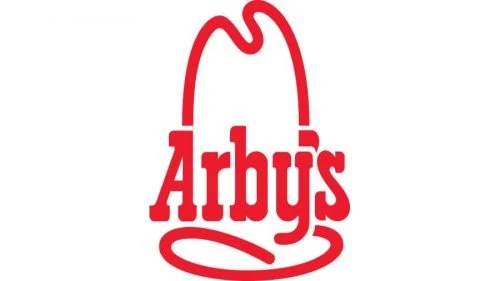
The next design replaced the brown illustration with a red contour hat and a prominent serif wordmark. The broad outline and large lettering made a simpler, more compact mark than the original sign. The stage’s start date is disputed: a Winston-Salem historic order says the hat was modernized in 1969, while Bloomberg Businessweek described the 2012 redesign as the first since 1975. The supplied heading is retained, but the evidence supports describing this as the long-running red-hat era rather than assigning it a settled start year.
2012 – 2013
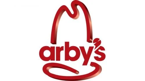
Arby’s introduced a glossy, dimensional hat with a lowercase wordmark in its 2012 brand relaunch. The apostrophe was shaped like a meat slicer, a detail Russ Klein described to Bloomberg Businessweek as part of the effort to distinguish the identity and connect it to fresh slicing. The campaign used the tagline “Slicing Up Freshness,” and television spots began on September 30, 2012, according to QSR Magazine.
2013 – present
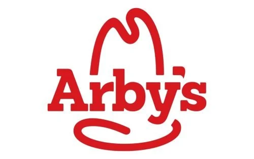
At its October 2013 National Franchise Conference, Arby’s introduced a flatter, two-dimensional hat and a larger serif wordmark, returning to a look closer to the earlier red design. Entrepreneur reported that the mark appeared in a November commercial, followed by print and promotional materials from January 2014 and a gradual restaurant-sign rollout. The flat red hat-and-wordmark identity remains the operative mark, according to the later status described in Entrepreneur’s account of the redesign.
Lettering and color
The lettering shifts from the original sign’s stacked serif text to the bold serif wordmark on the red contour hat. The 2012 version briefly broke from that approach with lowercase sans-serif lettering; the 2013 mark returned to a serif wordmark with an uppercase initial. Red defines the later hat marks, while the first sign used a brown hat. The available documentation does not establish a specific typeface name.
See the Arby’s logo archive for the image collection.
Disclaimer
This article is part of the educational resources provided by Logo Index, an independent archive covering logos, visual identities and graphic design history. Arbys and associated trademarks and brand assets remain the property of their respective rights holders where applicable.