Cadbury’s visual identity has included both an illustrated cocoa tree and the flowing script now associated with the brand. In 1905, William Cadbury commissioned Georges Auriol to create a logo combining a cocoa tree with the Cadbury name. The script wordmark came later: it was based on William Cadbury’s signature and was reportedly first used on the company’s transport fleet in the 1920s, often dated to 1921 (Connecting Histories; Marketing-Interactive).
 Cadbury Logo PNG
Meaning and history
Cadbury began with John Cadbury’s Birmingham shop, opened in 1824. The company’s later identity developed across changing products and packaging; its Dairy Milk chocolate launched in 1905. Cadbury is now a brand within Mondelez International, following the 2010 Kraft takeover and the 2012 formation of Mondelez (BBC News).
1824
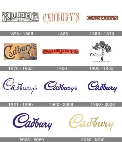
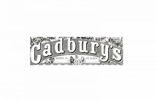
The image shows a dense, monochrome design with the Cadbury name in prominent serif lettering amid smaller decorative details. The 1824 heading matches the year John Cadbury opened his shop, but that date alone does not establish when this particular design was made.
1866
This version sets the name in narrow, spaced capitals. The thin strokes and small decorative breaks give it a more restrained appearance than the heavier lettering in the preceding image.
1866 (second version)
Here the capitals sit within a dark rectangular panel, rather than standing alone on a light field. The boxed treatment makes the name read as a compact label.
1876
The lettering is mixed case and more expressive, with a large looping initial C. Its warm-toned illustrated background contrasts with the plain panels in the earlier examples.
1900
This image uses large red capitals against a pink-toned field. Compared with the previous mixed-case design, the wordmark is broader and more emphatic.
1905
The documented 1905 logo is distinct from a simple wordmark: a stylised cocoa tree grows around the Cadbury name. Connecting Histories records the design on a promotional jug, while design coverage also describes the commission by Georges Auriol for William Cadbury (Connecting Histories; Creative Review).
1921
The script replaces the earlier block lettering with a connected, handwritten line. Marketing-Interactive reports that the design was based on William Cadbury’s signature and appeared on the transport fleet in the 1920s; the year 1921 is commonly associated with this stage.
1960
This stage keeps the flowing script but presents it in purple on a light background. The connected letters and sweeping initial C provide a clear contrast with the separated capitals in earlier examples.
2003
The large purple script fills more of the available space here than in the preceding image. The close crop emphasizes the distinctive initial and connected strokes.
2020
Bulletproof redesigned Cadbury’s global identity in 2020. The agency redrew the script around a signature-like treatment, and the redesign retained purple as a defining brand colour. For Dairy Milk, the team drew on the 1905 packaging for a new pattern and recrafted the product lettering; it also redrew the Glass and a Half icon to connect the pouring glass with a chocolate piece (Bulletproof; Cadbury). The rollout began in Australia in May 2020, followed by South Africa and Malaysia later that year and the UK and Ireland in early 2021 (Pentawards). The mark shown here uses a gold-coloured treatment; the redesign’s broader identity retained purple.
Script and colour
Cadbury’s script is recognizable through its connected strokes and oversized initial C. In the 2020 redesign, Bulletproof described its aim as restoring a sense of humanity to the identity through a signature-like wordmark. Purple remained central to the redesign rather than being replaced by gold (Bulletproof; Creative Review).
View the Cadbury logo archive entry.
Disclaimer
This article is part of the educational resources provided by Logo Index, an independent archive covering logos, visual identities and graphic design history. Cadbury and associated trademarks and brand assets remain the property of their respective rights holders where applicable.